目录
你是否在WPF开发中遇到过这样的困扰:每次创建新控件都要重复设置一堆属性?明明是同一类操作,却要在不同控件间反复配置样式、布局、数据绑定?作为一名有着10年WPF开发经验的程序员,我深知这种"重复劳动"的痛苦。
今天这篇文章,我将带你深入理解WPF控件的通用属性体系,掌握5个核心技巧,让你的开发效率瞬间提升50%!无论你是WPF新手还是有一定经验的开发者,这些实战技巧都能让你的代码更加优雅、可维护。
🔍 问题分析:WPF属性管理的三大痛点
痛点一:属性重复配置
每个控件都要单独设置字体、颜色、边距等基础属性,代码冗余严重。
痛点二:样式不统一
项目中控件样式五花八门,维护困难,用户体验不一致。
痛点三:性能浪费
不了解属性继承机制,导致不必要的资源消耗和渲染开销。
💡 解决方案:5个WPF通用属性管理技巧
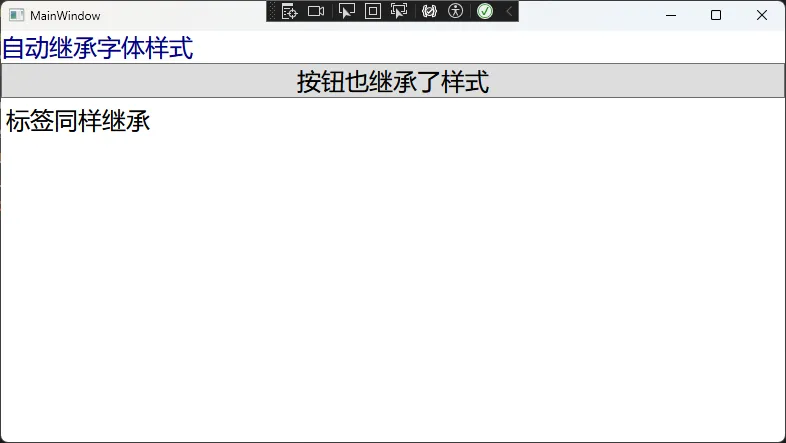
🎨 技巧1:掌握属性继承机制
WPF中的许多属性具有继承特性,子控件会自动继承父容器的属性值。
核心代码示例:
C#<Window x:Class="AppCommonProperty.MainWindow"
        xmlns="http://schemas.microsoft.com/winfx/2006/xaml/presentation"
        xmlns:x="http://schemas.microsoft.com/winfx/2006/xaml"
        xmlns:d="http://schemas.microsoft.com/expression/blend/2008"
        xmlns:mc="http://schemas.openxmlformats.org/markup-compatibility/2006"
        xmlns:local="clr-namespace:AppCommonProperty"
        mc:Ignorable="d"
        Title="MainWindow" Height="450" Width="800"
        FontFamily="Microsoft YaHei"
        FontSize="24"
        Foreground="DarkBlue"
        >
    <StackPanel>
        <TextBlock Text="自动继承字体样式" />
        <Button Content="按钮也继承了样式" />
        <Label Content="标签同样继承" />
    </StackPanel>
</Window>
实际应用场景:
在主窗口或用户控件的根容器设置通用属性,所有子控件自动应用,减少90%的重复配置。
并非所有属性都支持继承,如Width、Height等布局属性不会继承 显式设置的属性会覆盖继承值 这块其实与Winform基本一样
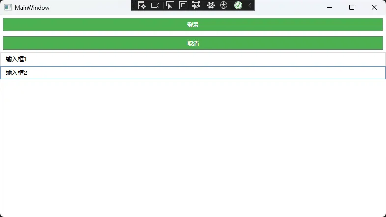
🎯 技巧2:使用隐式样式统一外观
通过定义无Key的样式,实现同类型控件的统一外观管理。
核心代码示例:
XML<Window x:Class="AppCommonProperty.MainWindow"
        xmlns="http://schemas.microsoft.com/winfx/2006/xaml/presentation"
        xmlns:x="http://schemas.microsoft.com/winfx/2006/xaml"
        xmlns:d="http://schemas.microsoft.com/expression/blend/2008"
        xmlns:mc="http://schemas.openxmlformats.org/markup-compatibility/2006"
        xmlns:local="clr-namespace:AppCommonProperty"
        mc:Ignorable="d"
        Title="MainWindow" Height="450" Width="800"
        FontFamily="Microsoft YaHei"
        Foreground="DarkBlue"
        >
    <Window.Resources>
        <!-- 隐式样式:所有Button自动应用 -->
        <Style TargetType="Button">
            <Setter Property="Background" Value="#4CAF50"/>
            <Setter Property="Foreground" Value="White"/>
            <Setter Property="Padding" Value="10,5"/>
            <Setter Property="Margin" Value="5"/>
            <Setter Property="Cursor" Value="Hand"/>
            <Style.Triggers>
                <Trigger Property="IsMouseOver" Value="True">
                    <Setter Property="Background" Value="#45a049"/>
                </Trigger>
            </Style.Triggers>
        </Style>

        <!-- TextBox的统一样式 -->
        <Style TargetType="TextBox">
            <Setter Property="Padding" Value="8,5"/>
            <Setter Property="BorderBrush" Value="#ddd"/>
            <Setter Property="BorderThickness" Value="1"/>
        </Style>
    </Window.Resources>

    <StackPanel>
        <Button Content="登录" />
        <Button Content="取消" />
        <TextBox Text="输入框1" />
        <TextBox Text="输入框2" />
    </StackPanel>
</Window>
实际应用场景:
企业级应用中确保UI风格统一,后期样式调整只需修改一处代码。
这块类似html中的style
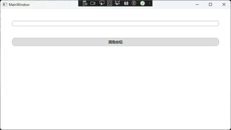
🔧 技巧3:创建通用附加属性
自定义附加属性,为任意控件添加通用功能。
核心代码示例:
C#using System;
using System.Windows;
using System.Windows.Controls;
using System.Windows.Media;

namespace AppCommonProperty
{
    public static class CommonProperties
    {
        // 圆角属性
        public static readonly DependencyProperty CornerRadiusProperty =
            DependencyProperty.RegisterAttached(
                "CornerRadius",
                typeof(CornerRadius),
                typeof(CommonProperties),
                new PropertyMetadata(default(CornerRadius), OnCornerRadiusChanged));

        public static void SetCornerRadius(DependencyObject element, CornerRadius value)
        {
            element.SetValue(CornerRadiusProperty, value);
        }

        public static CornerRadius GetCornerRadius(DependencyObject element)
        {
            return (CornerRadius)element.GetValue(CornerRadiusProperty);
        }

        private static void OnCornerRadiusChanged(DependencyObject d, DependencyPropertyChangedEventArgs e)
        {
            if (d is Control control)
            {
                var cornerRadius = (CornerRadius)e.NewValue;

                // 为不同类型的控件应用不同的处理方式
                if (control is TextBox textBox)
                {
                    ApplyCornerRadiusToTextBox(textBox, cornerRadius);
                }
                else if (control is Button button)
                {
                    ApplyCornerRadiusToButton(button, cornerRadius);
                }
            }
        }

        private static void ApplyCornerRadiusToTextBox(TextBox textBox, CornerRadius cornerRadius)
        {
            var style = new Style(typeof(TextBox));
            var template = new ControlTemplate(typeof(TextBox));

            // 创建边框
            var borderFactory = new FrameworkElementFactory(typeof(Border));
            borderFactory.Name = "border";
            borderFactory.SetValue(Border.CornerRadiusProperty, cornerRadius);
            borderFactory.SetValue(Border.BorderBrushProperty, SystemColors.ControlDarkBrush);
            borderFactory.SetValue(Border.BorderThicknessProperty, new Thickness(1));
            borderFactory.SetValue(Border.BackgroundProperty, Brushes.White);

            // 创建 ScrollViewer
            var scrollViewerFactory = new FrameworkElementFactory(typeof(ScrollViewer));
            scrollViewerFactory.Name = "PART_ContentHost";
            scrollViewerFactory.SetValue(ScrollViewer.HorizontalScrollBarVisibilityProperty, ScrollBarVisibility.Hidden);
            scrollViewerFactory.SetValue(ScrollViewer.VerticalScrollBarVisibilityProperty, ScrollBarVisibility.Hidden);
            scrollViewerFactory.SetValue(ScrollViewer.PaddingProperty, new Thickness(5));

            borderFactory.AppendChild(scrollViewerFactory);
            template.VisualTree = borderFactory;

            style.Setters.Add(new Setter(Control.TemplateProperty, template));
            textBox.Style = style;
        }

        private static void ApplyCornerRadiusToButton(Button button, CornerRadius cornerRadius)
        {
            var style = new Style(typeof(Button));
            var template = new ControlTemplate(typeof(Button));

            // 创建边框
            var borderFactory = new FrameworkElementFactory(typeof(Border));
            borderFactory.Name = "border";
            borderFactory.SetValue(Border.CornerRadiusProperty, cornerRadius);
            borderFactory.SetValue(Border.BackgroundProperty, new SolidColorBrush(Color.FromRgb(221, 221, 221)));
            borderFactory.SetValue(Border.BorderBrushProperty, new SolidColorBrush(Color.FromRgb(173, 173, 173)));
            borderFactory.SetValue(Border.BorderThicknessProperty, new Thickness(1));

            // 创建内容呈现器
            var contentPresenterFactory = new FrameworkElementFactory(typeof(ContentPresenter));
            contentPresenterFactory.SetValue(ContentPresenter.HorizontalAlignmentProperty, HorizontalAlignment.Center);
            contentPresenterFactory.SetValue(ContentPresenter.VerticalAlignmentProperty, VerticalAlignment.Center);
            contentPresenterFactory.SetValue(ContentPresenter.MarginProperty, new Thickness(5));

            borderFactory.AppendChild(contentPresenterFactory);
            template.VisualTree = borderFactory;

            // 添加触发器
            var trigger = new Trigger { Property = Button.IsMouseOverProperty, Value = true };
            trigger.Setters.Add(new Setter(Border.BackgroundProperty, new SolidColorBrush(Color.FromRgb(190, 230, 253)), "border"));
            template.Triggers.Add(trigger);

            style.Setters.Add(new Setter(Control.TemplateProperty, template));
            button.Style = style;
        }

        // 水印文字属性
        public static readonly DependencyProperty WatermarkProperty =
            DependencyProperty.RegisterAttached(
                "Watermark",
                typeof(string),
                typeof(CommonProperties),
                new PropertyMetadata(string.Empty));

        public static void SetWatermark(DependencyObject element, string value)
        {
            element.SetValue(WatermarkProperty, value);
        }

        public static string GetWatermark(DependencyObject element)
        {
            return (string)element.GetValue(WatermarkProperty);
        }
    }
}
XAML使用方式:
XML<StackPanel>
    <StackPanel.Margin>20</StackPanel.Margin>
    <TextBox local:CommonProperties.Watermark="请输入用户名"
     local:CommonProperties.CornerRadius="5" Margin="20"/>
    <Button local:CommonProperties.CornerRadius="10" Content="圆角按钮" Margin="20"/>
</StackPanel>
修改修改OnCornerRadiusChanged 比上面判断控件更灵活
C#using System;
using System.Collections.Generic;
using System.Linq;
using System.Text;
using System.Threading.Tasks;
using System.Windows.Controls;
using System.Windows;
using System.Windows.Media;

namespace AppCommonProperty
{
    // 定义附加属性类
    public static class CommonProperties
    {
        // 圆角属性
        public static readonly DependencyProperty CornerRadiusProperty =
            DependencyProperty.RegisterAttached(
                "CornerRadius",
                typeof(CornerRadius),
                typeof(CommonProperties),
                new PropertyMetadata(default(CornerRadius), OnCornerRadiusChanged));

        public static void SetCornerRadius(DependencyObject element, CornerRadius value)
        {
            element.SetValue(CornerRadiusProperty, value);
        }

        public static CornerRadius GetCornerRadius(DependencyObject element)
        {
            return (CornerRadius)element.GetValue(CornerRadiusProperty);
        }

        private static void OnCornerRadiusChanged(DependencyObject d, DependencyPropertyChangedEventArgs e)
        {
            if (d is Control control)
            {
                control.Loaded += (sender, args) =>
                {
                    // 查找控件模板中的边框元素并设置圆角
                    var border = FindVisualChild<Border>(control);
                    if (border != null)
                    {
                        border.CornerRadius = (CornerRadius)e.NewValue;
                    }
                    else
                    {
                        // 如果没有找到边框,则动态包装
                        WrapControlWithBorder(control, (CornerRadius)e.NewValue);
                    }
                };
            }
        }


        private static T FindVisualChild<T>(DependencyObject parent) where T : DependencyObject
        {
            for (int i = 0; i < VisualTreeHelper.GetChildrenCount(parent); i++)
            {
                var child = VisualTreeHelper.GetChild(parent, i);
                if (child is T result)
                    return result;

                var childOfChild = FindVisualChild<T>(child);
                if (childOfChild != null)
                    return childOfChild;
            }
            return null;
        }

        // 辅助方法:用边框包装控件
        private static void WrapControlWithBorder(Control control, CornerRadius cornerRadius)
        {
            if (control.Parent is Panel panel)
            {
                var index = panel.Children.IndexOf(control);
                panel.Children.RemoveAt(index);

                var border = new Border
                {
                    CornerRadius = cornerRadius,
                    Child = control,
                    Background = control.Background,
                    BorderBrush = new SolidColorBrush(Colors.Gray),
                    BorderThickness = new Thickness(1)
                };

                panel.Children.Insert(index, border);
            }
        }

        // 水印文字属性
        public static readonly DependencyProperty WatermarkProperty =
            DependencyProperty.RegisterAttached(
                "Watermark",
                typeof(string),
                typeof(CommonProperties),
                new PropertyMetadata(string.Empty));

        public static void SetWatermark(DependencyObject element, string value)
        {
            element.SetValue(WatermarkProperty, value);
        }

        public static string GetWatermark(DependencyObject element)
        {
            return (string)element.GetValue(WatermarkProperty);
        }
    }
}
实际应用场景:
为项目中的所有输入控件添加水印功能,或为任意控件添加圆角效果。 类似Winform中的继承控件,扩展属性,不过要灵活一些。
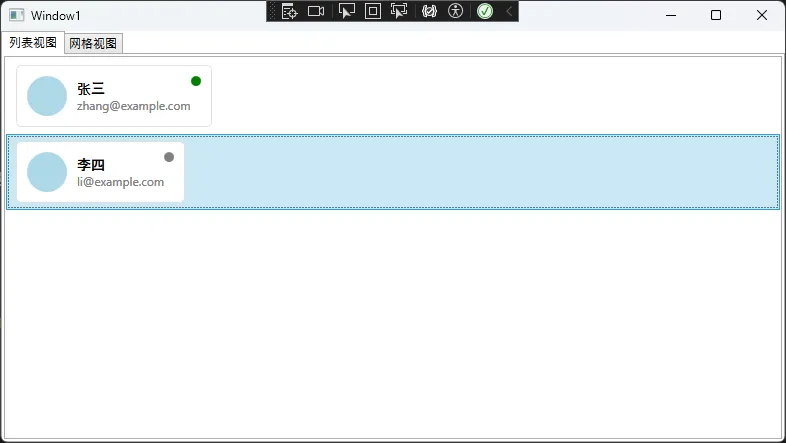
📊 技巧4:使用数据模板统一数据展示
通过DataTemplate定义数据的统一展示方式。
核心代码示例:
C#// 数据模型
public class UserInfo
{
    public string Name { get; set; }
    public string Email { get; set; }
    public string Avatar { get; set; }
    public bool IsOnline { get; set; }
}
C#// ViewModel
public class MainViewModel : INotifyPropertyChanged
{
    public ObservableCollection<UserInfo> Users { get; set; }

    public MainViewModel()
    {
        Users = new ObservableCollection<UserInfo>
        {
            new UserInfo { Name = "张三", Email = "zhang@example.com", IsOnline = true },
            new UserInfo { Name = "李四", Email = "li@example.com", IsOnline = false }
        };
    }
}
XAML数据模板:
XML<Window.Resources>
    <!-- 用户信息通用模板 -->
    <DataTemplate x:Key="UserInfoTemplate" DataType="{x:Type local:UserInfo}">
        <Border Background="White"
                BorderBrush="#E0E0E0"
                BorderThickness="1"
                CornerRadius="5"
                Margin="5"
                Padding="10">
            <Grid>
                <Grid.ColumnDefinitions>
                    <ColumnDefinition Width="Auto"/>
                    <ColumnDefinition Width="*"/>
                    <ColumnDefinition Width="Auto"/>
                </Grid.ColumnDefinitions>

                <!-- 头像 -->
                <Ellipse Grid.Column="0"
                         Width="40" Height="40"
                         Fill="LightBlue"
                         Margin="0,0,10,0"/>

                <!-- 用户信息 -->
                <StackPanel Grid.Column="1" VerticalAlignment="Center">
                    <TextBlock Text="{Binding Name}"
                               FontWeight="Bold"
                               FontSize="14"/>
                    <TextBlock Text="{Binding Email}"
                               Foreground="Gray"
                               FontSize="12"/>
                </StackPanel>

                <!-- 在线状态 -->
                <Ellipse Grid.Column="2"
                         Width="10" Height="10"
                         VerticalAlignment="Top">
                    <Ellipse.Style>
                        <Style TargetType="Ellipse">
                            <Setter Property="Fill" Value="Gray"/>
                            <Style.Triggers>
                                <DataTrigger Binding="{Binding IsOnline}" Value="True">
                                    <Setter Property="Fill" Value="Green"/>
                                </DataTrigger>
                            </Style.Triggers>
                        </Style>
                    </Ellipse.Style>
                </Ellipse>
            </Grid>
        </Border>
    </DataTemplate>
</Window.Resources>

<!-- 在不同控件中复用模板 -->
<TabControl>
    <TabItem Header="列表视图">
        <ListBox ItemsSource="{Binding Users}"
                 ItemTemplate="{StaticResource UserInfoTemplate}"/>
    </TabItem>
    <TabItem Header="网格视图">
        <ItemsControl ItemsSource="{Binding Users}"
                      ItemTemplate="{StaticResource UserInfoTemplate}">
            <ItemsControl.ItemsPanel>
                <ItemsPanelTemplate>
                    <WrapPanel/>
                </ItemsPanelTemplate>
            </ItemsControl.ItemsPanel>
        </ItemsControl>
    </TabItem>
</TabControl>
实际应用场景:
电商应用中商品信息在列表、网格、详情等多个页面保持一致的展示效果。
⚡ 技巧5:利用控件模板重定义外观
通过ControlTemplate完全自定义控件的视觉表现。
核心代码示例:
XML<Window x:Class="AppCommonProperty.Window2"
        xmlns="http://schemas.microsoft.com/winfx/2006/xaml/presentation"
        xmlns:x="http://schemas.microsoft.com/winfx/2006/xaml"
        xmlns:d="http://schemas.microsoft.com/expression/blend/2008"
        xmlns:mc="http://schemas.openxmlformats.org/markup-compatibility/2006"
        xmlns:local="clr-namespace:AppCommonProperty"
        mc:Ignorable="d"
        Title="Window2" Height="450" Width="800">
    <Window.Resources>
        <!-- 自定义按钮模板 -->
        <ControlTemplate x:Key="ModernButtonTemplate" TargetType="Button">
            <Border x:Name="border"
                Background="{TemplateBinding Background}"
                BorderBrush="{TemplateBinding BorderBrush}"
                BorderThickness="{TemplateBinding BorderThickness}"
                CornerRadius="5"
                SnapsToDevicePixels="True">
                <Grid>
                    <!-- 背景渐变效果 -->
                    <Rectangle x:Name="backgroundGradient"
                           Fill="White"
                           Opacity="0"
                           RadiusX="5" RadiusY="5"/>

                    <!-- 内容展示 -->
                    <ContentPresenter x:Name="contentPresenter"
                                  Focusable="False"
                                  HorizontalAlignment="{TemplateBinding HorizontalContentAlignment}"
                                  VerticalAlignment="{TemplateBinding VerticalContentAlignment}"
                                  Margin="{TemplateBinding Padding}"
                                  RecognizesAccessKey="True"
                                  SnapsToDevicePixels="{TemplateBinding SnapsToDevicePixels}"/>
                </Grid>
            </Border>

            <!-- 触发器定义交互效果 -->
            <ControlTemplate.Triggers>
                <Trigger Property="IsMouseOver" Value="True">
                    <Trigger.EnterActions>
                        <BeginStoryboard>
                            <Storyboard>
                                <DoubleAnimation Storyboard.TargetName="backgroundGradient"
                                             Storyboard.TargetProperty="Opacity"
                                             To="0.1" Duration="0:0:0.2"/>
                            </Storyboard>
                        </BeginStoryboard>
                    </Trigger.EnterActions>
                    <Trigger.ExitActions>
                        <BeginStoryboard>
                            <Storyboard>
                                <DoubleAnimation Storyboard.TargetName="backgroundGradient"
                                             Storyboard.TargetProperty="Opacity"
                                             To="0" Duration="0:0:0.2"/>
                            </Storyboard>
                        </BeginStoryboard>
                    </Trigger.ExitActions>
                </Trigger>

                <Trigger Property="IsPressed" Value="True">
                    <Setter TargetName="border" Property="RenderTransform">
                        <Setter.Value>
                            <ScaleTransform ScaleX="0.95" ScaleY="0.95"/>
                        </Setter.Value>
                    </Setter>
                </Trigger>

                <Trigger Property="IsEnabled" Value="False">
                    <Setter Property="Opacity" Value="0.5"/>
                </Trigger>
            </ControlTemplate.Triggers>
        </ControlTemplate>

        <!-- 基于模板的按钮样式 -->
        <Style x:Key="ModernButtonStyle" TargetType="Button">
            <Setter Property="Template" Value="{StaticResource ModernButtonTemplate}"/>
            <Setter Property="Background" Value="#2196F3"/>
            <Setter Property="Foreground" Value="White"/>
            <Setter Property="BorderThickness" Value="0"/>
            <Setter Property="Padding" Value="20,10"/>
            <Setter Property="FontSize" Value="14"/>
            <Setter Property="Cursor" Value="Hand"/>
            <Setter Property="Margin" Value="20"></Setter>
        </Style>
    </Window.Resources>

    <!-- 应用自定义样式 -->
    <StackPanel>
        <Button Content="现代风格按钮" Style="{StaticResource ModernButtonStyle}"/>
        <Button Content="另一个按钮" Style="{StaticResource ModernButtonStyle}" Background="#4CAF50"/>
    </StackPanel>
</Window>
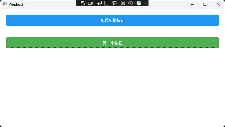
实际应用场景:
创建符合公司品牌风格的控件库,确保整个应用的视觉一致性。
自定义模板时必须保留原有功能性元素(如ContentPresenter) 触发器的优先级会影响最终效果,需要合理安排顺序
🏆 性能优化建议
📈 资源管理最佳实践
XML// 在App.xaml中定义全局资源
<Application.Resources>
    <ResourceDictionary>
        <ResourceDictionary.MergedDictionaries>
            <!-- 分模块管理样式资源 -->
            <ResourceDictionary Source="Styles/ButtonStyles.xaml"/>
            <ResourceDictionary Source="Styles/TextBoxStyles.xaml"/>
            <ResourceDictionary Source="Templates/DataTemplates.xaml"/>
        </ResourceDictionary.MergedDictionaries>
    </ResourceDictionary>
</Application.Resources>
🎯 金句总结
金句1: "掌握属性继承,一次设置,全局生效,让代码更优雅!"
金句2: "隐式样式 + 数据模板,打造专业级UI的黄金组合!"
金句3: "自定义附加属性,让任意控件都能拥有你想要的超能力!"
🎯 总结与展望
通过本文的5个核心技巧,我们彻底解决了WPF控件属性管理的三大痛点:
- 属性继承机制:减少90%的重复配置,让代码更简洁
- 样式模板系统:确保UI风格统一,提升用户体验
- 自定义扩展:通过附加属性和控件模板,实现无限可能
这些技巧不仅能提升开发效率,更能让你的WPF应用达到企业级标准。在实际项目中,建议循序渐进地应用这些技术,先从简单的属性继承开始,逐步深入到自定义模板。
你在WPF开发中还遇到过哪些属性管理的难题? 欢迎在评论区分享你的经验,或者提出你想深入了解的技术点。
如果这篇文章对你有帮助,请转发给更多的C#同行,让我们一起在技术的道路上互相学习,共同进步!
关注我,获取更多C#与WPF实战技巧,让编程之路更加精彩!
本文作者:技术老小子
本文链接:
版权声明:本博客所有文章除特别声明外,均采用 BY-NC-SA 许可协议。转载请注明出处!