目录
摘要
折线图是一种常用的数据可视化图表,在许多应用中都得到了广泛的应用。它可以显示排列在工作表的列或行中的数据,这些数据可以用来描述各种情况和趋势。在工程、科学、经济学等领域,折线图都被广泛使用,用于显示数据的趋势和变化。
折线图最大的特点就是能够显示随时间而变化的连续数据。因此,它非常适合用来显示在相等时间间隔下数据的趋势。通过使用折线图,人们可以清晰地看到数据随着时间的推移而发生的变化,这有助于人们更好地理解数据背后的含义。
在使用折线图时,人们需要注意一些关键的问题。首先,折线图应该与所使用的数据类型相匹配。如果数据是连续的,那么就应该使用连续的折线图。如果数据是分类的,那么就应该使用条形图或堆积条形图。其次,折线图的比例也非常重要。如果数据在时间轴上的比例不合适,那么就会导致折线图显示的数据趋势不正确。
除了时间轴之外,折线图还可以显示其他轴,例如数值轴和标签轴。数值轴用于显示数据的值,标签轴用于显示数据的类别。通过在折线图中使用多个轴,人们可以更好地理解数据背后的含义,并且更好地进行数据分析。
在使用折线图时,人们还需要注意一些技巧。首先,应该避免使用太多的线条,以免折线图过于复杂。其次,应该使用合适的颜色和字体来增强折线图的可读性。最后,应该在折线图中添加适当的注释,以便读者更好地理解数据背后的含义。
这里Series类型有Spline,Line,StepLine,FastLine等。
正文
一个基础类
C#public class Country
{
    public string Name { get; set; }

    public List<string> Year { get; set; }=new List<string>();

    public List<decimal> Money { get; set; }=new List<decimal>();

}
C#Chart chart = new Chart();
private void FrmMain_Load(object sender, EventArgs e)
{
Title title = new Title();
//标题内容
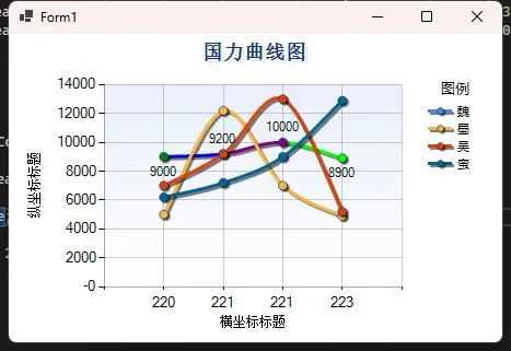
title.Text = "国力曲线图";
//标题的字体
title.Font = new System.Drawing.Font("Microsoft Sans Serif", 12, FontStyle.Bold);
//标题字体颜色
title.ForeColor = Color.FromArgb(26, 59, 105);
//标题阴影颜色
title.ShadowColor = Color.FromArgb(32, 0, 0, 0);
//标题阴影偏移量
title.ShadowOffset = 3;
chart.Titles.Add(title);
List<Country> countryList = new List<Country>();
countryList.Add(new Country { Name = "魏", Year = {"220","221","221","223" }, Money = {9000,9200,10000,8900 } });
countryList.Add(new Country { Name = "蜀", Year = { "220", "221", "221", "223" }, Money = { 5000, 12200, 7000, 4900 } });
countryList.Add(new Country { Name = "吴", Year = { "220", "221", "221", "223" }, Money = { 7000, 9200, 13000, 5200 } });
countryList.Add(new Country { Name = "蛮", Year = { "220", "221", "221", "223" }, Money = { 6200, 7200, 9000, 12900 } });
for (int i = 0; i < countryList.Count; i++)
{
Series series = new Series();
series.Name= countryList[i].Name;
for (int j = 0; j < countryList[i].Year.Count; j++)
{
series.Points.AddXY(countryList[i].Year[j], countryList[i].Money[j]);
}
series.ChartType = SeriesChartType.Spline;
//Series的边框颜色
series.BorderColor = Color.FromArgb(180, 26, 59, 105);
//线条宽度
series.BorderWidth = 3;
//线条阴影颜色
series.ShadowColor = Color.Black;
//阴影宽度
series.ShadowOffset = 2;
//是否显示数据说明
series.IsVisibleInLegend = true;
//线条上数据点上是否有数据显示
series.IsValueShownAsLabel = false;
//线条上的数据点标志类型
series.MarkerStyle = MarkerStyle.Circle;
//线条数据点的大小
series.MarkerSize = 8;
series.ToolTip = "#VALX:#VAL(万)"; //鼠标移动到对应点显示数值
chart.Series.Add(series);
}
//图例样式
Legend legend2 = new Legend("#VALX");
legend2.Title = "图例";
legend2.TitleBackColor = Color.Transparent;
legend2.BackColor = Color.Transparent;
legend2.TitleForeColor = Color.Black;
legend2.TitleFont = new Font("微软雅黑", 10f, FontStyle.Regular);
legend2.Font = new Font("微软雅黑", 8f, FontStyle.Regular);
legend2.ForeColor = Color.Black;
chart.Legends.Add(legend2);
chart.Legends[0].Position.Auto = true;
chart.Series[0].IsValueShownAsLabel = true;
ChartArea chartArea = new ChartArea();
//背景色
chartArea.BackColor = Color.FromArgb(64, 165, 191, 228);
//背景渐变方式
chartArea.BackGradientStyle = GradientStyle.TopBottom;
//渐变和阴影的辅助背景色
chartArea.BackSecondaryColor = Color.White;
//边框颜色
chartArea.BorderColor = Color.FromArgb(64, 64, 64, 64);
//阴影颜色
chartArea.ShadowColor = Color.Transparent;
//设置X轴和Y轴线条的颜色和宽度
chartArea.AxisX.LineColor = Color.FromArgb(64, 64, 64, 64);
chartArea.AxisX.LineWidth = 1;
chartArea.AxisY.LineColor = Color.FromArgb(64, 64, 64, 64);
chartArea.AxisY.LineWidth = 1;
//设置X轴和Y轴的标题
chartArea.AxisX.Title = "横坐标标题";
chartArea.AxisY.Title = "纵坐标标题";
//设置图表区网格横纵线条的颜色和宽度
chartArea.AxisX.MajorGrid.LineColor = Color.FromArgb(64, 64, 64, 64);
chartArea.AxisX.MajorGrid.LineWidth = 1;
chartArea.AxisY.MajorGrid.LineColor = Color.FromArgb(64, 64, 64, 64);
chartArea.AxisY.MajorGrid.LineWidth = 1;
chart.ChartAreas.Add(chartArea);
chart.Series[0].Palette = ChartColorPalette.Bright;
chart.Dock = DockStyle.Fill;
this.Controls.Add(chart);
}
本文作者:技术老小子
本文链接:
版权声明:本博客所有文章除特别声明外,均采用 BY-NC-SA 许可协议。转载请注明出处!
目录