目录
XAML是一种基于XML的声明式标记语言,作为WPF、UWP和Xamarin.Forms等.NET框架中用户界面开发的核心技术。它提供了丰富的控件系统,包括文本控件、按钮控件、列表控件等,并支持多种布局方式如StackPanel、Grid、DockPanel等。XAML具有强大的样式和模板系统,支持资源管理,并提供了灵活的数据绑定机制。
XAML 基础概念
什么是XAML
XAML (eXtensible Application Markup Language) 是一种基于XML的标记语言,主要用于描述用户界面。它是WPF、UWP、Xamarin.Forms等.NET框架中声明式UI的基础。
XAML的主要特点
- 声明式语法
- 与.NET紧密集成
- 支持数据绑定
- 资源系统
- 样式和模板
- 可扩展性
XAML 基本语法
命名空间声明
XML<Window x:Class="App02.MainWindow"
        xmlns="http://schemas.microsoft.com/winfx/2006/xaml/presentation"
        xmlns:x="http://schemas.microsoft.com/winfx/2006/xaml"
        xmlns:d="http://schemas.microsoft.com/expression/blend/2008"
        xmlns:mc="http://schemas.openxmlformats.org/markup-compatibility/2006"
        xmlns:local="clr-namespace:App02"
        mc:Ignorable="d"
        Title="MainWindow" Height="450" Width="800">
常用命名空间说明:
xmlns: WPF核心控件命名空间xmlns:x: XAML语言基本功能命名空间xmlns:local: 应用程序本地命名空间xmlns:d: 设计时属性命名空间xmlns:mc: 标记兼容性命名空间
基本元素语法
XML<Grid>
<!-- 简单属性设置 -->
<Button Content="点击我" Width="100" Height="30"/>
<!-- 复杂属性设置 -->
<Button>
<Button.Content>
<StackPanel>
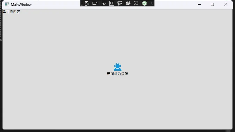
<Image Source="/Assets/Images/icon.png" Width="30" Height="30"/>
<TextBlock Text="带图标的按钮"/>
</StackPanel>
</Button.Content>
</Button>
<!-- 附加属性 -->
<TextBlock Grid.Row="1" Grid.Column="2" Text="单元格内容"/>
</Grid>
标记扩展
XML<!-- 静态资源引用 -->
<Button Background="{StaticResource PrimaryBrush}"/>

<!-- 动态资源引用 -->
<Button Background="{DynamicResource ThemeBrush}"/>

<!-- 绑定 -->
<TextBlock Text="{Binding UserName}"/>

<!-- 相对源绑定 -->
<TextBlock Text="{Binding RelativeSource={RelativeSource Self}, Path=Name}"/>

<!-- 元素绑定 -->
<TextBlock Text="{Binding ElementName=sourceElement, Path=Text}"/>
XAML 控件和布局
常用控件
XML<!-- 文本控件 -->
<TextBlock Text="普通文本" FontSize="14"/>
<TextBox Text="{Binding UserInput}" Width="200"/>

<!-- 按钮控件 -->
<Button Content="标准按钮"/>
<RadioButton Content="选项1" GroupName="group1"/>
<CheckBox Content="复选框" IsChecked="{Binding IsSelected}"/>

<!-- 列表控件 -->
<ListBox ItemsSource="{Binding Items}">
    <ListBox.ItemTemplate>
        <DataTemplate>
            <TextBlock Text="{Binding Name}"/>
        </DataTemplate>
    </ListBox.ItemTemplate>
</ListBox>

<!-- 图片控件 -->
<Image Source="/Assets/Images/icon.png" Stretch="Uniform"/>
布局容器
XML<!-- StackPanel - 堆栈布局 -->
<StackPanel Orientation="Vertical">
    <Button Content="按钮1"/>
    <Button Content="按钮2"/>
</StackPanel>

<!-- Grid - 网格布局 -->
<Grid>
    <Grid.RowDefinitions>
        <RowDefinition Height="Auto"/>
        <RowDefinition Height="*"/>
        <RowDefinition Height="100"/>
    </Grid.RowDefinitions>
    <Grid.ColumnDefinitions>
        <ColumnDefinition Width="200"/>
        <ColumnDefinition Width="*"/>
    </Grid.ColumnDefinitions>

    <TextBlock Grid.Row="0" Grid.Column="0" Text="标题"/>
    <Button Grid.Row="1" Grid.Column="1" Content="内容"/>
</Grid>

<!-- DockPanel - 停靠布局 -->
<DockPanel>
    <StackPanel DockPanel.Dock="Top" Height="50"/>
    <StackPanel DockPanel.Dock="Left" Width="200"/>
    <Grid/>
</DockPanel>

<!-- WrapPanel - 自动换行布局 -->
<WrapPanel>
    <Button Width="100" Height="100" Margin="5"/>
    <Button Width="100" Height="100" Margin="5"/>
    <Button Width="100" Height="100" Margin="5"/>
</WrapPanel>
样式和模板
样式定义和使用
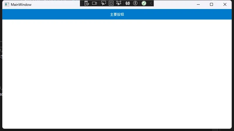
XML<!-- 样式定义 -->
<Window.Resources>
    <Style x:Key="PrimaryButton" TargetType="Button">
        <Setter Property="Background" Value="#007ACC"/>
        <Setter Property="Foreground" Value="White"/>
        <Setter Property="Padding" Value="20,10"/>
        <Setter Property="BorderThickness" Value="0"/>
        <Style.Triggers>
            <Trigger Property="IsMouseOver" Value="True">
                <Setter Property="Background" Value="#005999"/>
            </Trigger>
        </Style.Triggers>
    </Style>
</Window.Resources>

<!-- 样式使用 -->
<Button Style="{StaticResource PrimaryButton}" Content="主要按钮"/>
控件模板
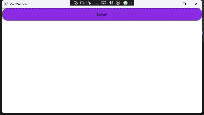
XML<Window.Resources>
    <Style x:Key="CustomButton" TargetType="Button">
        <Setter Property="Template">
            <Setter.Value>
                <ControlTemplate TargetType="Button">
                    <Border Background="{TemplateBinding Background}"
                    BorderBrush="{TemplateBinding BorderBrush}"
                    BorderThickness="{TemplateBinding BorderThickness}"
                    CornerRadius="20">
                        <ContentPresenter HorizontalAlignment="Center"
                                VerticalAlignment="Center"/>
                    </Border>
                </ControlTemplate>
            </Setter.Value>
        </Setter>
    </Style>
</Window.Resources>
<StackPanel>
    <Button Content="Button1" Style="{StaticResource CustomButton}" Height="50" Background="BlueViolet"/>
</StackPanel>
数据绑定
基本绑定
XML<!-- 单向绑定 -->
<TextBlock Text="{Binding UserName}"/>

<!-- 双向绑定 -->
<TextBox Text="{Binding UserInput, UpdateSourceTrigger=PropertyChanged}"/>

<!-- 绑定转换器 -->
<TextBlock Text="{Binding IsActive, Converter={StaticResource BoolToVisibilityConverter}}"/>
集合绑定
XML<ListBox ItemsSource="{Binding Items}">
    <ListBox.ItemTemplate>
        <DataTemplate>
            <StackPanel Orientation="Horizontal">
                <Image Source="{Binding ImageUrl}" Width="50" Height="50"/>
                <StackPanel Margin="10,0,0,0">
                    <TextBlock Text="{Binding Title}" FontWeight="Bold"/>
                    <TextBlock Text="{Binding Description}"/>
                </StackPanel>
            </StackPanel>
        </DataTemplate>
    </ListBox.ItemTemplate>
</ListBox>
资源管理
资源字典
XML<!-- App.xaml -->
<Application.Resources>
    <ResourceDictionary>
        <ResourceDictionary.MergedDictionaries>
            <ResourceDictionary Source="/Styles/Colors.xaml"/>
            <ResourceDictionary Source="/Styles/Typography.xaml"/>
            <ResourceDictionary Source="/Styles/Controls.xaml"/>
        </ResourceDictionary.MergedDictionaries>
    </ResourceDictionary>
</Application.Resources>

<!-- Colors.xaml -->
<ResourceDictionary xmlns="http://schemas.microsoft.com/winfx/2006/xaml/presentation"
                    xmlns:x="http://schemas.microsoft.com/winfx/2006/xaml">
    <Color x:Key="PrimaryColor">#007ACC</Color>
    <SolidColorBrush x:Key="PrimaryBrush" Color="{StaticResource PrimaryColor}"/>
</ResourceDictionary>
动态资源和静态资源
XML<!-- 静态资源 - 一次性加载 -->
<Button Background="{StaticResource PrimaryBrush}"/>

<!-- 动态资源 - 动态更新 -->
<Button Background="{DynamicResource ThemeBrush}"/>
通过掌握这些XAML的基础知识和最佳实践,您可以更好地开发WPF应用程序的用户界面。XAML的声明式特性使得UI开发变得更加直观和高效。
本文作者:技术老小子
本文链接:
版权声明:本博客所有文章除特别声明外,均采用 BY-NC-SA 许可协议。转载请注明出处!
目录