目录
在 Windows Forms 应用程序开发中,有时我们需要创建更加美观、灵活的界面控件。这篇文章将深入解析一个自定义的 CustomPanel 控件,它不仅继承了标准 Panel 的功能,还增加了 Bootstrap 风格的颜色主题和丰富的定制选项。
项目准备
- 创建一个新的 C# Windows Forms 应用程序项目。
- 添加一个新的类文件,命名为
CustomPanel.cs。
实现自定义 Panel 控件
首先,在 CustomPanel.cs 文件中,引用必要的命名空间并创建 CustomPanel 类:
C#using System;
using System.Drawing;
using System.Windows.Forms;

namespace AppControls
{
    // 定义 Bootstrap 颜色枚举
    public enum BootstrapColors
    {
        Primary,
        Secondary,
        Success,
        Danger,
        Warning,
        Info,
        Light,
        Dark,
        White,
        Black
    }

    public class CustomPanel : Panel
    {
        // 标题属性
        public string Title { get; set; } = "默认标题";

        // 背景颜色属性(使用颜色枚举)
        private BootstrapColors _backgroundColor = BootstrapColors.Light;

        public BootstrapColors BackgroundColor
        {
            get => _backgroundColor;
            set
            {
                _backgroundColor = value;
                Invalidate(); // 触发重绘
            }
        }

        // 实际的背景颜色
        private Color ActualBackgroundColor => GetBootstrapColor(_backgroundColor);

        // 图标颜色属性
        public Color IconColor { get; set; } = Color.White;

        // 标题字体属性
        public Font TitleFont { get; set; } = new Font("Arial", 16, FontStyle.Bold);

        // 标题字体大小属性
        public float TitleFontSize
        {
            get => TitleFont.Size;
            set => TitleFont = new Font(TitleFont.FontFamily, value, TitleFont.Style);
        }

        // 新增图标属性
        private Image _panelIcon;
        public Image PanelIcon
        {
            get => _panelIcon;
            set
            {
                _panelIcon = value;
                Invalidate(); // 触发重绘
            }
        }

        // 图标是否可见
        public bool ShowIcon { get; set; } = false;

        // 获取对应的 Bootstrap 颜色
        private Color GetBootstrapColor(BootstrapColors color)
        {
            return color switch
            {
                BootstrapColors.Primary => Color.FromArgb(0, 123, 255),
                BootstrapColors.Secondary => Color.FromArgb(108, 117, 125),
                BootstrapColors.Success => Color.FromArgb(40, 167, 69),
                BootstrapColors.Danger => Color.FromArgb(255, 7, 2),
                BootstrapColors.Warning => Color.FromArgb(255, 193, 7),
                BootstrapColors.Info => Color.FromArgb(23, 162, 184),
                BootstrapColors.Light => Color.FromArgb(248, 249, 250),
                BootstrapColors.Dark => Color.FromArgb(52, 58, 64),
                BootstrapColors.White => Color.FromArgb(255, 255, 255),
                BootstrapColors.Black => Color.FromArgb(0, 0, 0),
                _ => Color.LightBlue, // 默认颜色
            };
        }

        // 重写 OnPaint 方法以自定义绘制
        protected override void OnPaint(PaintEventArgs e)
        {
            // 设置高质量绘制
            e.Graphics.SmoothingMode = System.Drawing.Drawing2D.SmoothingMode.AntiAlias;
            e.Graphics.TextRenderingHint = System.Drawing.Text.TextRenderingHint.ClearTypeGridFit;

            base.OnPaint(e);

            // 绘制背景
            using (SolidBrush brush = new SolidBrush(ActualBackgroundColor))
            {
                e.Graphics.FillRectangle(brush, e.ClipRectangle);
            }

            // 绘制图标(竖线)
            using (Pen pen = new Pen(IconColor, 3)) // 设置颜色和宽度
            {
                e.Graphics.DrawLine(pen, new Point(5, 5), new Point(5, 25)); // 绘制竖线
            }

            // 计算标题的高度和居中 Y 坐标
            SizeF titleSize = e.Graphics.MeasureString(Title, TitleFont); // 获取标题的尺寸
            float titleY = (25 - titleSize.Height) / 2 + 5; // 计算标题的 Y 坐标,使其居中

            // 绘制标题
            using (SolidBrush textBrush = new SolidBrush(Color.White))
            {
                e.Graphics.DrawString(Title, TitleFont, textBrush, new PointF(20, titleY)); // 绘制标题
            }

            // 绘制右侧图标
            if (ShowIcon && PanelIcon != null)
            {
                // 计算图标的位置(右侧居中)
                int iconSize = 64;
                int iconX = Width - iconSize - 10; // 距离右边缘10像素
                int iconY = (Height - iconSize) / 2;

                // 绘制图标
                e.Graphics.DrawImage(PanelIcon, new Rectangle(iconX, iconY, iconSize, iconSize));
            }
        }
    }
}
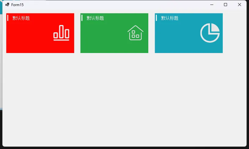
适用场景
这个自定义控件特别适合:
- 管理仪表盘
- 信息卡片
- 状态展示面板
- 通知和警告区域
注意事项
- 确保引用
System.Drawing和System.Windows.Forms - 图标大小固定为 64x64 像素
- 左侧竖线和标题颜色目前是固定的
总结
通过以上步骤,我们成功创建了一个简单的自定义 Panel 控件,使用 GDI+ 进行绘制。这个控件可以根据需要进一步扩展,例如添加更多的绘制功能或响应用户的交互事件。希望这篇文章能帮助你了解如何用 GDI+ 制作自定义控件!
本文作者:技术老小子
本文链接:
版权声明:本博客所有文章除特别声明外,均采用 BY-NC-SA 许可协议。转载请注明出处!
目录