目录
在日常的Windows应用开发中,标准的ComboBox控件往往显得过于单调和缺乏个性。作为一名开发者,您是否曾经希望能够:
- 为每个下拉选项设置独特的背景色
- 为选项添加个性化图标
- 精细控制文字颜色和样式
今天,我将为您详细解析如何使用C#开发一个功能强大且高度定制的下拉菜单控件!
关键技术:重写绘制方法
通过重写OnDrawItem方法,我们可以完全自定义每个选项的渲染效果:
- 绘制独特背景色
- 精确放置图标
- 自定义文字样式
- 添加选中状态特效
控件特性
- 支持为每个Item设置独立的背景颜色
- 支持为每个Item设置独立的文字颜色
- 支持为每个Item添加图标
- 支持自定义Item高度
- 支持鼠标悬停效果
- 完整的事件处理机制
具体实现
自定义ComboBox控件
C#using System;
using System.Collections.Generic;
using System.Linq;
using System.Text;
using System.Threading.Tasks;

namespace AppControls
{
    /// <summary>
    /// 自定义下拉菜单项类
    /// </summary>
    public class CustomComboBoxItem
    {
        // 显示文本
        public string Text { get; set; }

        // 项目值
        public object Value { get; set; }

        // 背景颜色
        public Color BackColor { get; set; }

        // 文字颜色
        public Color ForeColor { get; set; }

        // 图标
        public Image Icon { get; set; }

        public CustomComboBoxItem()
        {
            // 默认颜色设置
            BackColor = Color.White;
            ForeColor = Color.Black;
        }
    }
    public class CustomComboBox : ComboBox
    {
        // 项目高度
        private const int DEFAULT_ITEM_HEIGHT = 25;

        // 图标大小
        private const int IconWidth = 16;
        private const int IconHeight = 16;

        // 图标边距
        private const int IconMargin = 5;

        public CustomComboBox()
        {
            // 设置基本属性
            DrawMode = DrawMode.OwnerDrawFixed;
            DropDownStyle = ComboBoxStyle.DropDownList;
            base.ItemHeight = DEFAULT_ITEM_HEIGHT;
        }

        /// <summary>
        /// 重写ItemHeight属性
        /// </summary>
        public new int ItemHeight
        {
            get { return base.ItemHeight; }
            set { base.ItemHeight = value; }
        }

        /// <summary>
        /// 重写测量项目大小的方法
        /// </summary>
        protected override void OnMeasureItem(MeasureItemEventArgs e)
        {
            base.OnMeasureItem(e);
            e.ItemHeight = DEFAULT_ITEM_HEIGHT;
        }

        /// <summary>
        /// 重写绘制项目的方法
        /// </summary>
        protected override void OnDrawItem(DrawItemEventArgs e)
        {
            if (e.Index < 0) return;

            e.DrawBackground();

            // 获取当前项
            var item = Items[e.Index] as CustomComboBoxItem;
            if (item == null) return;

            // 创建绘制区域
            Rectangle bounds = e.Bounds;

            // 设置绘制颜色
            using (SolidBrush brush = new SolidBrush(item.BackColor))
            {
                // 绘制背景
                e.Graphics.FillRectangle(brush, bounds);
            }

            // 计算文本起始位置
            int textX = bounds.X + IconMargin;

            // 如果有图标,绘制图标
            if (item.Icon != null)
            {
                Rectangle iconBounds = new Rectangle(
                    bounds.X + IconMargin,
                    bounds.Y + (bounds.Height - IconHeight) / 2,
                    IconWidth,
                    IconHeight
                );

                e.Graphics.DrawImage(item.Icon, iconBounds);
                textX += IconWidth + IconMargin;
            }

            // 绘制文本
            using (SolidBrush textBrush = new SolidBrush(item.ForeColor))
            {
                e.Graphics.DrawString(
                    item.Text,
                    e.Font,
                    textBrush,
                    new Point(textX, bounds.Y + (bounds.Height - Font.Height) / 2)
                );
            }

            // 如果当前项被选中,绘制焦点框
            if ((e.State & DrawItemState.Focus) == DrawItemState.Focus)
            {
                using (Pen pen = new Pen(Color.Black))
                {
                    pen.DashStyle = System.Drawing.Drawing2D.DashStyle.Dot;
                    bounds.Width--;
                    bounds.Height--;
                    e.Graphics.DrawRectangle(pen, bounds);
                }
            }
        }
    }
}
使用示例
C#using System;
using System.Collections.Generic;
using System.ComponentModel;
using System.Data;
using System.Drawing;
using System.Linq;
using System.Text;
using System.Threading.Tasks;
using System.Windows.Forms;
namespace AppControls
{
public partial class Form21 : Form
{
private CustomComboBox customComboBox;
public Form21()
{
InitializeComponent();
// 创建自定义下拉菜单
customComboBox = new CustomComboBox();
customComboBox.Location = new Point(50, 50);
customComboBox.Size = new Size(200, 25);
// 添加项目
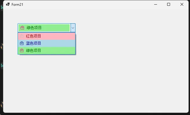
customComboBox.Items.Add(new CustomComboBoxItem
{
Text = "红色项目",
Value = 1,
BackColor = Color.LightPink,
ForeColor = Color.DarkRed,
Icon = Image.FromFile("D:\\myproject\\11Test\\AppControls\\AppControls\\Resources\\tasklist1.png")
});
customComboBox.Items.Add(new CustomComboBoxItem
{
Text = "蓝色项目",
Value = 2,
BackColor = Color.LightBlue,
ForeColor = Color.DarkBlue,
Icon = Image.FromFile("D:\\myproject\\11Test\\AppControls\\AppControls\\Resources\\tasklist2.png")
});
customComboBox.Items.Add(new CustomComboBoxItem
{
Text = "绿色项目",
Value = 3,
BackColor = Color.LightGreen,
ForeColor = Color.DarkGreen,
Icon = Image.FromFile("D:\\myproject\\11Test\\AppControls\\AppControls\\Resources\\tasklist3.png")
});
// 添加选择改变事件处理
customComboBox.SelectedIndexChanged += CustomComboBox_SelectedIndexChanged;
// 将控件添加到窗体
this.Controls.Add(customComboBox);
}
private void CustomComboBox_SelectedIndexChanged(object sender, EventArgs e)
{
if (customComboBox.SelectedItem is CustomComboBoxItem selectedItem)
{
MessageBox.Show($"选择了: {selectedItem.Text}, 值为: {selectedItem.Value}");
}
}
}
}
五、注意事项
- 图标尺寸建议使用32x32像素,以获得最佳显示效果
- 确保选择的背景色和前景色搭配合理,保证文字清晰可见
- 如果不需要图标,可以将Icon属性设置为null
- 控件高度会自动根据ItemHeight调整
- 可以根据需要调整IconMargin等常量值来改变布局
这个自定义下拉菜单控件提供了基本的自定义外观功能,可以根据实际项目需求进行进一步扩展和修改。通过继承ComboBox类并重写相关方法,我们能够实现更多自定义的功能。
本文作者:技术老小子
本文链接:
版权声明:本博客所有文章除特别声明外,均采用 BY-NC-SA 许可协议。转载请注明出处!
目录