目录
WinForm 中最常见的操作之一就是放置一个 Button(按钮),给它设置上适当的事件与属性即可完成点击操作。转到 WPF 之后,Button 依旧是实现交互和触发事件的主要控件之一,但 WPF 的优势在于更灵活强大的样式和布局系统。下面通过几个示例来说明如何将 WinForm 的思路迁移到 WPF,并进一步使用 WPF 的样式(Style)和模板(Template)功能来定制化按钮外观与交互行为。
基础 Button 示例
在 WinForm 中,你可能会这样写:
C#// WinForm 示例
private void Form1_Load(object sender, EventArgs e)
{
    Button btnWinForm = new Button();
    btnWinForm.Text = "点击我";
    btnWinForm.Location = new Point(50, 50);
    btnWinForm.Click += BtnWinForm_Click;
    this.Controls.Add(btnWinForm);
}

private void BtnWinForm_Click(object sender, EventArgs e)
{
    MessageBox.Show("你点击了WinForm按钮");
}
在 WPF 中,即使你也可以在后台代码里使用类似方式生成 Button,通常我们更倾向于在 XAML 中编写:
XML<Window x:Class="AppButton.MainWindow"
        xmlns="http://schemas.microsoft.com/winfx/2006/xaml/presentation"
        xmlns:x="http://schemas.microsoft.com/winfx/2006/xaml"
        xmlns:d="http://schemas.microsoft.com/expression/blend/2008"
        xmlns:mc="http://schemas.openxmlformats.org/markup-compatibility/2006"
        xmlns:local="clr-namespace:AppButton"
        mc:Ignorable="d"
        Title="MainWindow" Height="450" Width="800">
    <Grid>
        <!-- 定义一个Button -->
        <Button x:Name="btnWPF"
                Content="点击我"
                Width="80" Height="40"
                HorizontalAlignment="Left" VerticalAlignment="Top"
                Click="btnWPF_Click"/>
    </Grid>
</Window>
然后在后台代码 MainWindow.xaml.cs 中处理事件:
C#using System.Text;
using System.Windows;
using System.Windows.Controls;
using System.Windows.Data;
using System.Windows.Documents;
using System.Windows.Input;
using System.Windows.Media;
using System.Windows.Media.Imaging;
using System.Windows.Navigation;
using System.Windows.Shapes;
namespace AppButton
{
/// <summary>
/// Interaction logic for MainWindow.xaml
/// </summary>
public partial class MainWindow : Window
{
public MainWindow()
{
InitializeComponent();
}
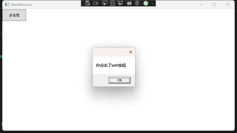
private void btnWPF_Click(object sender, RoutedEventArgs e)
{
MessageBox.Show("你点击了WPF按钮");
}
}
}
从 WinForm 迁移到 WPF,只要理解 WPF 中的 XAML 与代码分离机制,前期的迁移并不困难,但 WPF 的强大功能发挥还需要样式、数据绑定和模板等知识进行更深度扩展。
Button 样式(Style)基础
在 WinForm 中若想为按钮增加统一的样式,通常需要手动编写一套方法或重复在设计器中配置属性。WPF 的样式系统则可以帮助我们批量设置控件的外观和交互,便于统一管理:
XML<Application x:Class="AppButton.App"
             xmlns="http://schemas.microsoft.com/winfx/2006/xaml/presentation"
             xmlns:x="http://schemas.microsoft.com/winfx/2006/xaml"
             xmlns:local="clr-namespace:AppButton"
             StartupUri="MainWindow.xaml">
    <Application.Resources>
        <Style x:Key="MyButtonStyle" TargetType="Button">
            <!-- 可以直接设置属性,无需重复写到每个控件上 -->
            <Setter Property="FontSize" Value="16"/>
            <Setter Property="Foreground" Value="White"/>
            <Setter Property="Background" Value="LightBlue"/>
            <Setter Property="Margin" Value="5"/>
            <Setter Property="Padding" Value="8,4"/>
        </Style>
    </Application.Resources>
</Application>
使用此样式:
XML<Window x:Class="AppButton.MainWindow"
        xmlns="http://schemas.microsoft.com/winfx/2006/xaml/presentation"
        xmlns:x="http://schemas.microsoft.com/winfx/2006/xaml"
        xmlns:d="http://schemas.microsoft.com/expression/blend/2008"
        xmlns:mc="http://schemas.openxmlformats.org/markup-compatibility/2006"
        xmlns:local="clr-namespace:AppButton"
        mc:Ignorable="d"
        Title="MainWindow" Height="450" Width="800">
    <Grid>
        <!-- 定义一个Button -->
        <Button x:Name="btnWPF"
                Content="点击我"
                Width="80" Height="40"
                HorizontalAlignment="Left" VerticalAlignment="Top"
                Click="btnWPF_Click"
                Style="{StaticResource MyButtonStyle}"
                />
    </Grid>
</Window>
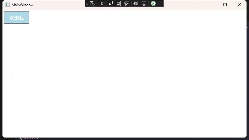
这样,“样式按钮”就会使用我们在 Style 中设置的统一外观。若你需要在多个窗口或页面中复用这一样式,只需将该样式定义在 App.xaml 或公共 ResourceDictionary 中,然后全局共享即可。
Button 样式的触发器(Triggers)
WPF 的触发器机制可以方便地在某些条件满足时,更改控件外观。例如鼠标悬停或按钮被按下时的视觉变化:
XML<Window x:Class="AppButton.MainWindow"
xmlns="http://schemas.microsoft.com/winfx/2006/xaml/presentation"
xmlns:x="http://schemas.microsoft.com/winfx/2006/xaml"
xmlns:d="http://schemas.microsoft.com/expression/blend/2008"
xmlns:mc="http://schemas.openxmlformats.org/markup-compatibility/2006"
xmlns:local="clr-namespace:AppButton"
mc:Ignorable="d"
Title="MainWindow" Height="450" Width="800">
<Window.Resources>
<Style x:Key="MyButtonWithTriggers" TargetType="Button">
<Setter Property="FontSize" Value="16"/>
<Setter Property="Background" Value="LightBlue"/>
<Setter Property="Foreground" Value="White"/>
<Style.Triggers>
<!-- 鼠标悬停时改变背景色 -->
<Trigger Property="IsMouseOver" Value="True">
<Setter Property="Foreground" Value="Red"/>
</Trigger>
<!-- 按钮被按下时的效果 -->
<Trigger Property="IsPressed" Value="True">
<Setter Property="Background" Value="DarkBlue"/>
<Setter Property="Foreground" Value="LightGray"/>
</Trigger>
</Style.Triggers>
</Style>
</Window.Resources>
<StackPanel>
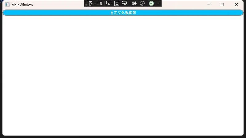
<Button Style="{StaticResource MyButtonWithTriggers}"
Content="自定义外观按钮"/>
</StackPanel>
</Window>
在 Button 中,这些触发器让按钮有了类似 WinForm 中 “MouseEnter / MouseLeave / MouseDown” 等事件效果,但实现方式更直接,也更好维护。
Button 的 ControlTemplate 自定义
如果你想彻底改变按钮的外观,例如做出一个圆形按钮或者将按钮背景换成渐变或图片,可以编写 ControlTemplate:
XML<Window x:Class="AppButton.MainWindow"
        xmlns="http://schemas.microsoft.com/winfx/2006/xaml/presentation"
        xmlns:x="http://schemas.microsoft.com/winfx/2006/xaml"
        xmlns:d="http://schemas.microsoft.com/expression/blend/2008"
        xmlns:mc="http://schemas.openxmlformats.org/markup-compatibility/2006"
        xmlns:local="clr-namespace:AppButton"
        mc:Ignorable="d"
        Title="MainWindow" Height="450" Width="800">
    <Window.Resources>
        <Style x:Key="CustomButtonTemplateStyle" TargetType="Button">
            <Setter Property="Template">
                <Setter.Value>
                    <ControlTemplate TargetType="Button">
                        <!-- Grid或Border作为容器 -->
                        <Border CornerRadius="10"
                        Background="{TemplateBinding Background}"
                        BorderBrush="Gray"
                        BorderThickness="2">
                            <!-- ContentPresenter显示按钮的Content -->
                            <ContentPresenter HorizontalAlignment="Center"
                                      VerticalAlignment="Center"/>
                        </Border>
                    </ControlTemplate>
                </Setter.Value>
            </Setter>
            <Setter Property="Background" Value="DeepSkyBlue"/>
            <Setter Property="Foreground" Value="White"/>
        </Style>
    </Window.Resources>
    <StackPanel>
        <Button Style="{StaticResource CustomButtonTemplateStyle}"
        Content="自定义外观按钮"/>
    </StackPanel>
</Window>
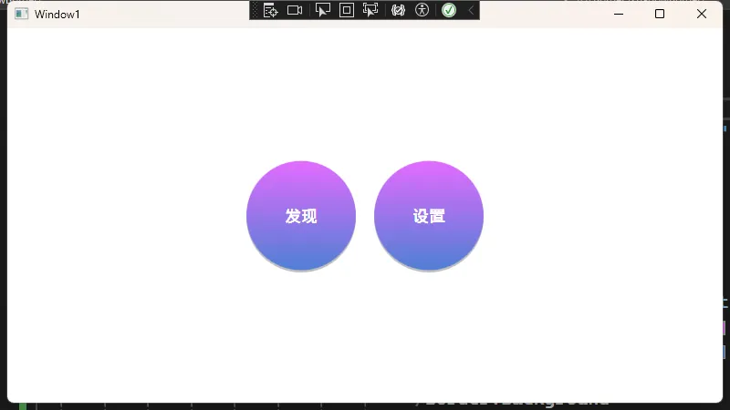
圆形按钮
XML<Window x:Class="AppButton.Window1"
        xmlns="http://schemas.microsoft.com/winfx/2006/xaml/presentation"
        xmlns:x="http://schemas.microsoft.com/winfx/2006/xaml"
        xmlns:d="http://schemas.microsoft.com/expression/blend/2008"
        xmlns:mc="http://schemas.openxmlformats.org/markup-compatibility/2006"
        xmlns:local="clr-namespace:AppButton"
        mc:Ignorable="d"
        Title="Window1" Height="450" Width="800">
    <Window.Resources>
        <Style x:Key="ModernCircularButtonStyle" TargetType="Button">
            <Setter Property="Template">
                <Setter.Value>
                    <ControlTemplate TargetType="Button">
                        <Grid>
                            <Border x:Name="shadowBorder"
                                    Width="120"
                                    Height="120"
                                    CornerRadius="60"
                                    Background="#40000000"
                                    Margin="0,5,0,0"
                                    RenderTransform="{x:Null}"/>

                            <Border x:Name="mainBorder"
                                    Width="120"
                                    Height="120"
                                    CornerRadius="60">
                                <Border.Background>
                                    <LinearGradientBrush StartPoint="0,0" EndPoint="0,1">
                                        <GradientStop Color="#FFE36BFF" Offset="0"/>
                                        <GradientStop Color="#FF4E7FD4" Offset="1"/>
                                    </LinearGradientBrush>
                                </Border.Background>

                                <Grid>
                                    <ContentPresenter
                                        x:Name="contentPresenter"
                                        HorizontalAlignment="Center"
                                        VerticalAlignment="Center"
                                        Margin="{TemplateBinding Padding}"/>
                                </Grid>
                            </Border>
                        </Grid>

                        <ControlTemplate.Triggers>
                            <Trigger Property="IsMouseOver" Value="True">
                                <Setter TargetName="mainBorder" Property="RenderTransform">
                                    <Setter.Value>
                                        <ScaleTransform ScaleX="1.05" ScaleY="1.05" CenterX="60" CenterY="60"/>
                                    </Setter.Value>
                                </Setter>
                                <Setter TargetName="shadowBorder" Property="RenderTransform">
                                    <Setter.Value>
                                        <ScaleTransform ScaleX="1.05" ScaleY="1.05" CenterX="60" CenterY="60"/>
                                    </Setter.Value>
                                </Setter>
                            </Trigger>

                            <Trigger Property="IsPressed" Value="True">
                                <Setter TargetName="mainBorder" Property="Background">
                                    <Setter.Value>
                                        <LinearGradientBrush StartPoint="0,0" EndPoint="0,1">
                                            <GradientStop Color="#FF4E7FD4" Offset="0"/>
                                            <GradientStop Color="#FF2C5CAA" Offset="1"/>
                                        </LinearGradientBrush>
                                    </Setter.Value>
                                </Setter>
                                <Setter TargetName="mainBorder" Property="RenderTransform">
                                    <Setter.Value>
                                        <ScaleTransform ScaleX="0.95" ScaleY="0.95" CenterX="60" CenterY="60"/>
                                    </Setter.Value>
                                </Setter>
                                <Setter TargetName="shadowBorder" Property="RenderTransform">
                                    <Setter.Value>
                                        <ScaleTransform ScaleX="0.95" ScaleY="0.95" CenterX="60" CenterY="60"/>
                                    </Setter.Value>
                                </Setter>
                            </Trigger>
                        </ControlTemplate.Triggers>
                    </ControlTemplate>
                </Setter.Value>
            </Setter>

            <!-- 默认样式 -->
            <Setter Property="Foreground" Value="White"/>
            <Setter Property="FontSize" Value="18"/>
            <Setter Property="FontWeight" Value="SemiBold"/>
            <Setter Property="Padding" Value="15"/>
        </Style>
    </Window.Resources>

    <Grid>
        <StackPanel HorizontalAlignment="Center"
                    VerticalAlignment="Center"
                    Orientation="Horizontal">
            <Button Style="{StaticResource ModernCircularButtonStyle}"
                    Content="发现"
                    Margin="10"
                    Click="Button_Click"/>

            <Button Style="{StaticResource ModernCircularButtonStyle}"
                    Content="设置"
                    Margin="10"
                    Click="Button_Click"/>
        </StackPanel>
    </Grid>
</Window>
小结
WinForm 中开发者通常将关注点放在事件与逻辑层面,而在 WPF 中,更多精力会转移到如何充分利用 XAML 的强大布局和样式系统,从而实现更灵活与更优雅的界面。
以上就是从 WinForm 到 WPF 关于 Button 及其样式的一个大致介绍,从简单的内容设置到使用样式(Style)与模板(Template)自定义外观。尽管迁移过程中要了解新的机制与命名方式,但只要掌握了 WPF 的布局、依赖属性与数据绑定,再配合样式系统,便能更顺畅地享受 WPF 的丰富功能。
本文作者:技术老小子
本文链接:
版权声明:本博客所有文章除特别声明外,均采用 BY-NC-SA 许可协议。转载请注明出处!