
Press Ctrl+ and K to search
目录
还在为WPF应用中那个"丑陋"的默认PasswordBox而烦恼吗?据统计,超过70%的C#开发者在项目中都遇到过这个问题:系统默认的密码输入框不仅外观单调,还与精心设计的UI界面格格不入。更要命的是,当产品经理指着设计稿说"能不能让密码框好看点"时,很多开发者只能望而兴叹。
今天这篇文章将彻底解决你的痛点!我将分享5个实战级的PasswordBox样式定制方案,从基础美化到高级动效,让你的密码框不仅颜值在线,更能提升用户体验。每个方案都提供完整代码,拿来即用!
💡 主体内容
🔍 问题分析:为什么PasswordBox这么难看?
WPF默认的PasswordBox存在几个致命问题:
- 视觉单调:白底黑框,毫无设计感
- 缺乏反馈:鼠标悬停、焦点状态没有明显变化
- 适配性差:在深色主题下显得突兀
- 扩展困难:想要添加图标、占位符等元素非常复杂
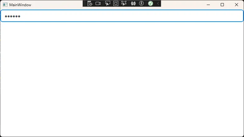
🛠️ 解决方案1:现代简约风格密码框
这是最实用的基础方案,适合90%的商务应用场景。
XML<Window x:Class="AppPasswordBox.MainWindow"
        xmlns="http://schemas.microsoft.com/winfx/2006/xaml/presentation"
        xmlns:x="http://schemas.microsoft.com/winfx/2006/xaml"
        xmlns:d="http://schemas.microsoft.com/expression/blend/2008"
        xmlns:mc="http://schemas.openxmlformats.org/markup-compatibility/2006"
        xmlns:local="clr-namespace:AppPasswordBox"
        mc:Ignorable="d"
        Title="MainWindow" Height="450" Width="800">
    <Window.Resources>
        <Style x:Key="PasswordBoxStyle" TargetType="PasswordBox">
            <!-- 基础属性设置 -->
            <Setter Property="Background" Value="AliceBlue"/>
            <Setter Property="BorderBrush" Value="#E9ECEF"/>
            <Setter Property="BorderThickness" Value="1"/>
            <Setter Property="Foreground" Value="#495057"/>
            <Setter Property="FontSize" Value="14"/>
            <Setter Property="Padding" Value="5,0,0,0"/>
            <Setter Property="Height" Value="40"/>

            <!-- 自定义模板 -->
            <Setter Property="Template">
                <Setter.Value>
                    <ControlTemplate TargetType="PasswordBox">
                        <Border Background="{TemplateBinding Background}"
                        BorderBrush="{TemplateBinding BorderBrush}"
                        BorderThickness="{TemplateBinding BorderThickness}"
                        CornerRadius="6">
                            <!-- 滚动查看器,密码框的核心容器 -->
                            <ScrollViewer x:Name="PART_ContentHost"
                                  Margin="{TemplateBinding Padding}"
                                  VerticalAlignment="Center"/>
                        </Border>

                        <!-- 触发器:鼠标悬停效果 -->
                        <ControlTemplate.Triggers>
                            <Trigger Property="IsMouseOver" Value="True">
                                <Setter Property="BorderBrush" Value="#007BFF"/>
                                <Setter Property="Background" Value="#FFFFFF"/>
                            </Trigger>
                            <!-- 焦点状态 -->
                            <Trigger Property="IsFocused" Value="True">
                                <Setter Property="BorderBrush" Value="#007BFF"/>
                                <Setter Property="Background" Value="#FFFFFF"/>
                                <Setter Property="BorderThickness" Value="2"/>
                            </Trigger>
                        </ControlTemplate.Triggers>
                    </ControlTemplate>
                </Setter.Value>
            </Setter>
        </Style>
    </Window.Resources>
    <StackPanel>
        <PasswordBox Style="{StaticResource PasswordBoxStyle}"/>
    </StackPanel>
</Window>
⚠️ 坑点提醒: PART_ContentHost是必须的命名约定,不能随意更改,否则密码框将无法正常工作!
🎨 解决方案2:带图标的增强型密码框
为了更好的用户体验,我们经常需要在密码框前添加锁图标。
XML<Window x:Class="AppPasswordBox.Window1"
        xmlns="http://schemas.microsoft.com/winfx/2006/xaml/presentation"
        xmlns:x="http://schemas.microsoft.com/winfx/2006/xaml"
        xmlns:d="http://schemas.microsoft.com/expression/blend/2008"
        xmlns:mc="http://schemas.openxmlformats.org/markup-compatibility/2006"
        xmlns:local="clr-namespace:AppPasswordBox"
        mc:Ignorable="d"
        Title="Window1" Height="450" Width="800">
    <Window.Resources>
        <Style x:Key="IconPasswordBoxStyle" TargetType="PasswordBox">
            <Setter Property="Background" Value="Transparent"/>
            <Setter Property="BorderBrush" Value="#DDDDDD"/>
            <Setter Property="Foreground" Value="#333333"/>
            <Setter Property="FontSize" Value="14"/>
            <Setter Property="Height" Value="45"/>

            <Setter Property="Template">
                <Setter.Value>
                    <ControlTemplate TargetType="PasswordBox">
                        <!-- 外层容器,包含图标和输入框 -->
                        <Border Background="{TemplateBinding Background}"
                         BorderBrush="{TemplateBinding BorderBrush}"
                         BorderThickness="{TemplateBinding BorderThickness}"
                         CornerRadius="6">
                            <Grid>
                                <Grid.ColumnDefinitions>
                                    <ColumnDefinition Width="Auto"/>
                                    <ColumnDefinition Width="*"/>
                                </Grid.ColumnDefinitions>

                                <!-- 锁图标 -->
                                <TextBlock Grid.Column="0"
                                   Text="🔒"
                                   FontSize="16"
                                   VerticalAlignment="Center"
                                   Margin="12,0,8,0"
                                   Foreground="#666666"/>

                                <!-- 密码输入区域 -->
                                <ScrollViewer x:Name="PART_ContentHost"
                                      Grid.Column="1"
                                      Margin="0,0,12,0"
                                      VerticalAlignment="Center"/>
                            </Grid>
                        </Border>

                        <!-- 状态触发器 -->
                        <ControlTemplate.Triggers>
                            <Trigger Property="IsMouseOver" Value="True">
                                <Setter TargetName="PART_ContentHost" Property="Background" Value="#FFFFFF"/>
                            </Trigger>
                            <Trigger Property="IsFocused" Value="True">
                                <Setter Property="Background" Value="#FFFFFF"/>
                                <Setter Property="BorderBrush" Value="#4CAF50"/>
                                <Setter Property="BorderThickness" Value="2"/>
                            </Trigger>
                        </ControlTemplate.Triggers>
                    </ControlTemplate>
                </Setter.Value>
            </Setter>
        </Style>
    </Window.Resources>
    <StackPanel>
        <PasswordBox Style="{StaticResource IconPasswordBoxStyle}"></PasswordBox>
    </StackPanel>
</Window>
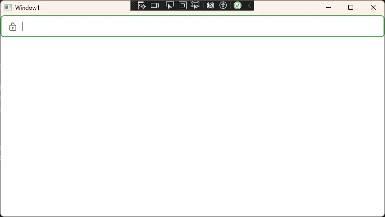
实际应用场景: 登录页面、注册表单等需要清晰视觉指引的场景。
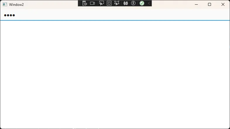
✨ 解决方案3:动画效果密码框
现代应用都讲究微交互,一个有动画的密码框能显著提升用户体验。
XML<Window x:Class="AppPasswordBox.Window2"
        xmlns="http://schemas.microsoft.com/winfx/2006/xaml/presentation"
        xmlns:x="http://schemas.microsoft.com/winfx/2006/xaml"
        xmlns:d="http://schemas.microsoft.com/expression/blend/2008"
        xmlns:mc="http://schemas.openxmlformats.org/markup-compatibility/2006"
        xmlns:local="clr-namespace:AppPasswordBox"
        mc:Ignorable="d"
        Title="Window2" Height="450" Width="800">
    <Window.Resources>
        <Style x:Key="AnimatedPasswordBoxStyle" TargetType="PasswordBox">
            <Setter Property="Background" Value="#FAFAFA"/>
            <Setter Property="BorderBrush" Value="#E0E0E0"/>
            <Setter Property="BorderThickness" Value="0,0,0,2"/>
            <Setter Property="Foreground" Value="#212121"/>
            <Setter Property="FontSize" Value="16"/>
            <Setter Property="Padding" Value="5,0,0,0"/>
            <Setter Property="Height" Value="40"/>

            <Setter Property="Template">
                <Setter.Value>
                    <ControlTemplate TargetType="PasswordBox">
                        <Grid>
                            <Border x:Name="BorderElement"
                            Background="{TemplateBinding Background}"
                            BorderBrush="{TemplateBinding BorderBrush}"
                            BorderThickness="{TemplateBinding BorderThickness}">
                                <ScrollViewer x:Name="PART_ContentHost"
                                      Margin="{TemplateBinding Padding}"
                                      VerticalAlignment="Center"/>
                            </Border>

                            <!-- 动画底线 -->
                            <Rectangle x:Name="FocusLine"
                               Height="2"
                               VerticalAlignment="Bottom"
                               Fill="#2196F3"
                               RenderTransformOrigin="0.5,0.5">
                                <Rectangle.RenderTransform>
                                    <ScaleTransform ScaleX="0" />
                                </Rectangle.RenderTransform>
                            </Rectangle>
                        </Grid>

                        <ControlTemplate.Triggers>
                            <!-- 焦点获得动画 -->
                            <Trigger Property="IsFocused" Value="True">
                                <Trigger.EnterActions>
                                    <BeginStoryboard>
                                        <Storyboard>
                                            <DoubleAnimation Storyboard.TargetName="FocusLine"
                                                     Storyboard.TargetProperty="(Rectangle.RenderTransform).(ScaleTransform.ScaleX)"
                                                     To="1"
                                                     Duration="0:0:0.3">
                                                <DoubleAnimation.EasingFunction>
                                                    <CubicEase EasingMode="EaseOut"/>
                                                </DoubleAnimation.EasingFunction>
                                            </DoubleAnimation>
                                        </Storyboard>
                                    </BeginStoryboard>
                                </Trigger.EnterActions>

                                <!-- 焦点失去动画 -->
                                <Trigger.ExitActions>
                                    <BeginStoryboard>
                                        <Storyboard>
                                            <DoubleAnimation Storyboard.TargetName="FocusLine"
                                                     Storyboard.TargetProperty="(Rectangle.RenderTransform).(ScaleTransform.ScaleX)"
                                                     To="0"
                                                     Duration="0:0:0.2"/>
                                        </Storyboard>
                                    </BeginStoryboard>
                                </Trigger.ExitActions>
                            </Trigger>
                        </ControlTemplate.Triggers>
                    </ControlTemplate>
                </Setter.Value>
            </Setter>
        </Style>
    </Window.Resources>
    <StackPanel>
        <PasswordBox Style="{StaticResource AnimatedPasswordBoxStyle}"></PasswordBox>
    </StackPanel>
</Window>
💡 技术要点:
- 使用
ScaleTransform实现底线伸缩效果 EasingFunction让动画更自然RenderTransformOrigin="0.5,0.5"确保从中心缩放
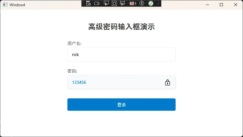
🎯 解决方案4:终极自定义 - 带显示/隐藏功能
这是最高级的方案,让用户可以切换密码的显示状态。
C#using System;
using System.Globalization;
using System.Windows;
using System.Windows.Data;

namespace AdvancedPasswordBoxDemo.Converters
{
    // Boolean到Visibility的转换器
    public class BoolToVisibilityConverter : IValueConverter
    {
        public object Convert(object value, Type targetType, object parameter, CultureInfo culture)
        {
            if (value == null) return Visibility.Collapsed;

            bool boolValue = (bool)value;
            string param = parameter as string;

            if (param == "Invert")
            {
                boolValue = !boolValue;
            }

            return boolValue ? Visibility.Visible : Visibility.Collapsed;
        }

        public object ConvertBack(object value, Type targetType, object parameter, CultureInfo culture)
        {
            Visibility visibility = (Visibility)value;
            bool result = visibility == Visibility.Visible;

            string param = parameter as string;
            if (param == "Invert")
            {
                result = !result;
            }

            return result;
        }
    }

    // 可见性图标转换器
    public class VisibilityIconConverter : IValueConverter
    {
        public object Convert(object value, Type targetType, object parameter, CultureInfo culture)
        {
            if (value == null) return "👁";

            bool isVisible = (bool)value;
            // 使用Unicode眼睛图标
            return isVisible ? "🔒" : "👁"; // 显示时用锁,隐藏时用眼睛
        }

        public object ConvertBack(object value, Type targetType, object parameter, CultureInfo culture)
        {
            throw new NotImplementedException();
        }
    }
}
XML<UserControl x:Class="AdvancedPasswordBoxDemo.Controls.AdvancedPasswordBox"
             xmlns="http://schemas.microsoft.com/winfx/2006/xaml/presentation"
             xmlns:x="http://schemas.microsoft.com/winfx/2006/xaml"
             xmlns:converters="clr-namespace:AdvancedPasswordBoxDemo.Converters">

    <UserControl.Resources>
        <!-- 转换器资源 -->
        <converters:BoolToVisibilityConverter x:Key="BoolToVisibilityConverter"/>
        <converters:VisibilityIconConverter x:Key="VisibilityIconConverter"/>

        <Style x:Key="ModernTextBoxStyle" TargetType="TextBox">
            <Setter Property="Background" Value="Transparent"/>
            <Setter Property="BorderThickness" Value="0"/>
            <Setter Property="Padding" Value="12,0"/>
            <Setter Property="FontSize" Value="14"/>
            <Setter Property="VerticalAlignment" Value="Center"/>
            <Setter Property="Foreground" Value="#333333"/>
            <Style.Triggers>
                <Trigger Property="IsFocused" Value="True">
                    <Setter Property="Foreground" Value="#007ACC"/>
                </Trigger>
            </Style.Triggers>
        </Style>

        <Style x:Key="ModernPasswordBoxStyle" TargetType="PasswordBox">
            <Setter Property="Background" Value="Transparent"/>
            <Setter Property="BorderThickness" Value="0"/>
            <Setter Property="Padding" Value="12,0"/>
            <Setter Property="FontSize" Value="14"/>
            <Setter Property="VerticalAlignment" Value="Center"/>
            <Setter Property="Foreground" Value="#333333"/>
            <Style.Triggers>
                <Trigger Property="IsFocused" Value="True">
                    <Setter Property="Foreground" Value="#007ACC"/>
                </Trigger>
            </Style.Triggers>
        </Style>

        <!-- 切换按钮样式 -->
        <Style x:Key="ToggleButtonStyle" TargetType="Button">
            <Setter Property="Background" Value="Transparent"/>
            <Setter Property="BorderThickness" Value="0"/>
            <Setter Property="Cursor" Value="Hand"/>
            <Setter Property="Width" Value="40"/>
            <Setter Property="Height" Value="40"/>
            <Setter Property="Margin" Value="5,0"/>
            <Setter Property="Template">
                <Setter.Value>
                    <ControlTemplate TargetType="Button">
                        <Border Background="{TemplateBinding Background}"
                                CornerRadius="4">
                            <ContentPresenter HorizontalAlignment="Center"
                                              VerticalAlignment="Center"/>
                        </Border>
                        <ControlTemplate.Triggers>
                            <Trigger Property="IsMouseOver" Value="True">
                                <Setter Property="Background" Value="#F0F0F0"/>
                            </Trigger>
                            <Trigger Property="IsPressed" Value="True">
                                <Setter Property="Background" Value="#E0E0E0"/>
                            </Trigger>
                        </ControlTemplate.Triggers>
                    </ControlTemplate>
                </Setter.Value>
            </Setter>
        </Style>
    </UserControl.Resources>

    <Grid Height="45">
        <Border Background="#F8F9FA"
                BorderBrush="#E9ECEF"
                BorderThickness="1"
                CornerRadius="6">
            <Border.Effect>
                <DropShadowEffect Color="Black"
                                  Opacity="0.1"
                                  ShadowDepth="1"
                                  BlurRadius="3"/>
            </Border.Effect>

            <Grid>
                <Grid.ColumnDefinitions>
                    <ColumnDefinition Width="*"/>
                    <ColumnDefinition Width="Auto"/>
                </Grid.ColumnDefinitions>

                <!-- 密码框 -->
                <PasswordBox x:Name="PasswordBox"
                             Grid.Column="0"
                             Style="{StaticResource ModernPasswordBoxStyle}"
                             Visibility="{Binding Path=IsPasswordVisible,
                                         RelativeSource={RelativeSource AncestorType=UserControl},
                                         Converter={StaticResource BoolToVisibilityConverter},
                                         ConverterParameter=Invert}"
                             PasswordChanged="PasswordBox_PasswordChanged"/>

                <!-- 文本框(显示密码时使用) -->
                <TextBox x:Name="TextBox"
                         Grid.Column="0"
                         Style="{StaticResource ModernTextBoxStyle}"
                         Visibility="{Binding Path=IsPasswordVisible,
                                     RelativeSource={RelativeSource AncestorType=UserControl},
                                     Converter={StaticResource BoolToVisibilityConverter}}"
                         TextChanged="TextBox_TextChanged"/>

                <!-- 切换按钮 -->
                <Button Grid.Column="1"
                        Style="{StaticResource ToggleButtonStyle}"
                        Click="TogglePasswordVisibility">
                    <Button.ToolTip>
                        <TextBlock>
                            <TextBlock.Text>
                                <Binding Path="IsPasswordVisible"
                                         RelativeSource="{RelativeSource AncestorType=UserControl}">
                                    <Binding.Converter>
                                        <converters:VisibilityIconConverter/>
                                    </Binding.Converter>
                                </Binding>
                            </TextBlock.Text>
                        </TextBlock>
                    </Button.ToolTip>
                    <TextBlock FontSize="18">
                        <TextBlock.Text>
                            <Binding Path="IsPasswordVisible"
                                     RelativeSource="{RelativeSource AncestorType=UserControl}">
                                <Binding.Converter>
                                    <converters:VisibilityIconConverter/>
                                </Binding.Converter>
                            </Binding>
                        </TextBlock.Text>
                    </TextBlock>
                </Button>
            </Grid>
        </Border>
    </Grid>
</UserControl>
C#using System.ComponentModel;
using System.Runtime.CompilerServices;
using System.Windows;
using System.Windows.Controls;

namespace AdvancedPasswordBoxDemo.Controls
{
    public partial class AdvancedPasswordBox : UserControl, INotifyPropertyChanged
    {
        private bool _isPasswordVisible = false;
        private bool _isUpdating = false;

        public static readonly DependencyProperty PasswordProperty =
            DependencyProperty.Register("Password", typeof(string), typeof(AdvancedPasswordBox),
                new FrameworkPropertyMetadata(string.Empty, FrameworkPropertyMetadataOptions.BindsTwoWayByDefault,
                    OnPasswordChanged));

        public string Password
        {
            get { return (string)GetValue(PasswordProperty); }
            set { SetValue(PasswordProperty, value); }
        }

        private static void OnPasswordChanged(DependencyObject d, DependencyPropertyChangedEventArgs e)
        {
            var control = d as AdvancedPasswordBox;
            control?.UpdatePassword((string)e.NewValue);
        }

        public bool IsPasswordVisible
        {
            get => _isPasswordVisible;
            set
            {
                if (_isPasswordVisible != value)
                {
                    _isPasswordVisible = value;
                    OnPropertyChanged();
                    SyncPasswordText();
                }
            }
        }

        public AdvancedPasswordBox()
        {
            InitializeComponent();
        }

        private void TogglePasswordVisibility(object sender, RoutedEventArgs e)
        {
            IsPasswordVisible = !IsPasswordVisible;

            // 确保焦点正确切换
            if (IsPasswordVisible)
            {
                TextBox.Focus();
                TextBox.CaretIndex = TextBox.Text.Length;
            }
            else
            {
                PasswordBox.Focus();
            }
        }

        private void SyncPasswordText()
        {
            if (_isUpdating) return;

            _isUpdating = true;

            if (IsPasswordVisible)
            {
                TextBox.Text = PasswordBox.Password;
            }
            else
            {
                PasswordBox.Password = TextBox.Text;
            }

            _isUpdating = false;
        }

        private void UpdatePassword(string newPassword)
        {
            if (_isUpdating) return;

            _isUpdating = true;

            if (IsPasswordVisible)
            {
                if (TextBox.Text != newPassword)
                    TextBox.Text = newPassword;
            }
            else
            {
                if (PasswordBox.Password != newPassword)
                    PasswordBox.Password = newPassword;
            }

            _isUpdating = false;
        }

        private void PasswordBox_PasswordChanged(object sender, RoutedEventArgs e)
        {
            if (!_isUpdating)
            {
                Password = PasswordBox.Password;
            }
        }

        private void TextBox_TextChanged(object sender, TextChangedEventArgs e)
        {
            if (!_isUpdating)
            {
                Password = TextBox.Text;
            }
        }

        public event PropertyChangedEventHandler PropertyChanged;

        protected virtual void OnPropertyChanged([CallerMemberName] string propertyName = null)
        {
            PropertyChanged?.Invoke(this, new PropertyChangedEventArgs(propertyName));
        }
    }
}
使用用户控件代码:
XML<Window x:Class="AdvancedPasswordBoxDemo.Window4"
        xmlns="http://schemas.microsoft.com/winfx/2006/xaml/presentation"
        xmlns:x="http://schemas.microsoft.com/winfx/2006/xaml"
        xmlns:d="http://schemas.microsoft.com/expression/blend/2008"
        xmlns:mc="http://schemas.openxmlformats.org/markup-compatibility/2006"
        xmlns:local="clr-namespace:AppPasswordBox"
        mc:Ignorable="d"
        xmlns:controls="clr-namespace:AdvancedPasswordBoxDemo.Controls"
        Title="Window4" Height="450" Width="800">
    <Window.Resources>
        <Style x:Key="ModernButtonStyle" TargetType="Button">
            <Setter Property="Background" Value="#007ACC"/>
            <Setter Property="Foreground" Value="White"/>
            <Setter Property="BorderThickness" Value="0"/>
            <Setter Property="Padding" Value="20,10"/>
            <Setter Property="FontSize" Value="14"/>
            <Setter Property="Cursor" Value="Hand"/>
            <Setter Property="Template">
                <Setter.Value>
                    <ControlTemplate TargetType="Button">
                        <Border Background="{TemplateBinding Background}"
                                CornerRadius="4">
                            <ContentPresenter HorizontalAlignment="Center"
                                              VerticalAlignment="Center"/>
                        </Border>
                        <ControlTemplate.Triggers>
                            <Trigger Property="IsMouseOver" Value="True">
                                <Setter Property="Background" Value="#005A9E"/>
                            </Trigger>
                            <Trigger Property="IsPressed" Value="True">
                                <Setter Property="Background" Value="#004578"/>
                            </Trigger>
                        </ControlTemplate.Triggers>
                    </ControlTemplate>
                </Setter.Value>
            </Setter>
        </Style>
    </Window.Resources>

    <Grid Background="#FFFFFF">
        <StackPanel HorizontalAlignment="Center"
                    VerticalAlignment="Center"
                    Width="350">

            <TextBlock Text="高级密码输入框演示"
                       FontSize="24"
                       FontWeight="Bold"
                       HorizontalAlignment="Center"
                       Margin="0,0,0,30"
                       Foreground="#333333"/>

            <TextBlock Text="用户名:"
                       FontSize="14"
                       Margin="0,0,0,5"
                       Foreground="#666666"/>
            <TextBox Name="UsernameTextBox"
                     Height="45"
                     Padding="12,10"
                     FontSize="14"
                     BorderBrush="#E9ECEF"
                     BorderThickness="1"
                     Margin="0,0,0,20"/>

            <TextBlock Text="密码:"
                       FontSize="14"
                       Margin="0,0,0,5"
                       Foreground="#666666"/>
            <controls:AdvancedPasswordBox x:Name="PasswordControl"
                                          Password="{Binding UserPassword, Mode=TwoWay}"
                                          Margin="0,0,0,20"/>

            <Button Content="登录"
                    Style="{StaticResource ModernButtonStyle}"
                    Click="LoginButton_Click"
                    Height="40"
                    Margin="0,10"/>

            <TextBlock Name="StatusTextBlock"
                       FontSize="12"
                       HorizontalAlignment="Center"
                       Margin="0,20,0,0"
                       Foreground="#666666"/>
        </StackPanel>
    </Grid>
</Window>
C#using System;
using System.Collections.Generic;
using System.ComponentModel;
using System.Linq;
using System.Runtime.CompilerServices;
using System.Text;
using System.Threading.Tasks;
using System.Windows;
using System.Windows.Controls;
using System.Windows.Data;
using System.Windows.Documents;
using System.Windows.Input;
using System.Windows.Media;
using System.Windows.Media.Imaging;
using System.Windows.Shapes;

namespace AdvancedPasswordBoxDemo
{
    /// <summary>
    /// Interaction logic for Window4.xaml
    /// </summary>
    public partial class Window4 :  Window, INotifyPropertyChanged
    {
        private string _userPassword = "";

        public string UserPassword
        {
            get => _userPassword;
            set
            {
                _userPassword = value;
                OnPropertyChanged();
            }
        }
        public Window4()
        {
            InitializeComponent();
            DataContext = this;
        }

        private void LoginButton_Click(object sender, RoutedEventArgs e)
        {
            string username = UsernameTextBox.Text;
            string password = UserPassword;

            if (string.IsNullOrWhiteSpace(username) || string.IsNullOrWhiteSpace(password))
            {
                StatusTextBlock.Text = "请输入用户名和密码";
                StatusTextBlock.Foreground = System.Windows.Media.Brushes.Red;
                return;
            }

            // 简单的演示验证
            if (username == "admin" && password == "123456")
            {
                StatusTextBlock.Text = "登录成功!";
                StatusTextBlock.Foreground = System.Windows.Media.Brushes.Green;
            }
            else
            {
                StatusTextBlock.Text = "用户名或密码错误";
                StatusTextBlock.Foreground = System.Windows.Media.Brushes.Red;
            }
        }

        public event PropertyChangedEventHandler PropertyChanged;

        protected virtual void OnPropertyChanged([CallerMemberName] string propertyName = null)
        {
            PropertyChanged?.Invoke(this, new PropertyChangedEventArgs(propertyName));
        }
    }
}
🔥 实战技巧总结
💎 收藏级代码模板
XML<!-- 万能密码框样式基础模板 -->
<Style x:Key="BasePasswordBoxStyle" TargetType="PasswordBox">
    <!-- 基础属性 -->
    <Setter Property="FontFamily" Value="Segoe UI"/>
    <Setter Property="FontSize" Value="14"/>
    <Setter Property="Padding" Value="12,8"/>
    <Setter Property="Height" Value="40"/>

    <!-- 颜色方案 -->
    <Setter Property="Background" Value="{DynamicResource BackgroundBrush}"/>
    <Setter Property="BorderBrush" Value="{DynamicResource BorderBrush}"/>
    <Setter Property="Foreground" Value="{DynamicResource TextBrush}"/>

    <!-- 可复用模板结构 -->
    <Setter Property="Template">
        <Setter.Value>
            <ControlTemplate TargetType="PasswordBox">
                <Border Background="{TemplateBinding Background}"
                        BorderBrush="{TemplateBinding BorderBrush}"
                        BorderThickness="{TemplateBinding BorderThickness}"
                        CornerRadius="4">
                    <ScrollViewer x:Name="PART_ContentHost"
                                  Margin="{TemplateBinding Padding}"
                                  VerticalAlignment="Center"/>
                </Border>
            </ControlTemplate>
        </Setter.Value>
    </Setter>
</Style>
⚡ 性能优化要点
- 使用DynamicResource而非StaticResource:当需要支持主题切换时
- 避免复杂动画:密码输入时性能优先
- 合理使用模板缓存:大量密码框时考虑性能影响
🎨 设计原则
- 一致性:与整体应用风格保持统一
- 可访问性:确保对比度符合WCAG标准
- 响应性:不同尺寸屏幕下都能正常显示
🎯 结尾呼应
通过今天的分享,我们彻底解决了PasswordBox样式定制的难题。核心要点回顾:
- 掌握基础模板结构:
PART_ContentHost是关键,所有自定义都围绕它展开 - 善用触发器机制:通过
IsMouseOver、IsFocused等状态实现丰富交互效果 - 主题适配思维:使用
DynamicResource和代码动态切换,让应用更专业
这些方案在我的实际项目中都经过验证,从简单的企业管理系统到复杂的金融应用,都能完美适配。记住,好的UI不仅仅是好看,更要好用!
💭 互动时间:
- 你在项目中还遇到过哪些PasswordBox的坑?
- 你最喜欢文中的哪种样式方案?
觉得这篇文章对你有帮助吗?请转发给更多C#同行,让大家一起告别丑陋的默认控件!下期我们聊聊DataGrid的高级定制技巧,记得关注哦~ 🚀
关注我,获取更多WPF实战干货!每周三篇技术文章,助你成为C#高手!
本文作者:技术老小子
本文链接:
版权声明:本博客所有文章除特别声明外,均采用 BY-NC-SA 许可协议。转载请注明出处!
目录