目录
摘要
统计图表是一种以图形的形式来表达数据信息的方式,其中包括柱形图、柱状统计图、条图、条状图和棒形图等多种类型。这些图表能够以简单明了的方式,帮助人们更好地理解和比较不同数据集之间的差异。柱形图是一种常用的图表类型,它通过长方形的长度来表示不同数据之间的大小关系。柱状统计图则在柱形图的基础上,对每个柱子进行标注,使得人们更加清晰地了解每个柱子所代表的具体数据。
除了柱形图和柱状统计图,条图和条状图也是常见的图表类型。条图是一种垂直或水平的柱形图,它通过横轴和纵轴来表示数据之间的比较关系。而条状图则是一种通过横向或纵向的条形来表示数据大小的图表类型。与柱形图和柱状统计图相比,条图和条状图更加适用于数据之间的相对大小比较,能够清晰地呈现数据之间的差异。
另外,棒形图也是一种常用的图表类型,它通过将长条划分为多个小条来表示不同数据之间的差异。与其他图表类型不同的是,棒形图可以同时表示数量和比例之间的关系,因此在表达数据大小和数量之间的关系时非常有用。
在 C# 中,使用 Chart 控件绘制柱状图是非常常见的操作。柱状图通常用于比较不同类别之间的数量或值,因此可以使用柱状图来展示数据。C# 中的 Chart 控件提供了多种图表类型,包括折线图、散点图、饼图和柱状图等。
在柱状图中,数据可以以行的形式呈现,每行代表一个类别,每个格子代表该类别的数据。C# 中的 Chart 控件提供了一个 Column 类型,用于创建柱状图。Column 类型是一个包含数据点的数组,每个数据点包含类别名称和数据值。
正文
三步流程
- 添加ChartAreas
- 添加Series
- 绑定数据
C#Chart chart = new Chart();
private void FrmMain_Load(object sender, EventArgs e)
{
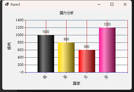
string[] x = new string[] { "魏", "蜀", "吴", "蛮" };
double[] y = new double[] { 1000, 800, 600, 1200 };
chart.Titles.Add("国力分析");
chart.Titles[0].ForeColor = Color.Black;
chart.Titles[0].Alignment = ContentAlignment.TopCenter;
chart.ChartAreas.Add(new ChartArea());
//控件背景
chart.BackColor = ColorTranslator.FromHtml("#f1f1f1");
//图表区背景
chart.ChartAreas[0].BackColor = Color.Transparent;
chart.ChartAreas[0].BorderColor = Color.Transparent;
//X轴标签间距
chart.ChartAreas[0].AxisX.Interval = 1;
chart.ChartAreas[0].AxisX.LabelStyle.IsStaggered = true;
chart.ChartAreas[0].AxisX.LabelStyle.Angle = -45; //下方标签显示的角度
chart.ChartAreas[0].AxisX.TitleFont = new Font("宋体", 10f, FontStyle.Regular);
chart.ChartAreas[0].AxisX.TitleForeColor = Color.Black;
//X坐标轴颜色
chart.ChartAreas[0].AxisX.LineColor = Color.Blue;
chart.ChartAreas[0].AxisX.LabelStyle.ForeColor = Color.Black;
chart.ChartAreas[0].AxisX.LabelStyle.Font = new Font("宋体", 10f, FontStyle.Regular);
//X坐标轴标题
chart.ChartAreas[0].AxisX.Title = "国家";
chart.ChartAreas[0].AxisX.TitleFont = new Font("宋体", 10f, FontStyle.Regular);
chart.ChartAreas[0].AxisX.TitleForeColor = Color.Black;
chart.ChartAreas[0].AxisX.TextOrientation = TextOrientation.Horizontal;
chart.ChartAreas[0].AxisX.ToolTip = "银两";
//X轴网络线条
chart.ChartAreas[0].AxisX.MajorGrid.Enabled = true;
chart.ChartAreas[0].AxisX.MajorGrid.LineColor = Color.Red;
//Y坐标轴颜色
chart.ChartAreas[0].AxisY.LineColor = Color.Brown;
chart.ChartAreas[0].AxisY.LabelStyle.ForeColor = Color.Black;
chart.ChartAreas[0].AxisY.LabelStyle.Font = new Font("宋体", 10f, FontStyle.Regular);
//Y坐标轴标题
chart.ChartAreas[0].AxisY.Title = "银两";
chart.ChartAreas[0].AxisY.TitleFont = new Font("宋体", 10f, FontStyle.Regular);
chart.ChartAreas[0].AxisY.TitleForeColor = Color.Black;
chart.ChartAreas[0].AxisY.TextOrientation = TextOrientation.Rotated270;
chart.ChartAreas[0].AxisY.ToolTip = "银两";
//Y轴网格线条
chart.ChartAreas[0].AxisY.MajorGrid.Enabled = true;
chart.ChartAreas[0].AxisY.MajorGrid.LineColor = ColorTranslator.FromHtml("#2c4c6d");
chart.ChartAreas[0].AxisY2.LineColor = Color.Transparent;
chart.ChartAreas[0].BackGradientStyle = GradientStyle.TopBottom;
string now_time = System.DateTime.Now.ToString("d");
chart.Series.Add(new Series());
chart.Series[0].XValueType = ChartValueType.String; //设置X轴上的值类型
chart.Series[0].Label = "#VAL"; //设置显示X Y的值
chart.Series[0].LabelForeColor = Color.Black;
chart.Series[0].ToolTip = "#VALX:#VAL"; //鼠标移动到对应点显示数值
chart.Series[0].ChartType = SeriesChartType.Column; //图类型(折线)
chart.Series[0].Color = Color.Green;
chart.Series[0].IsValueShownAsLabel = true;
chart.Series[0].LabelForeColor = Color.Black;
chart.Series[0].CustomProperties = "DrawingStyle = Cylinder";
//绑定数据
chart.Series[0].Points.DataBindXY(x, y);
chart.Series[0].Points[0].Color = Color.Black;
chart.Series[0].Palette = ChartColorPalette.Fire;
chart.Dock= DockStyle.Fill;
this.Controls.Add(chart);
}
我们再添加一个Series
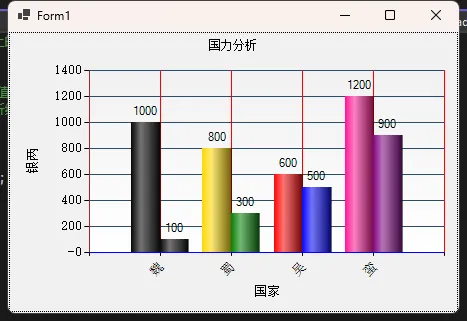
C#chart.Series.Add(new Series());
chart.Series[1].XValueType = ChartValueType.String;//设置X轴上的值类型
chart.Series[1].Label = "#VAL";//设置显示X Y的值
chart.Series[1].LabelForeColor = Color.Black;
chart.Series[1].ToolTip = "#VALX:#VAL";//鼠标移动到对应点显示数值
chart.Series[1].ChartType = SeriesChartType.Column;//图类型(折线)
chart.Series[1].Color = Color.Green;
chart.Series[1].IsValueShownAsLabel = true;
chart.Series[1].LabelForeColor = Color.Black;
chart.Series[1]["DrawingStyle"] = "Cylinder";

//绑定数据
chart.Series[1].Points.DataBindXY(x, z);
chart.Series[1].Points[0].Color = Color.Black;
chart.Series[1].Palette = ChartColorPalette.Bright;
本文作者:技术老小子
本文链接:
版权声明:本博客所有文章除特别声明外,均采用 BY-NC-SA 许可协议。转载请注明出处!
目录