目录
摘要
饼状图是一种常用的数据可视化工具,常用于统计学模型中,可以显示各个数据系列之间的关系和占比情况。饼状图有两种类型:2D和3D。其中,2D饼状图为圆形,是手绘饼状图最常用的一种类型,手绘时常用圆规作图。
在2D饼状图中,各个数据系列表示为数据点,在图表中绘制。每个数据点的位置表示该数据系列在总体中的占比。通过观察饼状图,我们可以清晰地看到各个数据系列之间的关系和占比情况。
在3D饼状图中,数据系列的表示形式发生了变化。数据系列表示为点云,并且点云之间存在交错的关系。这种类型的饼状图更加立体和直观,能够更好地展示数据之间的关系。
在实际应用中,饼状图被广泛应用于各种领域,如金融、医疗、科学等。例如,在金融领域,饼状图可以用于显示各种财务指标的占比情况;在医疗领域,饼状图可以用于显示不同病症的患病率;在科学领域,饼状图可以用于显示实验结果的各个方面的贡献。
饼状图是一种非常有用的数据可视化工具,能够清晰地展示数据之间的关系和占比情况,并被广泛应用于各个领域。
正文
C#Chart chart = new Chart();
private void FrmMain_Load(object sender, EventArgs e)
{
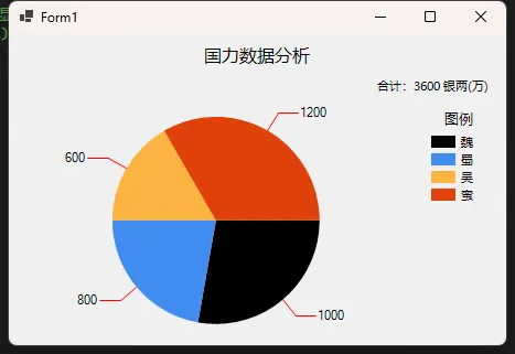
string[] x = new string[] { "魏", "蜀", "吴", "蛮" };
double[] y = new double[] { 1000, 800, 600, 1200 };
chart.Titles.Add("国力数据分析");
chart.Titles[0].ForeColor = Color.Black;
chart.Titles[0].Font = new Font("微软雅黑", 12f, FontStyle.Regular);
chart.Titles[0].Alignment = ContentAlignment.TopCenter;
chart.Titles.Add("合计:3600 银两(万)");
chart.Titles[1].ForeColor = Color.Black;
chart.Titles[1].Font = new Font("微软雅黑", 8f, FontStyle.Regular);
chart.Titles[1].Alignment = ContentAlignment.TopRight;
//控件背景
chart.BackColor = Color.Transparent;
chart.ChartAreas.Add(new ChartArea());
//图表区背景
chart.ChartAreas[0].BackColor = Color.Transparent;
chart.ChartAreas[0].BorderColor = Color.Transparent;
chart.ChartAreas[0].Area3DStyle.Enable3D = true;//启用3D显示
//图例样式
Legend legend2 = new Legend("#VALX");
legend2.Title = "图例";
legend2.TitleBackColor = Color.Transparent;
legend2.BackColor = Color.Transparent;
legend2.TitleForeColor = Color.Black;
legend2.TitleFont = new Font("微软雅黑", 10f, FontStyle.Regular);
legend2.Font = new Font("微软雅黑", 8f, FontStyle.Regular);
legend2.ForeColor = Color.Black;
chart.Series.Add(new Series());
chart.Series[0].XValueType = ChartValueType.String; //设置X轴上的值类型
chart.Series[0].Label = "#VAL"; //设置显示X Y的值
chart.Series[0].LabelForeColor = Color.Black;
chart.Series[0].ToolTip = "#VALX:#VAL(万)"; //鼠标移动到对应点显示数值
chart.Series[0].ChartType = SeriesChartType.Pie; //图类型(折线)
chart.Series[0].Color = Color.Lime;
chart.Series[0].LegendText = legend2.Name;
chart.Series[0].IsValueShownAsLabel = true;
chart.Series[0].LabelForeColor = Color.Black;
chart.Series[0].CustomProperties = "PieLabelStyle = Outside";
chart.Legends.Add(legend2);
chart.Legends[0].Position.Auto = true;
chart.Series[0].IsValueShownAsLabel = true;
//是否显示图例
chart.Series[0].IsVisibleInLegend = true;
chart.Series[0].ShadowOffset = 0;
//饼图折线
chart.Series[0]["PieLineColor"] = "Red";
//绑定数据
chart.Series[0].Points.DataBindXY(x, y);
chart.Series[0].Points[0].Color = Color.Black;
//绑定颜色
chart.Series[0].Palette = ChartColorPalette.BrightPastel;
chart.Dock = DockStyle.Fill;
this.Controls.Add(chart);
}
本文作者:技术老小子
本文链接:
版权声明:本博客所有文章除特别声明外,均采用 BY-NC-SA 许可协议。转载请注明出处!
目录