目录
前言
从WinForm转向WPF开发时,最需要转变的思维就是布局方式。WPF提供了更加灵活和强大的布局系统,可以轻松实现自适应布局设计。本文将详细介绍WPF中常用的布局控件及其应用。
Grid布局 - 最常用的布局控件
Grid是WPF中最灵活的布局控件,类似于HTML中的表格布局。它允许你定义行和列,并可以设置比例或固定大小。
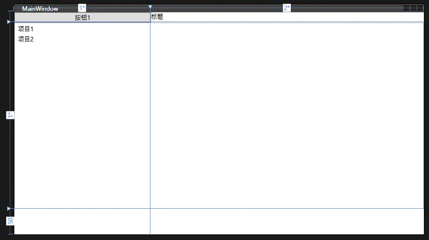
基础Grid示例
XML<Grid>
    <Grid.RowDefinitions>
        <!-- 第一行高度为Auto,根据内容自动调整 -->
        <RowDefinition Height="Auto"/>
        <!-- 第二行高度为* ,占用剩余所有空间 -->
        <RowDefinition Height="*"/>
        <!-- 第三行固定高度50 -->
        <RowDefinition Height="50"/>
    </Grid.RowDefinitions>

    <Grid.ColumnDefinitions>
        <!-- 第一列宽度占比1 -->
        <ColumnDefinition Width="*"/>
        <!-- 第二列宽度占比2 -->
        <ColumnDefinition Width="2*"/>
    </Grid.ColumnDefinitions>

    <!-- 放置在第0行第0列的按钮 -->
    <Button Grid.Row="0" Grid.Column="0" Content="按钮1"/>
    <!-- 放置在第0行,跨越2列的文本块 -->
    <TextBlock Grid.Row="0" Grid.Column="1" Text="标题"/>
    <!-- 放置在第1行,跨越2列的列表 -->
    <ListBox Grid.Row="1" Grid.ColumnSpan="2">
        <ListBoxItem>项目1</ListBoxItem>
        <ListBoxItem>项目2</ListBoxItem>
    </ListBox>
</Grid>
StackPanel - 堆叠式布局
StackPanel是一个简单但实用的布局控件,可以将子元素垂直或水平排列。
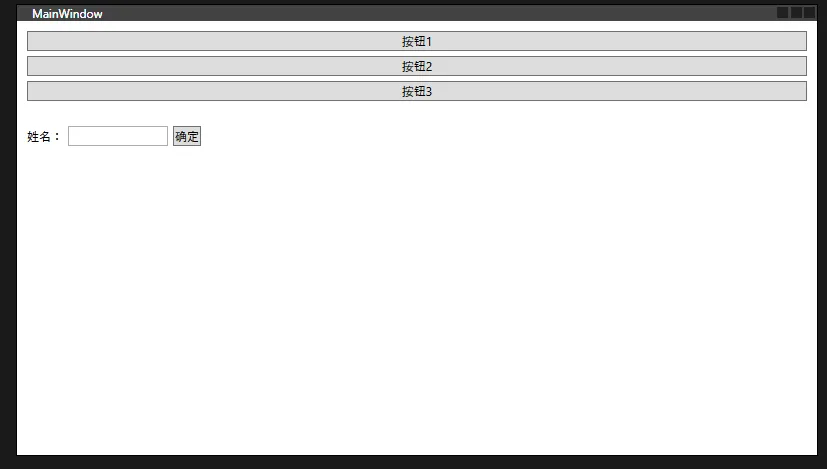
StackPanel示例
XML<StackPanel>
    <!-- 垂直排列的StackPanel -->
    <StackPanel Orientation="Vertical" Margin="10">
        <Button Content="按钮1" Margin="0,0,0,5"/>
        <Button Content="按钮2" Margin="0,0,0,5"/>
        <Button Content="按钮3" Margin="0,0,0,5"/>
    </StackPanel>

    <!-- 水平排列的StackPanel -->
    <StackPanel Orientation="Horizontal" Margin="10">
        <TextBlock Text="姓名:" VerticalAlignment="Center"/>
        <TextBox Width="100" Margin="5,0"/>
        <Button Content="确定"/>
    </StackPanel>
</StackPanel>
DockPanel - 停靠式布局
DockPanel允许子元素停靠在容器的四边或填充剩余空间。
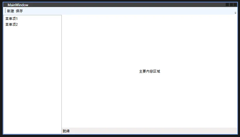
DockPanel示例
XML<DockPanel LastChildFill="True">
    <!-- 顶部工具栏 -->
    <ToolBar DockPanel.Dock="Top">
        <Button Content="新建"/>
        <Button Content="保存"/>
    </ToolBar>

    <!-- 左侧导航栏 -->
    <ListView DockPanel.Dock="Left" Width="200">
        <ListViewItem>菜单项1</ListViewItem>
        <ListViewItem>菜单项2</ListViewItem>
    </ListView>

    <!-- 底部状态栏 -->
    <StatusBar DockPanel.Dock="Bottom">
        <StatusBarItem>
            <TextBlock Text="就绪"/>
        </StatusBarItem>
    </StatusBar>

    <!-- 主内容区域(自动填充剩余空间) -->
    <Grid>
        <TextBlock Text="主要内容区域"
                   HorizontalAlignment="Center"
                   VerticalAlignment="Center"/>
    </Grid>
</DockPanel>
WrapPanel - 自动换行布局
WrapPanel会在容器宽度不足时自动换行显示子元素。
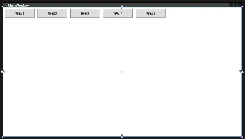
WrapPanel示例
XML<WrapPanel Orientation="Horizontal">
    <!-- 这些按钮会在空间不足时自动换行 -->
    <Button Content="按钮1" Width="100" Height="30" Margin="5"/>
    <Button Content="按钮2" Width="100" Height="30" Margin="5"/>
    <Button Content="按钮3" Width="100" Height="30" Margin="5"/>
    <Button Content="按钮4" Width="100" Height="30" Margin="5"/>
    <Button Content="按钮5" Width="100" Height="30" Margin="5"/>
</WrapPanel>
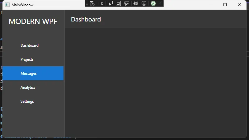
综合实例 - 自适应布局的应用程序框架
下面是一个结合多种布局控件的完整示例:
XML<Application x:Class="AppAdaptiveLayout.App"
             xmlns="http://schemas.microsoft.com/winfx/2006/xaml/presentation"
             xmlns:x="http://schemas.microsoft.com/winfx/2006/xaml"
             xmlns:local="clr-namespace:AppAdaptiveLayout"
             StartupUri="MainWindow.xaml">
    <Application.Resources>
        <!-- 颜色资源 -->
        <SolidColorBrush x:Key="PrimaryColor" Color="#1976D2"/>
        <SolidColorBrush x:Key="SecondaryColor" Color="#2196F3"/>
        <SolidColorBrush x:Key="BackgroundColor" Color="#303030"/>
        <SolidColorBrush x:Key="SidebarColor" Color="#424242"/>

        <!-- 菜单按钮样式 -->
        <Style x:Key="MenuButtonStyle" TargetType="RadioButton">
            <Setter Property="Height" Value="45"/>
            <Setter Property="Background" Value="Transparent"/>
            <Setter Property="Foreground" Value="White"/>
            <Setter Property="BorderThickness" Value="0"/>
            <Setter Property="HorizontalContentAlignment" Value="Left"/>
            <Setter Property="FocusVisualStyle" Value="{x:Null}"/>
            <Setter Property="Template">
                <Setter.Value>
                    <ControlTemplate TargetType="RadioButton">
                        <Grid Background="Transparent">
                            <!-- 选中指示器 -->
                            <Border x:Name="SelectionIndicator"
                                    Width="3"
                                    HorizontalAlignment="Left"
                                    Background="{StaticResource PrimaryColor}"
                                    Opacity="0"/>

                            <!-- 按钮主体 -->
                            <Border x:Name="MainBorder"
                                    Background="{TemplateBinding Background}"
                                    Margin="3,0">
                                <Grid Margin="20,0">
                                    <Grid.ColumnDefinitions>
                                        <ColumnDefinition Width="25"/>
                                        <ColumnDefinition Width="*"/>
                                    </Grid.ColumnDefinitions>

                                    <!-- 图标位置 -->
                                    <ContentPresenter Grid.Column="0"
                                                    x:Name="Icon"
                                                    Content="{Binding Tag, RelativeSource={RelativeSource TemplatedParent}}"
                                                    HorizontalAlignment="Center"
                                                    VerticalAlignment="Center"/>

                                    <!-- 文本内容 -->
                                    <ContentPresenter Grid.Column="1"
                                                    Content="{TemplateBinding Content}"
                                                    HorizontalAlignment="{TemplateBinding HorizontalContentAlignment}"
                                                    VerticalAlignment="Center"
                                                    Margin="10,0,0,0"/>
                                </Grid>
                            </Border>
                        </Grid>
                        <ControlTemplate.Triggers>
                            <Trigger Property="IsMouseOver" Value="True">
                                <Setter TargetName="MainBorder" Property="Background" Value="#454545"/>
                            </Trigger>
                            <Trigger Property="IsPressed" Value="True">
                                <Setter TargetName="MainBorder" Property="Background" Value="{StaticResource PrimaryColor}"/>
                            </Trigger>
                            <Trigger Property="IsChecked" Value="True">
                                <Setter TargetName="MainBorder" Property="Background" Value="{StaticResource PrimaryColor}"/>
                                <Setter TargetName="SelectionIndicator" Property="Opacity" Value="1"/>
                            </Trigger>
                        </ControlTemplate.Triggers>
                    </ControlTemplate>
                </Setter.Value>
            </Setter>
        </Style>
    </Application.Resources>
</Application>
XML<Window x:Class="AppAdaptiveLayout.MainWindow"
        xmlns="http://schemas.microsoft.com/winfx/2006/xaml/presentation"
        xmlns:x="http://schemas.microsoft.com/winfx/2006/xaml"
        xmlns:d="http://schemas.microsoft.com/expression/blend/2008"
        xmlns:mc="http://schemas.openxmlformats.org/markup-compatibility/2006"
        xmlns:local="clr-namespace:AppAdaptiveLayout"
        mc:Ignorable="d"
        Title="MainWindow" Height="450" Width="800"
        Background="#F5F6F7">

    <Window.Resources>
        <!-- 定义颜色 -->
        <SolidColorBrush x:Key="PrimaryColor" Color="#1976D2"/>
        <SolidColorBrush x:Key="SecondaryColor" Color="#2196F3"/>
        <SolidColorBrush x:Key="BackgroundColor" Color="#303030"/>
        <SolidColorBrush x:Key="SidebarColor" Color="#424242"/>
    </Window.Resources>

    <Grid Background="{StaticResource BackgroundColor}">
        <Grid.ColumnDefinitions>
            <ColumnDefinition Width="200"/>
            <ColumnDefinition Width="*"/>
        </Grid.ColumnDefinitions>

        <!-- 左侧导航栏 -->
        <Border Grid.Column="0"
                Background="{StaticResource SidebarColor}"
                BorderBrush="#505050"
                BorderThickness="0,0,1,0">
            <DockPanel>
                <!-- 顶部Logo -->
                <TextBlock DockPanel.Dock="Top"
                         Text="MODERN WPF"
                         Foreground="White"
                         FontSize="24"
                         Margin="20,20,20,40"
                         HorizontalAlignment="Left"/>

                <!-- 导航菜单 -->
                <StackPanel>
                    <RadioButton Style="{StaticResource MenuButtonStyle}"
                 Content="Dashboard"
                 GroupName="NavMenu"
                 IsChecked="True"/>
                    <RadioButton Style="{StaticResource MenuButtonStyle}"
                 Content="Projects"
                 GroupName="NavMenu"/>
                    <RadioButton Style="{StaticResource MenuButtonStyle}"
                 Content="Messages"
                 GroupName="NavMenu"/>
                    <RadioButton Style="{StaticResource MenuButtonStyle}"
                 Content="Analytics"
                 GroupName="NavMenu"/>
                    <RadioButton Style="{StaticResource MenuButtonStyle}"
                 Content="Settings"
                 GroupName="NavMenu"/>
                </StackPanel>
            </DockPanel>
        </Border>

        <!-- 主内容区域 -->
        <Grid Grid.Column="1">
            <Grid.RowDefinitions>
                <RowDefinition Height="60"/>
                <RowDefinition Height="*"/>
            </Grid.RowDefinitions>

            <!-- 顶部工具栏 -->
            <Border Grid.Row="0"
                    Background="#383838"
                    BorderBrush="#505050"
                    BorderThickness="0,0,0,1">
                <StackPanel Orientation="Horizontal"
                           Margin="20,0"
                           VerticalAlignment="Center">
                    <TextBlock Text="Dashboard"
                             Foreground="White"
                             FontSize="20"/>
                </StackPanel>
            </Border>

            <!-- 内容区域 -->
            <Grid Grid.Row="1" Margin="20">
                <ContentControl x:Name="MainContent"/>
            </Grid>
        </Grid>
    </Grid>
</Window>
布局设计的最佳实践
- 合理使用Grid
- 使用Grid作为主要布局容器
- 善用行列比例设置(
*、Auto、固定值) - 适当使用Grid嵌套来处理复杂布局
- 正确选择布局控件
- StackPanel适用于简单的线性布局
- DockPanel适合需要停靠的界面框架
- WrapPanel适用于需要自动换行的场景
- Grid适合复杂的表格式布局
- 注意性能考虑
- 避免过深的布局嵌套
- 合理使用UpdateLayout和Measure/Arrange
- 适当使用虚拟化面板(VirtualizingStackPanel)
- 响应式设计
- 使用比例而不是固定尺寸
- 合理设置最小/最大尺寸
- 使用Grid的自动行列定义
结论
WPF的布局系统相比WinForm更加灵活和强大,掌握这些布局控件的使用可以帮助我们创建出更好的用户界面。在实际开发中,需要根据具体需求选择合适的布局控件,并遵循最佳实践来确保应用程序的可维护性和性能。
本文作者:技术老小子
本文链接:
版权声明:本博客所有文章除特别声明外,均采用 BY-NC-SA 许可协议。转载请注明出处!
目录