目录
从WinForm转型到WPF开发时,最显著的变化之一就是布局系统的差异。WPF提供了更加灵活和强大的响应式布局能力,本文将详细介绍WPF中实现响应式布局的多种方式。
Grid布局 - 使用星号和Auto实现响应式
Grid是WPF中最灵活的布局容器之一,通过设置列宽和行高的比例,可以轻松实现响应式布局。
XML<Window x:Class="AppResponsive.Window1"
        xmlns="http://schemas.microsoft.com/winfx/2006/xaml/presentation"
        xmlns:x="http://schemas.microsoft.com/winfx/2006/xaml"
        xmlns:d="http://schemas.microsoft.com/expression/blend/2008"
        xmlns:mc="http://schemas.openxmlformats.org/markup-compatibility/2006"
        xmlns:local="clr-namespace:AppResponsive"
        mc:Ignorable="d"
        Title="Window1" Height="450" Width="800">
    <DockPanel LastChildFill="True">
        <!-- 顶部工具栏 -->
        <StackPanel DockPanel.Dock="Top" Background="LightBlue" Height="50">
            <TextBlock Text="顶部工具栏" VerticalAlignment="Center" HorizontalAlignment="Center"/>
        </StackPanel>

        <!-- 左侧导航 -->
        <StackPanel DockPanel.Dock="Left" Background="LightGreen" Width="150">
            <TextBlock Text="左侧导航" VerticalAlignment="Center" HorizontalAlignment="Center"/>
        </StackPanel>

        <!-- 右侧面板 -->
        <StackPanel DockPanel.Dock="Right" Background="LightPink" Width="200">
            <TextBlock Text="右侧面板" VerticalAlignment="Center" HorizontalAlignment="Center"/>
        </StackPanel>

        <!-- 底部状态栏 -->
        <StackPanel DockPanel.Dock="Bottom" Background="LightGray" Height="30">
            <TextBlock Text="底部状态栏" VerticalAlignment="Center" HorizontalAlignment="Center"/>
        </StackPanel>

        <!-- 主内容区域(自动填充剩余空间) -->
        <Grid Background="White">
            <TextBlock Text="主内容区域" VerticalAlignment="Center" HorizontalAlignment="Center"/>
        </Grid>
    </DockPanel>
</Window>
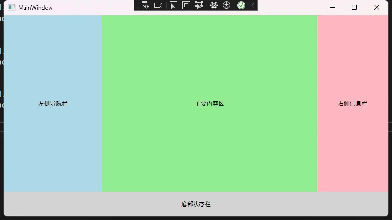
DockPanel - 停靠式响应布局
DockPanel允许子元素停靠在容器的不同边缘,最后一个元素会自动填充剩余空间。
XML<Window x:Class="AppResponsive.Window2"
        xmlns="http://schemas.microsoft.com/winfx/2006/xaml/presentation"
        xmlns:x="http://schemas.microsoft.com/winfx/2006/xaml"
        xmlns:d="http://schemas.microsoft.com/expression/blend/2008"
        xmlns:mc="http://schemas.openxmlformats.org/markup-compatibility/2006"
        xmlns:local="clr-namespace:AppResponsive"
        mc:Ignorable="d"
        Title="Window2" Height="450" Width="800">
    <DockPanel LastChildFill="True">
        <!-- 顶部工具栏 -->
        <StackPanel DockPanel.Dock="Top" Background="LightBlue" Height="50">
            <TextBlock Text="顶部工具栏" VerticalAlignment="Center" HorizontalAlignment="Center"/>
        </StackPanel>

        <!-- 左侧导航 -->
        <StackPanel DockPanel.Dock="Left" Background="LightGreen" Width="150">
            <TextBlock Text="左侧导航" VerticalAlignment="Center" HorizontalAlignment="Center"/>
        </StackPanel>

        <!-- 右侧面板 -->
        <StackPanel DockPanel.Dock="Right" Background="LightPink" Width="200">
            <TextBlock Text="右侧面板" VerticalAlignment="Center" HorizontalAlignment="Center"/>
        </StackPanel>

        <!-- 底部状态栏 -->
        <StackPanel DockPanel.Dock="Bottom" Background="LightGray" Height="30">
            <TextBlock Text="底部状态栏" VerticalAlignment="Center" HorizontalAlignment="Center"/>
        </StackPanel>

        <!-- 主内容区域(自动填充剩余空间) -->
        <Grid Background="White">
            <TextBlock Text="主内容区域" VerticalAlignment="Center" HorizontalAlignment="Center"/>
        </Grid>
    </DockPanel>
</Window>
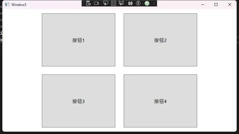
ViewBox - 内容缩放响应
ViewBox可以根据可用空间自动缩放其内容。
XML<Window x:Class="ResponsiveDemo.ViewBoxWindow"
        xmlns="http://schemas.microsoft.com/winfx/2006/xaml/presentation"
        xmlns:x="http://schemas.microsoft.com/winfx/2006/xaml"
        Title="ViewBox示例" Height="450" Width="800">
    <Viewbox Stretch="Uniform">
        <!-- 内容会随窗口大小自动缩放 -->
        <Grid Width="400" Height="300">
            <Grid.RowDefinitions>
                <RowDefinition Height="*"/>
                <RowDefinition Height="*"/>
            </Grid.RowDefinitions>
            <Grid.ColumnDefinitions>
                <ColumnDefinition Width="*"/>
                <ColumnDefinition Width="*"/>
            </Grid.ColumnDefinitions>

            <Button Grid.Row="0" Grid.Column="0" Margin="10" Content="按钮1"/>
            <Button Grid.Row="0" Grid.Column="1" Margin="10" Content="按钮2"/>
            <Button Grid.Row="1" Grid.Column="0" Margin="10" Content="按钮3"/>
            <Button Grid.Row="1" Grid.Column="1" Margin="10" Content="按钮4"/>
        </Grid>
    </Viewbox>
</Window>
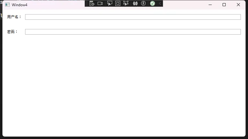
使用SharedSizeGroup实现列同步响应
SharedSizeGroup允许不同Grid之间的列保持相同宽度。
XML<Window x:Class="AppResponsive.Window4"
        xmlns="http://schemas.microsoft.com/winfx/2006/xaml/presentation"
        xmlns:x="http://schemas.microsoft.com/winfx/2006/xaml"
        xmlns:d="http://schemas.microsoft.com/expression/blend/2008"
        xmlns:mc="http://schemas.openxmlformats.org/markup-compatibility/2006"
        xmlns:local="clr-namespace:AppResponsive"
        mc:Ignorable="d"
        Title="Window4" Height="450" Width="800">
    <StackPanel Grid.IsSharedSizeScope="True">
        <!-- 第一个Grid -->
        <Grid Margin="10">
            <Grid.ColumnDefinitions>
                <ColumnDefinition Width="Auto" SharedSizeGroup="Labels"/>
                <ColumnDefinition Width="*"/>
            </Grid.ColumnDefinitions>
            <TextBlock Grid.Column="0" Text="用户名:" Margin="5"/>
            <TextBox Grid.Column="1" Margin="5"/>
        </Grid>

        <!-- 第二个Grid -->
        <Grid Margin="10">
            <Grid.ColumnDefinitions>
                <ColumnDefinition Width="Auto" SharedSizeGroup="Labels"/>
                <ColumnDefinition Width="*"/>
            </Grid.ColumnDefinitions>
            <TextBlock Grid.Column="0" Text="密码:" Margin="5"/>
            <PasswordBox Grid.Column="1" Margin="5"/>
        </Grid>
    </StackPanel>
</Window>
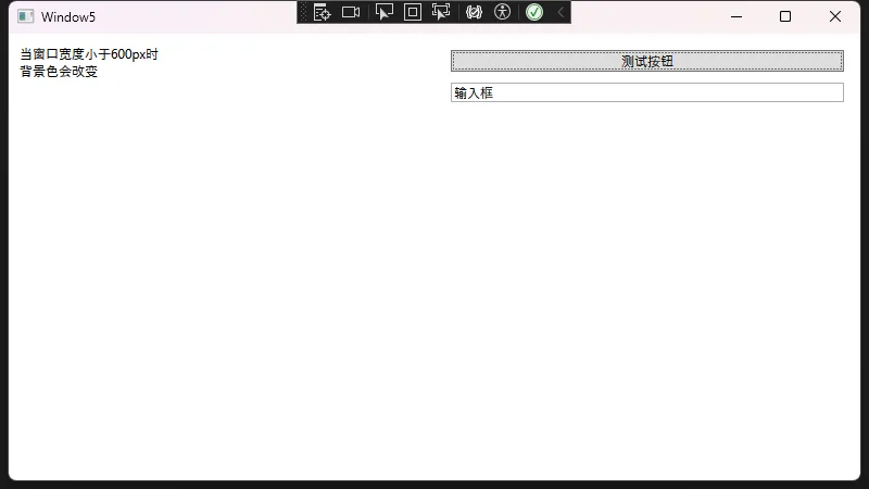
使用触发器实现响应式设计
可以通过触发器根据窗口大小动态调整布局。
XML<Window x:Class="ResponsiveDemo.TriggerWindow"
        xmlns="http://schemas.microsoft.com/winfx/2006/xaml/presentation"
        xmlns:x="http://schemas.microsoft.com/winfx/2006/xaml"
        Title="触发器响应式示例" Height="450" Width="800">
    <Window.Resources>
        <Style TargetType="Grid">
            <Style.Triggers>
                <DataTrigger Binding="{Binding RelativeSource={RelativeSource Mode=FindAncestor,
                                     AncestorType=Window}, Path=ActualWidth}" Value="600">
                    <Setter Property="Background" Value="LightYellow"/>
                </DataTrigger>
            </Style.Triggers>
        </Style>
    </Window.Resources>

    <Grid>
        <Grid.ColumnDefinitions>
            <ColumnDefinition Width="*"/>
            <ColumnDefinition Width="*"/>
        </Grid.ColumnDefinitions>

        <StackPanel Grid.Column="0" Margin="10">
            <TextBlock Text="当窗口宽度小于600px时"/>
            <TextBlock Text="背景色会改变"/>
        </StackPanel>

        <StackPanel Grid.Column="1" Margin="10">
            <Button Content="测试按钮" Margin="5"/>
            <TextBox Text="输入框" Margin="5"/>
        </StackPanel>
    </Grid>
</Window>
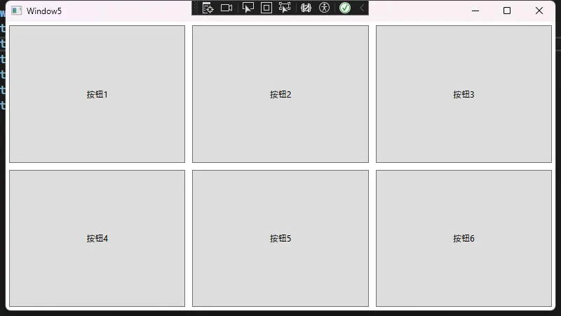
UniformGrid - 均匀网格响应式布局
UniformGrid会自动将空间均匀分配给所有子元素。
XML<Window x:Class="ResponsiveDemo.UniformGridWindow"
        xmlns="http://schemas.microsoft.com/winfx/2006/xaml/presentation"
        xmlns:x="http://schemas.microsoft.com/winfx/2006/xaml"
        Title="UniformGrid示例" Height="450" Width="800">
    <UniformGrid Rows="2" Columns="3">
        <Button Content="按钮1" Margin="5"/>
        <Button Content="按钮2" Margin="5"/>
        <Button Content="按钮3" Margin="5"/>
        <Button Content="按钮4" Margin="5"/>
        <Button Content="按钮5" Margin="5"/>
        <Button Content="按钮6" Margin="5"/>
    </UniformGrid>
</Window>
最佳实践建议
- 合理使用Grid系统
- 使用Grid的星号尺寸可以实现最灵活的响应式布局
- 避免硬编码尺寸,优先使用Auto和星号
- 嵌套布局注意事项
- 避免过度嵌套,会影响性能
- 合理使用Grid.IsSharedSizeScope实现对齐
- 响应式设计原则
- 使用相对单位而不是固定像素
- 考虑不同分辨率下的显示效果
- 适当使用最小/最大尺寸约束
- 性能优化
- 合理使用UpdateSourceTrigger
- 避免过多的绑定表达式
- 适当使用虚拟化面板(VirtualizingStackPanel)
结论
WPF提供了丰富的布局控件和属性,通过合理组合使用这些功能,可以轻松实现各种响应式布局需求。相比WinForm的绝对定位,WPF的布局系统更加灵活和强大。在实际开发中,应根据具体需求选择合适的布局方案,并注意遵循最佳实践原则。
本文作者:技术老小子
本文链接:
版权声明:本博客所有文章除特别声明外,均采用 BY-NC-SA 许可协议。转载请注明出处!
目录