目录
在Windows桌面开发中,WinForm曾经是主流的技术栈,但随着界面设计和交互需求越来越丰富,WPF(Windows Presentation Foundation)以更强大的UI渲染、可扩展的样式和更灵活的数据绑定特性吸引了众多开发者转向。
WinForm与WPF在绘图方面的差异
-
渲染引擎
WinForm基于GDI+,需要手动处理绘制逻辑、重绘、坐标转换等;WPF使用基于DirectX的矢量渲染引擎,UI可自动响应分辨率、缩放和动画等需求。
-
布局系统
WinForm一般使用
Dock、Anchor或手动绝对坐标;WPF提供了丰富的布局容器(如Grid、StackPanel、Canvas),并支持自动伸缩和自适应,大幅减少手动定位的工作量。 -
可视化与样式
在WinForm中对控件进行自定义样式常常需要重写
OnPaint;WPF中提供了ControlTemplate、Style以及基于XAML的可视化树,能自定义任意形状、颜色和动画效果。
Ellipse的基本用法
在WPF中,Ellipse是一个通用的“图形”控件,用于绘制圆形或椭圆形。与WinForm相比,WPF中的Ellipse使用更加简单明了。
在窗口中直接使用Ellipse
下面是一个最简单的示例,展示了如何在WPF窗口中创建和使用椭圆。该示例展示了一个包含红色椭圆的窗口:
XML<Window x:Class="AppEllipse.MainWindow"
        xmlns="http://schemas.microsoft.com/winfx/2006/xaml/presentation"
        xmlns:x="http://schemas.microsoft.com/winfx/2006/xaml"
        xmlns:d="http://schemas.microsoft.com/expression/blend/2008"
        xmlns:mc="http://schemas.openxmlformats.org/markup-compatibility/2006"
        xmlns:local="clr-namespace:AppEllipse"
        mc:Ignorable="d"
        Title="MainWindow" Height="450" Width="800">
    <Grid>
        <Ellipse Width="100"
                 Height="100"
                 Fill="Red"
                 Stroke="Black"
                 StrokeThickness="2" />
    </Grid>
</Window>
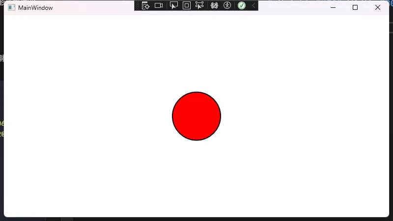
以上示例相当于在WinForm中Paint事件中绘制一个圆,但在WPF中只需要一个标签式的声明即可,无需在后台编写任何绘制逻辑。
使用Canvas定位Ellipse
如果想要自由定位Ellipse, 可以用Canvas控件来固定它的位置。下面的示例展示了如何在Canvas中放置多个不同颜色的Ellipse:
XML<Window x:Class="AppEllipse.Window1"
        xmlns="http://schemas.microsoft.com/winfx/2006/xaml/presentation"
        xmlns:x="http://schemas.microsoft.com/winfx/2006/xaml"
        xmlns:d="http://schemas.microsoft.com/expression/blend/2008"
        xmlns:mc="http://schemas.openxmlformats.org/markup-compatibility/2006"
        xmlns:local="clr-namespace:AppEllipse"
        mc:Ignorable="d"
        Title="Window1" Height="450" Width="800">
    <Canvas>
        <!-- 第一个Ellipse:蓝色 -->
        <Ellipse Canvas.Left="50"
                 Canvas.Top="50"
                 Width="80" Height="80"
                 Fill="Blue"
                 Stroke="Black"
                 StrokeThickness="2" />

        <!-- 第二个Ellipse:绿色 -->
        <Ellipse Canvas.Left="150"
                 Canvas.Top="80"
                 Width="100" Height="60"
                 Fill="Green"
                 Stroke="Black"
                 StrokeThickness="2" />
    </Canvas>
</Window>
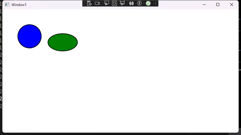
在上述示例中:
Canvas.Left和Canvas.Top控制Ellipse的左上角位置Width和Height指定椭圆所占用的宽高
在代码后端动态创建Ellipse
在WPF中也能像WinForm那样,通过后台代码动态创建并添加控件。示例如下所示,再次使用Canvas来演示:
XML<Window x:Class="AppEllipse.Window2"
        xmlns="http://schemas.microsoft.com/winfx/2006/xaml/presentation"
        xmlns:x="http://schemas.microsoft.com/winfx/2006/xaml"
        xmlns:d="http://schemas.microsoft.com/expression/blend/2008"
        xmlns:mc="http://schemas.openxmlformats.org/markup-compatibility/2006"
        xmlns:local="clr-namespace:AppEllipse"
        mc:Ignorable="d"
        Title="Window2" Height="450" Width="800">
    <Canvas x:Name="MyCanvas" Background="White">

    </Canvas>
</Window>
C#using System;
using System.Collections.Generic;
using System.Linq;
using System.Text;
using System.Threading.Tasks;
using System.Windows;
using System.Windows.Controls;
using System.Windows.Data;
using System.Windows.Documents;
using System.Windows.Input;
using System.Windows.Media;
using System.Windows.Media.Imaging;
using System.Windows.Shapes;

namespace AppEllipse
{
    /// <summary>
    /// Interaction logic for Window2.xaml
    /// </summary>
    public partial class Window2 : Window
    {
        public Window2()
        {
            InitializeComponent();

            // 动态创建Ellipse
            Ellipse ellipse = new Ellipse
            {
                Width = 120,
                Height = 120,
                // 填充渐变颜色
                Fill = new LinearGradientBrush(Colors.Orange, Colors.Red, 45.0),
                Stroke = Brushes.Black,
                StrokeThickness = 3
            };

            // 设置椭圆在Canvas中的位置
            Canvas.SetLeft(ellipse, 100);
            Canvas.SetTop(ellipse, 60);

            // 加入Canvas中
            MyCanvas.Children.Add(ellipse);
        }
    }
}
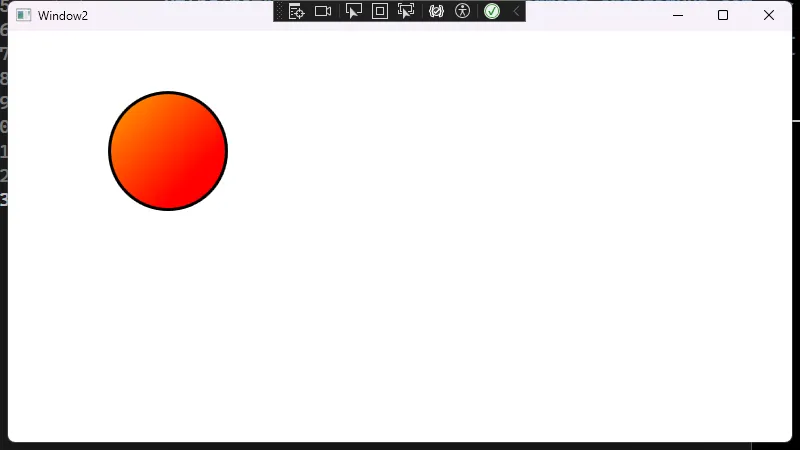
在这个示例中,你可以像WinForm一样在后台动态添加控件,并为它配置属性。但WPF同时保留了XAML的声明式优点,让UI和逻辑更好地分离。
Ellipse的样式与模板
WPF最大的优势之一就是能够轻松设置和复用样式。与WinForm里为每个控件单独设置属性相比,WPF可以在资源字典中定义样式,批量应用到多个控件上。
定义样式
假设你想让界面中的椭圆都保持相同的外观,可以在Window.Resources或单独的ResourceDictionary里定义一个Style:
XML<Window x:Class="AppEllipse.Window3"
        xmlns="http://schemas.microsoft.com/winfx/2006/xaml/presentation"
        xmlns:x="http://schemas.microsoft.com/winfx/2006/xaml"
        xmlns:d="http://schemas.microsoft.com/expression/blend/2008"
        xmlns:mc="http://schemas.openxmlformats.org/markup-compatibility/2006"
        xmlns:local="clr-namespace:AppEllipse"
        mc:Ignorable="d"
        Title="Window3" Height="450" Width="800">
    <Window.Resources>
        <!-- 针对Ellipse的Style定义 -->
        <Style TargetType="Ellipse" x:Key="ColoredEllipseStyle">
            <Setter Property="Width" Value="100"/>
            <Setter Property="Height" Value="100"/>
            <Setter Property="Stroke" Value="Black"/>
            <Setter Property="StrokeThickness" Value="2"/>
            <Setter Property="Fill">
                <Setter.Value>
                    <!-- 使用放射性渐变 -->
                    <RadialGradientBrush GradientOrigin="0.5,0.5">
                        <GradientStop Color="LightBlue" Offset="0.0"/>
                        <GradientStop Color="Blue" Offset="1.0"/>
                    </RadialGradientBrush>
                </Setter.Value>
            </Setter>
        </Style>
    </Window.Resources>

    <Grid>
        <StackPanel HorizontalAlignment="Center" VerticalAlignment="Center" Orientation="Horizontal"
              >
            <Ellipse Style="{StaticResource ColoredEllipseStyle}"/>
            <Ellipse Style="{StaticResource ColoredEllipseStyle}"/>
        </StackPanel>
    </Grid>
</Window>
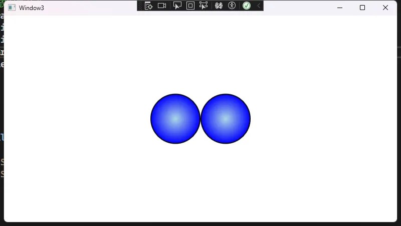
在上例中:
TargetType="Ellipse"表示该样式适用于所有Ellipse类型控件(如果不想为所有Ellipse都应用,可以使用x:Key让其成为显式样式)。- 定义了一系列属性的默认值,如
Width、Height、Stroke和Fill等。 - 使用
RadialGradientBrush创建放射性渐变,让椭圆有更具层次感的填充颜色。
随后,你只需在Ellipse上通过Style="{StaticResource ColoredEllipseStyle}"显式引用,或去掉x:Key使其成为隐式样式,让窗口内所有Ellipse自动应用此样式。
样式触发器
WPF的样式还可以通过触发器(Triggers)进行状态切换。比如,你想让鼠标悬停时在椭圆上显示描边动画或更改颜色,可以为Style添加Trigger:
XML<Window x:Class="AppEllipse.Window4"
        xmlns="http://schemas.microsoft.com/winfx/2006/xaml/presentation"
        xmlns:x="http://schemas.microsoft.com/winfx/2006/xaml"
        xmlns:d="http://schemas.microsoft.com/expression/blend/2008"
        xmlns:mc="http://schemas.openxmlformats.org/markup-compatibility/2006"
        xmlns:local="clr-namespace:AppEllipse"
        mc:Ignorable="d"
        Title="Window4" Height="450" Width="800">
    <Window.Resources>
        <Style TargetType="Ellipse" x:Key="HoverEllipseStyle">
            <Setter Property="Width" Value="80"/>
            <Setter Property="Height" Value="80"/>
            <Setter Property="Stroke" Value="Gray"/>
            <Setter Property="StrokeThickness" Value="2"/>
            <Setter Property="Fill" Value="LightGray"/>
            <!-- 触发器:鼠标悬停时改变Fill与Stroke -->
            <Style.Triggers>
                <Trigger Property="IsMouseOver" Value="True">
                    <Setter Property="Fill" Value="Yellow"/>
                    <Setter Property="Stroke" Value="Orange"/>
                </Trigger>
            </Style.Triggers>
        </Style>
    </Window.Resources>

    <StackPanel HorizontalAlignment="Center" VerticalAlignment="Center" Orientation="Horizontal">
        <Ellipse Style="{StaticResource HoverEllipseStyle}"/>
        <Ellipse Style="{StaticResource HoverEllipseStyle}"/>
        <Ellipse Style="{StaticResource HoverEllipseStyle}"/>
    </StackPanel>
</Window>
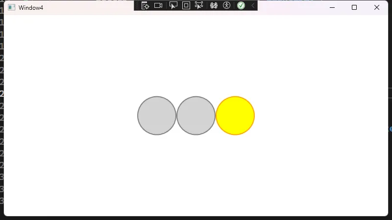
该例展示了当鼠标指针悬停到椭圆上时自动高亮的效果,不再需要在后台逻辑中写任何事件处理。
小结
- WPF通过XAML大幅降低了界面设计和自定义绘制的复杂度。
Ellipse及其它形状控件能以声明方式快速创建并呈现出更丰富的视觉效果。- 样式和触发器能帮助开发者摆脱繁琐的后台事件,并实现更高复用性。
如果你习惯了WinForm的Paint方法、Graphics操作,转向WPF会发现许多事情做起来更灵活、更直观。借由WPF的强大渲染能力和样式体系,你可以轻松应用渐变、动画、触发器等原本在WinForm中需要大量手动实现的效果,这无疑能加快界面开发和迭代速度。
本文作者:技术老小子
本文链接:
版权声明:本博客所有文章除特别声明外,均采用 BY-NC-SA 许可协议。转载请注明出处!