目录
前言
在从 Windows Forms (WinForm) 转到 Windows Presentation Foundation (WPF) 的过程中,初学者常常会被全新的布局系统与控件体系所困扰。WPF 提供了许多新的控件和特性来帮助简化 UI 构建,其中一个常用控件就是 Border。本文将结合具体示例,介绍在 WPF 中如何使用 Border,并与 WinForm 的常见做法进行对比。
WinForm 与 WPF 的边框区别
- 在 WinForm 中,自定义控件或 Panel 可能通过设置
BorderStyle等属性来显示简单边框。要想进一步美化或调整更多外观细节,就需要借助第三方控件或自己绘制。 - 在 WPF 中,Border 是一个专门用于为单个子元素添加边框、背景、圆角和边距的容器控件,开发者无需自行绘制即可完成丰富的样式配置。
基础用法
以下示例展示了最基本的 Border 用法,包括设置背景色、边框厚度和颜色等。
XML<Window x:Class="AppBorder.MainWindow"
        xmlns="http://schemas.microsoft.com/winfx/2006/xaml/presentation"
        xmlns:x="http://schemas.microsoft.com/winfx/2006/xaml"
        xmlns:d="http://schemas.microsoft.com/expression/blend/2008"
        xmlns:mc="http://schemas.openxmlformats.org/markup-compatibility/2006"
        xmlns:local="clr-namespace:AppBorder"
        mc:Ignorable="d"
        Title="MainWindow" Height="450" Width="800">
    <Grid>
        <Border
            BorderThickness="2"
            BorderBrush="LightBlue"
            Background="AliceBlue"
            Padding="10"
            HorizontalAlignment="Center"
            VerticalAlignment="Center">
            <TextBlock Text="我是被Border包裹的内容"
                       Foreground="DarkBlue"
                       FontSize="16"/>
            </Border>
    </Grid>
</Window>
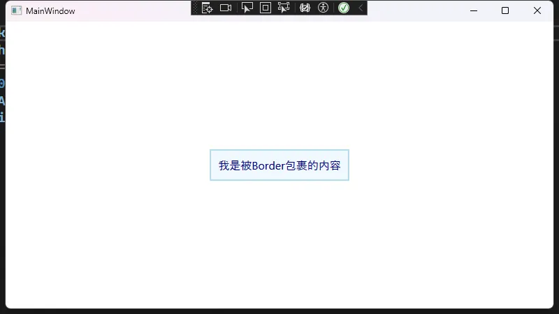
以上示例中的关键点:
Border只容纳一个子元素,这与 WinForm 直接在一个 Panel 中放多个子控件的做法略有不同。若要放置多个元素,可以在 Border 内再添加一个容器控件(如Grid、StackPanel等)。BorderThickness用于控制边框的粗细。WPF 提供了非常灵活的厚度设置方式,可设置为统一或不同方向各自独立的厚度值。BorderBrush用于指定边框画刷,可以是纯色或更复杂的线性渐变、图像等。
圆角边框
相比于在 WinForm 中需要自定义绘制或使用第三方库才能做到的圆角效果,WPF 的 Border 可以轻松实现圆角。
XML<Window x:Class="AppBorder.Window1"
        xmlns="http://schemas.microsoft.com/winfx/2006/xaml/presentation"
        xmlns:x="http://schemas.microsoft.com/winfx/2006/xaml"
        xmlns:d="http://schemas.microsoft.com/expression/blend/2008"
        xmlns:mc="http://schemas.openxmlformats.org/markup-compatibility/2006"
        xmlns:local="clr-namespace:AppBorder"
        mc:Ignorable="d"
        Title="Window1" Height="450" Width="800">
    <Grid>
        <Border
            CornerRadius="15"
            BorderThickness="2"
            BorderBrush="Orange"
            Background="LightYellow"
            Padding="20"
            HorizontalAlignment="Center"
            VerticalAlignment="Center">
            <StackPanel>
                <TextBlock Text="圆角Border示例"
                           FontSize="16"
                           FontWeight="Bold"/>
                <Button Content="点我试试"
                        Margin="0,10,0,0"
                        HorizontalAlignment="Center" Click="Button_Click"/>
            </StackPanel>
        </Border>
    </Grid>
</Window>
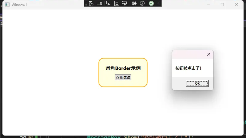
以上示例通过 CornerRadius 可以直接设置圆角大小,减少了 WinForm 中需要借助 Graphics 对控件进行自定义绘制的繁琐步骤。
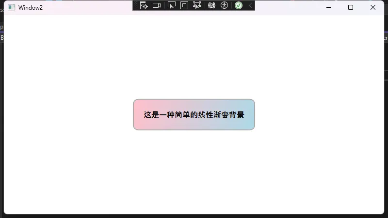
自定义背景效果
在 WPF 中,背景不仅能设置为纯色,还可以使用渐变、图像甚至视频。以下示例为 Border 的背景设置了一种线性渐变效果:
XML<Window x:Class="AppBorder.Window2"
        xmlns="http://schemas.microsoft.com/winfx/2006/xaml/presentation"
        xmlns:x="http://schemas.microsoft.com/winfx/2006/xaml"
        xmlns:d="http://schemas.microsoft.com/expression/blend/2008"
        xmlns:mc="http://schemas.openxmlformats.org/markup-compatibility/2006"
        xmlns:local="clr-namespace:AppBorder"
        mc:Ignorable="d"
        Title="Window2" Height="450" Width="800">
    <Grid>
        <Border
            CornerRadius="10"
            BorderThickness="2"
            BorderBrush="DarkGray"
            Padding="20"
            HorizontalAlignment="Center"
            VerticalAlignment="Center">
            <Border.Background>
                <!-- 线性渐变 -->
                <LinearGradientBrush StartPoint="0,0" EndPoint="1,1">
                    <GradientStop Color="Pink" Offset="0" />
                    <GradientStop Color="LightBlue" Offset="1" />
                </LinearGradientBrush>
            </Border.Background>
            <TextBlock Text="这是一种简单的线性渐变背景"
                       FontSize="16"
                       FontWeight="Bold"/>
        </Border>
    </Grid>
</Window>
与其他容器的结合
如果需要在 Border 内部放置多个控件,可以组合其他布局容器,如 Grid、StackPanel、DockPanel 等。下面例子演示了在 Border 内部使用 StackPanel,并在不同 Border 中嵌套更多内容:
XML<Window x:Class="AppBorder.Window3"
        xmlns="http://schemas.microsoft.com/winfx/2006/xaml/presentation"
        xmlns:x="http://schemas.microsoft.com/winfx/2006/xaml"
        xmlns:d="http://schemas.microsoft.com/expression/blend/2008"
        xmlns:mc="http://schemas.openxmlformats.org/markup-compatibility/2006"
        xmlns:local="clr-namespace:AppBorder"
        mc:Ignorable="d"
        Title="Window3" Height="450" Width="800">
    <Grid>
        <!-- Border示例4:多个容器的结合 -->
        <StackPanel Orientation="Vertical" HorizontalAlignment="Center">
            <Border
                BorderThickness="1"
                BorderBrush="Black"
                Background="Bisque"
                Padding="10"
                Margin="0,0,0,10">
                <StackPanel>
                    <TextBlock Text="上方区块" Foreground="DarkBlue" FontSize="16"/>
                    <Button Content="点击事件1" Margin="0,5,0,0" />
                </StackPanel>
            </Border>

            <Border
                BorderThickness="1"
                BorderBrush="Black"
                Background="LightGreen"
                Padding="10">
                <StackPanel>
                    <TextBlock Text="下方区块" Foreground="Green" FontSize="16"/>
                    <Button Content="点击事件2" Margin="0,5,0,0" />
                </StackPanel>
            </Border>
        </StackPanel>
    </Grid>
</Window>
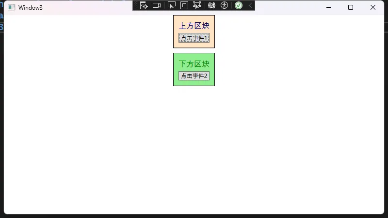
在上方的示例中,我们使用 StackPanel 垂直排列多个 Border,每个 Border 再包含自己的布局与控件。这种嵌套布局十分灵活,摆脱了 WinForm 中往往要手动处理坐标或 Anchor、Dock 属性的约束。
与 WinForm 的主要差异
- Visual Tree:WPF 使用可视化树(Visual Tree)结构,每个控件都有自己的子控件或子元素,布局层次分明。
- XAML 分离:通过 XAML 可以更容易地定义界面外观,逻辑则在 C# 后台代码中实现。
- 丰富的绘制支持:在 WPF 中,Border 不仅提供基础边框功能,还能结合
Brush、Transform等创建多变的效果。 - 内容模型:WPF 的控件内容模型普遍比 WinForm 中的更为灵活,Border 只接受一个子对象,但可以是复杂的布局,从而实现控件嵌套。
小结
在 WPF 中使用 Border 控件,可以通过简单的属性设置获得多种样式与布局效果,极大提升了界面开发的灵活度与可维护性。对于从 WinForm 转型到 WPF 的开发者来说,掌握并熟练运用 Border 是迈向熟悉 WPF 布局体系的第一步。通过与其他容器的结合,可以快速实现许多在 WinForm 中需要自定义绘制才能完成的界面效果。
本文作者:技术老小子
本文链接:
版权声明:本博客所有文章除特别声明外,均采用 BY-NC-SA 许可协议。转载请注明出处!