
目录
WinForm到WPF的转型往往让开发者需要适应新的组件和布局方式。本文将针对RadioButton在WPF下的使用,以及自定义样式的方式做较为详尽的介绍,并通过具体示例对比WinForm和WPF的实现与效果差异。
前言
在WinForm中,RadioButton是一种常用的选择控件。多组RadioButton可放置在相应的容器(例如GroupBox)中,或通过判断RadioButton的Checked属性进行选择。这些用法在WPF中也可以实现,但WPF的优势在于可直接通过XAML与数据绑定、样式和控件模板等特性进行更灵活的开发。
基本用法对比
在WinForm中的RadioButton
在WinForm中,如果要创建一个RadioButton,一般会这样写(以C#为例):
C#RadioButton rbtn1 = new RadioButton();
rbtn1.Text = "选项一";
// 设置位置
rbtn1.Location = new Point(20, 20);
// 事件处理
rbtn1.CheckedChanged += (s, e) =>
{
    // 被选中时进行的处理
};
this.Controls.Add(rbtn1);
在WPF中的RadioButton
WPF中使用XAML可以轻松实现相同的效果。下面是一个最基础的写法:
XML<Window x:Class="AppRadioButton.MainWindow"
        xmlns="http://schemas.microsoft.com/winfx/2006/xaml/presentation"
        xmlns:x="http://schemas.microsoft.com/winfx/2006/xaml"
        xmlns:d="http://schemas.microsoft.com/expression/blend/2008"
        xmlns:mc="http://schemas.openxmlformats.org/markup-compatibility/2006"
        xmlns:local="clr-namespace:AppRadioButton"
        mc:Ignorable="d"
        Title="MainWindow" Height="450" Width="800">
    <Grid>
        <StackPanel Orientation="Vertical" HorizontalAlignment="Center" VerticalAlignment="Center">
            <RadioButton Content="选项一" x:Name="RadioButton1" Checked="RadioButton_Checked"/>
            <RadioButton Content="选项二" x:Name="RadioButton2" Checked="RadioButton_Checked"/>
            <RadioButton Content="选项三" x:Name="RadioButton3" Checked="RadioButton_Checked"/>
        </StackPanel>
    </Grid>
</Window>
在C#后端(MainWindow.xaml.cs)中捕获事件:
C#using System.Text;
using System.Windows;
using System.Windows.Controls;
using System.Windows.Data;
using System.Windows.Documents;
using System.Windows.Input;
using System.Windows.Media;
using System.Windows.Media.Imaging;
using System.Windows.Navigation;
using System.Windows.Shapes;
namespace AppRadioButton
{
/// <summary>
/// Interaction logic for MainWindow.xaml
/// </summary>
public partial class MainWindow : Window
{
public MainWindow()
{
InitializeComponent();
}
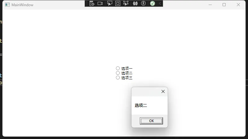
private void RadioButton_Checked(object sender, RoutedEventArgs e)
{
RadioButton rbtn = sender as RadioButton;
if (rbtn != null)
{
string content = rbtn.Content.ToString(); // 获取当前选项文字
MessageBox.Show(content);
}
}
}
}
RadioButton分组
无论在WinForm还是在WPF中,如果要区分多组RadioButton,需要将它们置于不同的容器内,例如GroupBox或Panel等。WPF中同样支持直接通过GroupName属性区分同一组内允许单选:
XML<Window x:Class="AppRadioButton.Window1"
        xmlns="http://schemas.microsoft.com/winfx/2006/xaml/presentation"
        xmlns:x="http://schemas.microsoft.com/winfx/2006/xaml"
        xmlns:d="http://schemas.microsoft.com/expression/blend/2008"
        xmlns:mc="http://schemas.openxmlformats.org/markup-compatibility/2006"
        xmlns:local="clr-namespace:AppRadioButton"
        mc:Ignorable="d"
        Title="Window1" Height="450" Width="800">
    <StackPanel Orientation="Vertical" Margin="10">
        <GroupBox Header="分组一">
            <StackPanel>
                <RadioButton GroupName="GroupA" Content="选项一-A"/>
                <RadioButton GroupName="GroupA" Content="选项二-A"/>
            </StackPanel>
        </GroupBox>

        <GroupBox Header="分组二">
            <StackPanel>
                <RadioButton GroupName="GroupB" Content="选项一-B"/>
                <RadioButton GroupName="GroupB" Content="选项二-B"/>
            </StackPanel>
        </GroupBox>
    </StackPanel>
</Window>
自定义RadioButton样式
WPF强大之处在于可以自由定制控件的外观和交互动效。我们可以通过Style和ControlTemplate来自定义RadioButton的样式。
Style(简易样式示例)
下面的示例通过定义一个简单的Style来改变RadioButton的前景色和鼠标事件时的视觉反馈。
XML<Window x:Class="AppRadioButton.Window2"
        xmlns="http://schemas.microsoft.com/winfx/2006/xaml/presentation"
        xmlns:x="http://schemas.microsoft.com/winfx/2006/xaml"
        xmlns:d="http://schemas.microsoft.com/expression/blend/2008"
        xmlns:mc="http://schemas.openxmlformats.org/markup-compatibility/2006"
        xmlns:local="clr-namespace:AppRadioButton"
        mc:Ignorable="d"
        Title="Window2" Height="450" Width="800">
    <Window.Resources>
        <!-- 简单的Style示例 -->
        <Style TargetType="RadioButton" x:Key="ColorfulRadioButtonStyle">
            <!-- 设置默认状态的样式 -->
            <Setter Property="Foreground" Value="DarkBlue"/>
            <Setter Property="Margin" Value="5"/>
            <!-- 通过Trigger进一步定制 -->
            <Style.Triggers>
                <!-- 鼠标移入时改变前景色 -->
                <Trigger Property="IsMouseOver" Value="True">
                    <Setter Property="Foreground" Value="Red"/>
                </Trigger>
                <!-- 当RadioButton被选中时 -->
                <Trigger Property="IsChecked" Value="True">
                    <Setter Property="Foreground" Value="Green"/>
                </Trigger>
            </Style.Triggers>
        </Style>
    </Window.Resources>
    <Grid>
        <StackPanel Orientation="Vertical" HorizontalAlignment="Center" VerticalAlignment="Center">
            <RadioButton Content="选项一" Style="{StaticResource ColorfulRadioButtonStyle}"/>
            <RadioButton Content="选项二" Style="{StaticResource ColorfulRadioButtonStyle}"/>
            <RadioButton Content="选项三" Style="{StaticResource ColorfulRadioButtonStyle}"/>
        </StackPanel>
    </Grid>
</Window>
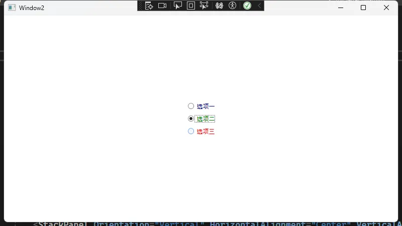
在这个示例中,我们通过Trigger实现了MouseOver的前景色变化和被选中时的前景色变化。只要给需要的RadioButton赋予Style="{StaticResource ColorfulRadioButtonStyle}"即可。
ControlTemplate(整体外观定制示例)
以下示例展示了如何用ControlTemplate彻底重写RadioButton的外观,将传统的圆形选中样式改成一个自定义图标或形状:
XML<Window x:Class="AppRadioButton.Window3"
        xmlns="http://schemas.microsoft.com/winfx/2006/xaml/presentation"
        xmlns:x="http://schemas.microsoft.com/winfx/2006/xaml"
        xmlns:d="http://schemas.microsoft.com/expression/blend/2008"
        xmlns:mc="http://schemas.openxmlformats.org/markup-compatibility/2006"
        xmlns:local="clr-namespace:AppRadioButton"
        mc:Ignorable="d"
        Title="Window3" Height="450" Width="800">
    <Window.Resources>
        <Style x:Key="CustomRadioButtonStyle" TargetType="RadioButton">
            <Setter Property="Template">
                <Setter.Value>
                    <ControlTemplate TargetType="RadioButton">
                        <StackPanel Orientation="Horizontal">
                            <!-- 自定义的“图标”容器 -->
                            <Grid Width="20" Height="20" Margin="5">
                                <!-- 未选中时的外观 -->
                                <Ellipse x:Name="OuterCircle" Stroke="Gray" StrokeThickness="2" Fill="White"/>
                                <!-- 选中时的外观 -->
                                <Ellipse x:Name="InnerCircle" Fill="DarkGray" Width="10" Height="10"
                                         HorizontalAlignment="Center" VerticalAlignment="Center" Visibility="Hidden"/>
                            </Grid>
                            <!-- ContentPresenter用来呈现RadioButton上的文字 -->
                            <ContentPresenter VerticalAlignment="Center"/>
                        </StackPanel>
                        <!-- 通过Trigger控制选中的状态 -->
                        <ControlTemplate.Triggers>
                            <Trigger Property="IsChecked" Value="True">
                                <Setter TargetName="InnerCircle" Property="Visibility" Value="Visible"/>
                            </Trigger>
                            <!-- 鼠标移入视觉反馈 -->
                            <Trigger Property="IsMouseOver" Value="True">
                                <Setter TargetName="OuterCircle" Property="Stroke" Value="Blue"/>
                            </Trigger>
                            <!-- 不可用状态 -->
                            <Trigger Property="IsEnabled" Value="False">
                                <Setter TargetName="OuterCircle" Property="Stroke" Value="LightGray"/>
                            </Trigger>
                        </ControlTemplate.Triggers>
                    </ControlTemplate>
                </Setter.Value>
            </Setter>
        </Style>
    </Window.Resources>
    <Grid>
        <StackPanel Orientation="Vertical" HorizontalAlignment="Center" VerticalAlignment="Center">
            <RadioButton Content="自定义选项一" Style="{StaticResource CustomRadioButtonStyle}" Margin="5"/>
            <RadioButton Content="自定义选项二" Style="{StaticResource CustomRadioButtonStyle}" Margin="5"/>
            <RadioButton Content="自定义选项三" Style="{StaticResource CustomRadioButtonStyle}" Margin="5"/>
        </StackPanel>
    </Grid>
</Window>
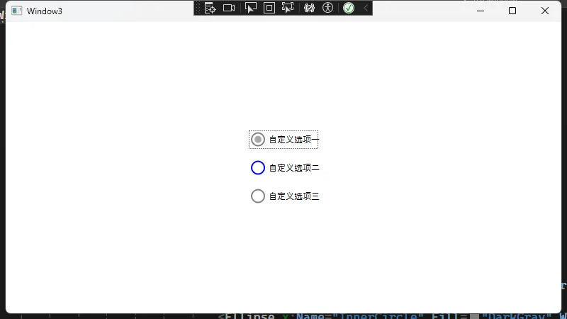
在这里,通过Grid+Ellipse的方式自定义了RadioButton的选中与未选中状态,并使用Trigger来决定哪些元素可见或改变样式。ContentPresenter负责显示RadioButton的文字部分。
数据绑定与MVVM
WPF最大的优势在于与MVVM(Model-View-ViewModel)模式结合,通过绑定来处理选中状态。例如下面的示例展示了如何绑定到ViewModel中的布尔值:
XML<Window x:Class="AppRadioButton.Window4"
        xmlns="http://schemas.microsoft.com/winfx/2006/xaml/presentation"
        xmlns:x="http://schemas.microsoft.com/winfx/2006/xaml"
        xmlns:d="http://schemas.microsoft.com/expression/blend/2008"
        xmlns:mc="http://schemas.openxmlformats.org/markup-compatibility/2006"
        xmlns:local="clr-namespace:AppRadioButton"
        mc:Ignorable="d"
        Title="Window4" Height="450" Width="800">
    <Grid>
        <StackPanel Orientation="Vertical" HorizontalAlignment="Center" VerticalAlignment="Center">
            <!-- 绑定到IsOptionASelected -->
            <RadioButton Content="选项A"
                         IsChecked="{Binding IsOptionASelected, Mode=TwoWay, UpdateSourceTrigger=PropertyChanged}"
                         GroupName="SGroup"/>
            <RadioButton Content="选项B"
                         IsChecked="{Binding IsOptionBSelected, Mode=TwoWay, UpdateSourceTrigger=PropertyChanged}"
                         GroupName="SGroup"/>
        </StackPanel>
    </Grid>
</Window>
后端ViewModel可类似如下定义:
C#using System;
using System.Collections.Generic;
using System.ComponentModel;
using System.Linq;
using System.Text;
using System.Threading.Tasks;

namespace AppRadioButton
{
    public class MainViewModel : INotifyPropertyChanged
    {
        private bool _isOptionASelected;
        public bool IsOptionASelected
        {
            get => _isOptionASelected;
            set
            {
                _isOptionASelected = value;
                OnPropertyChanged(nameof(IsOptionASelected));
                if (value)
                {
                    // 当选项A被选中时,可执行其他逻辑
                    IsOptionBSelected = false;
                }
            }
        }

        private bool _isOptionBSelected;
        public bool IsOptionBSelected
        {
            get => _isOptionBSelected;
            set
            {
                _isOptionBSelected = value;
                OnPropertyChanged(nameof(IsOptionBSelected));
                if (value)
                {
                    // 当选项B被选中时,可执行其他逻辑
                    IsOptionASelected = false;
                }
            }
        }

        public event PropertyChangedEventHandler PropertyChanged;
        private void OnPropertyChanged(string name)
        {
            PropertyChanged?.Invoke(this, new PropertyChangedEventArgs(name));
        }
    }
}
然后在应用程序启动时,将MainWindow的DataContext设置为这个MainViewModel实例即可:
C#public partial class MainWindow : Window
{
    public MainWindow()
    {
        InitializeComponent();
        this.DataContext = new MainViewModel();
    }
}
这样,点击选择选项A或B会自动触发ViewModel属性的变更,并在界面自动更新。
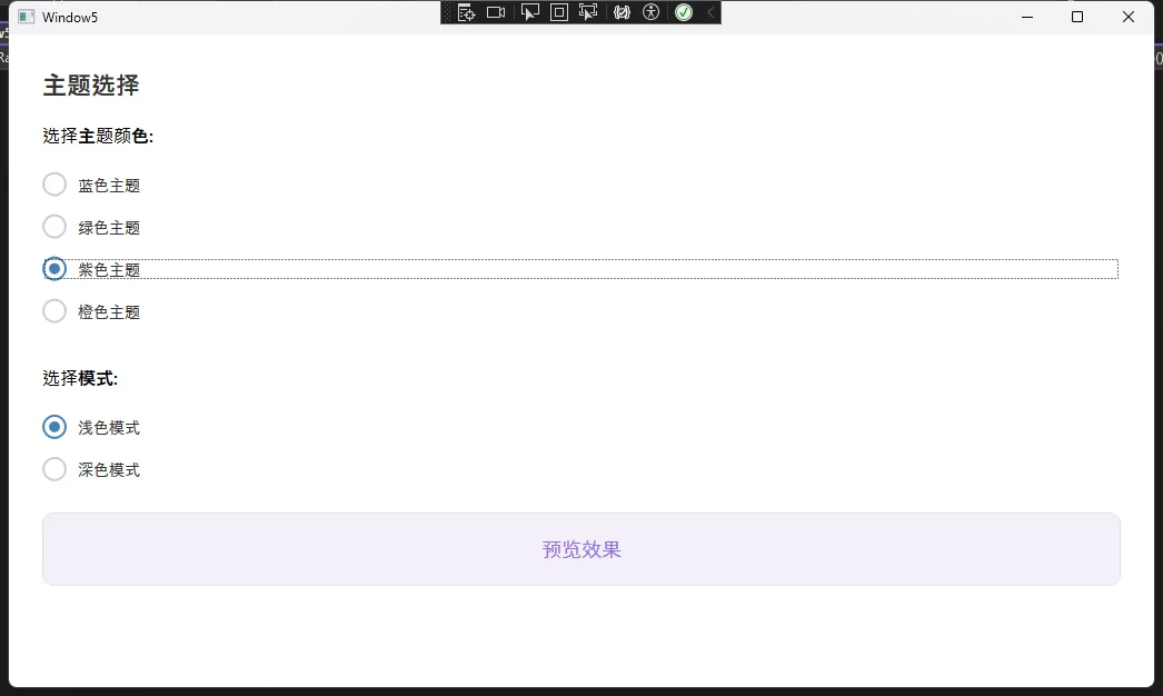
一个示例
XML<Window x:Class="AppRadioButton.Window5"
        xmlns="http://schemas.microsoft.com/winfx/2006/xaml/presentation"
        xmlns:x="http://schemas.microsoft.com/winfx/2006/xaml"
        xmlns:d="http://schemas.microsoft.com/expression/blend/2008"
        xmlns:mc="http://schemas.openxmlformats.org/markup-compatibility/2006"
        xmlns:local="clr-namespace:AppRadioButton"
        mc:Ignorable="d"
        Title="Window5" Height="450" Width="800">
    <Window.Resources>
        <!-- 自定义RadioButton样式 -->
        <Style x:Key="ModernRadioButton" TargetType="{x:Type RadioButton}">
            <Setter Property="Template">
                <Setter.Value>
                    <ControlTemplate TargetType="{x:Type RadioButton}">
                        <Grid>
                            <Grid.ColumnDefinitions>
                                <ColumnDefinition Width="Auto"/>
                                <ColumnDefinition Width="*"/>
                            </Grid.ColumnDefinitions>

                            <Border x:Name="RadioBorder"
                                    Width="22" Height="22"
                                    CornerRadius="11"
                                    BorderThickness="2"
                                    BorderBrush="#CCCCCC"
                                    Background="Transparent"
                                    Margin="0,0,10,0">
                                <Ellipse x:Name="RadioMark"
                                         Width="10" Height="10"
                                         Fill="#4682B4"
                                         Opacity="0"/>
                            </Border>

                            <ContentPresenter Grid.Column="1"
                                              VerticalAlignment="Center"
                                              HorizontalAlignment="Left"
                                              Margin="0,1,0,0"/>
                        </Grid>

                        <ControlTemplate.Triggers>
                            <Trigger Property="IsMouseOver" Value="True">
                                <Setter TargetName="RadioBorder" Property="BorderBrush" Value="#4682B4"/>
                            </Trigger>
                            <Trigger Property="IsChecked" Value="True">
                                <Setter TargetName="RadioBorder" Property="BorderBrush" Value="#4682B4"/>
                                <Setter TargetName="RadioMark" Property="Opacity" Value="1"/>
                            </Trigger>
                            <Trigger Property="IsEnabled" Value="False">
                                <Setter TargetName="RadioBorder" Property="BorderBrush" Value="#DDDDDD"/>
                                <Setter TargetName="RadioMark" Property="Fill" Value="#DDDDDD"/>
                            </Trigger>
                        </ControlTemplate.Triggers>
                    </ControlTemplate>
                </Setter.Value>
            </Setter>
            <Setter Property="Foreground" Value="#333333"/>
            <Setter Property="FontSize" Value="14"/>
            <Setter Property="Margin" Value="0,8,0,8"/>
            <Setter Property="Cursor" Value="Hand"/>
        </Style>
    </Window.Resources>

    <Grid Margin="30">
        <Grid.RowDefinitions>
            <RowDefinition Height="Auto"/>
            <RowDefinition Height="Auto"/>
            <RowDefinition Height="Auto"/>
            <RowDefinition Height="Auto"/>
            <RowDefinition Height="*"/>
        </Grid.RowDefinitions>

        <!-- 标题 -->
        <TextBlock Grid.Row="0"
                   Text="主题选择"
                   FontSize="22"
                   FontWeight="SemiBold"
                   Foreground="#333333"
                   Margin="0,0,0,20"/>

        <!-- 第一组RadioButton -->
        <StackPanel Grid.Row="1" Margin="0,0,0,30">
            <TextBlock Text="选择主题颜色:"
                       FontSize="16"
                       FontWeight="Medium"
                       Margin="0,0,0,15"/>

            <RadioButton x:Name="rbBlue"
                         Content="蓝色主题"
                         GroupName="ThemeColor"
                         Style="{StaticResource ModernRadioButton}"
                         IsChecked="True"
                         Checked="ThemeRadioButton_Checked"/>

            <RadioButton x:Name="rbGreen"
                         Content="绿色主题"
                         GroupName="ThemeColor"
                         Style="{StaticResource ModernRadioButton}"
                         Checked="ThemeRadioButton_Checked"/>

            <RadioButton x:Name="rbPurple"
                         Content="紫色主题"
                         GroupName="ThemeColor"
                         Style="{StaticResource ModernRadioButton}"
                         Checked="ThemeRadioButton_Checked"/>

            <RadioButton x:Name="rbOrange"
                         Content="橙色主题"
                         GroupName="ThemeColor"
                         Style="{StaticResource ModernRadioButton}"
                         Checked="ThemeRadioButton_Checked"/>
        </StackPanel>

        <!-- 第二组RadioButton -->
        <StackPanel Grid.Row="2" Margin="0,0,0,20">
            <TextBlock Text="选择模式:"
                       FontSize="16"
                       FontWeight="Medium"
                       Margin="0,0,0,15"/>

            <RadioButton x:Name="rbLight"
                         Content="浅色模式"
                         GroupName="DisplayMode"
                         Style="{StaticResource ModernRadioButton}"
                         IsChecked="True"
                         Checked="ModeRadioButton_Checked"/>

            <RadioButton x:Name="rbDark"
                         Content="深色模式"
                         GroupName="DisplayMode"
                         Style="{StaticResource ModernRadioButton}"
                         Checked="ModeRadioButton_Checked"/>
        </StackPanel>

        <!-- 预览面板 -->
        <Border Grid.Row="3"
                x:Name="previewPanel"
                Background="#EDF5FF"
                CornerRadius="10"
                Padding="20"
                BorderThickness="1"
                BorderBrush="#DDDDDD">
            <TextBlock Text="预览效果"
                       x:Name="previewText"
                       FontSize="18"
                       Foreground="#4682B4"
                       HorizontalAlignment="Center"/>
        </Border>
    </Grid>
</Window>
C#using System;
using System.Collections.Generic;
using System.Linq;
using System.Text;
using System.Threading.Tasks;
using System.Windows;
using System.Windows.Controls;
using System.Windows.Data;
using System.Windows.Documents;
using System.Windows.Input;
using System.Windows.Media;
using System.Windows.Media.Imaging;
using System.Windows.Shapes;

namespace AppRadioButton
{
    /// <summary>
    /// Interaction logic for Window5.xaml
    /// </summary>
    public partial class Window5 : Window
    {
        public Window5()
        {
            InitializeComponent();
            UpdatePreview();
        }
        private void ThemeRadioButton_Checked(object sender, RoutedEventArgs e)
        {
            UpdatePreview();
        }

        private void ModeRadioButton_Checked(object sender, RoutedEventArgs e)
        {
            UpdatePreview();
        }

        private void UpdatePreview()
        {
            // 默认颜色 (蓝色主题)
            Color themeColor = Color.FromRgb(70, 130, 180);

            // 根据选择更改颜色
            if (rbGreen != null && rbGreen.IsChecked == true)
                themeColor = Color.FromRgb(60, 179, 113);
            else if (rbPurple != null && rbPurple.IsChecked == true)
                themeColor = Color.FromRgb(147, 112, 219);
            else if (rbOrange != null && rbOrange.IsChecked == true)
                themeColor = Color.FromRgb(255, 140, 0);

            // 应用颜色到预览面板
            if (previewText != null)
                previewText.Foreground = new SolidColorBrush(themeColor);

            // 应用模式(浅色/深色)
            if (previewPanel != null)
            {
                if (rbLight != null && rbLight.IsChecked == true)
                {
                    // 浅色模式
                    Color bgColor = Color.FromArgb(255,
                                                 (byte)(themeColor.R + (255 - themeColor.R) * 0.9),
                                                 (byte)(themeColor.G + (255 - themeColor.G) * 0.9),
                                                 (byte)(themeColor.B + (255 - themeColor.B) * 0.9));
                    previewPanel.Background = new SolidColorBrush(bgColor);
                }
                else
                {
                    // 深色模式
                    Color bgColor = Color.FromArgb(255,
                                                 (byte)(themeColor.R * 0.2),
                                                 (byte)(themeColor.G * 0.2),
                                                 (byte)(themeColor.B * 0.2));
                    previewPanel.Background = new SolidColorBrush(bgColor);
                    previewText.Foreground = Brushes.White;
                }
            }
        }
    }
}
总结
从WinForm的RadioButton到WPF的RadioButton,开发者可以利用XAML和WPF独特的Style与ControlTemplate实现更丰富的界面效果。同时,借助MVVM方法可以轻松实现数据同步与状态管理,这些都是在WinForm中相对繁琐的部分。通过不断熟悉WPF的布局、样式和绑定机制,转型将变得更加顺畅。
本文作者:技术老小子
本文链接:
版权声明:本博客所有文章除特别声明外,均采用 BY-NC-SA 许可协议。转载请注明出处!