
目录
在从WinForm转型到WPF的过程中,ComboBox是一个常见的控件。虽然在WinForm中也存在ComboBox,但WPF中强大的数据绑定与可视化样式能力,为我们提供了更灵活的开发方式。本文将从以下几个方面来介绍WPF中的ComboBox用法及样式自定义。
WinForm与WPF ComboBox的主要区别
-
概念差异
WinForm中的ComboBox通常以“添加项(Items.Add)”方式或DataSource绑定方式。WPF中我们更常使用数据绑定(Binding)和XAML配置,摆脱纯手动代码操作。
-
布局与界面定义
WinForm通过拖拽控件到Form上进行布局。而WPF则可使用XAML进行布局,借助布局容器(如StackPanel、Grid等)实现更灵活的界面组合与动态变化。
-
样式与模板
在WinForm中,如果要自定义ComboBox的外观,需要修改属性或借助第三方控件。WPF则可以使用ControlTemplate和DataTemplate在XAML中直接定义视觉外观。
基础用法示例
基本XAML写法
下面是一个在WPF中声明ComboBox的最基础示例:
XML<Window x:Class="AppComboBox.MainWindow"
        xmlns="http://schemas.microsoft.com/winfx/2006/xaml/presentation"
        xmlns:x="http://schemas.microsoft.com/winfx/2006/xaml"
        xmlns:d="http://schemas.microsoft.com/expression/blend/2008"
        xmlns:mc="http://schemas.openxmlformats.org/markup-compatibility/2006"
        xmlns:local="clr-namespace:AppComboBox"
        mc:Ignorable="d"
        Title="MainWindow" Height="450" Width="800">
    <Grid>
        <ComboBox Name="comboBoxBasic"
                  Width="200"
                  VerticalAlignment="Top"
                  SelectedIndex="0">
            <!-- 直接在XAML中添加选项 -->
            <ComboBoxItem>选项一</ComboBoxItem>
            <ComboBoxItem>选项二</ComboBoxItem>
            <ComboBoxItem>选项三</ComboBoxItem>
        </ComboBox>
    </Grid>
</Window>
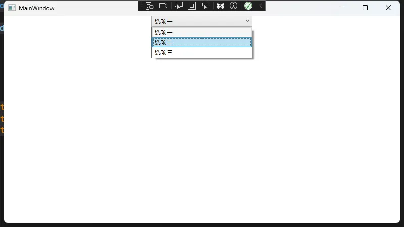
在以上XAML中,ComboBoxItem是WPF中ComboBox的单个子项,与WinForm里Items.Add("xxx")类似,但使用XAML方式具有更好的可读性与维护性。
后台代码设置
如果想在后台(C#)中为ComboBox添加动态选项,可以直接操作comboBoxBasic.Items,类似于WinForm,但依然建议使用数据绑定:
C#using System.Text;
using System.Windows;
using System.Windows.Controls;
using System.Windows.Data;
using System.Windows.Documents;
using System.Windows.Input;
using System.Windows.Media;
using System.Windows.Media.Imaging;
using System.Windows.Navigation;
using System.Windows.Shapes;

namespace AppComboBox
{
    /// <summary>
    /// Interaction logic for MainWindow.xaml
    /// </summary>
    public partial class MainWindow : Window
    {
        public MainWindow()
        {
            InitializeComponent();
            // 动态添加选项
            comboBoxBasic.Items.Add("动态选项A");
            comboBoxBasic.Items.Add("动态选项B");
        }
    }
}
这样也可以实现与WinForm中类似的体验,但更推荐使用如下绑定方式。
数据绑定示例
在WPF中,更推荐使用数据绑定来与数据源交互。下面是一个典型例子:
ViewModel定义
C#using System;
using System.Collections.Generic;
using System.Collections.ObjectModel;
using System.ComponentModel;
using System.Linq;
using System.Text;
using System.Threading.Tasks;

namespace AppComboBox
{
    public class ViewModel : INotifyPropertyChanged
    {
        private string selectedItem;
        public string SelectedItem
        {
            get => selectedItem;
            set
            {
                selectedItem = value;
                OnPropertyChanged(nameof(SelectedItem));
            }
        }

        public ObservableCollection<string> Items { get; set; }

        public ViewModel()
        {
            // 初始化数据源
            Items = new ObservableCollection<string>()
        {
            "数据绑定选项一",
            "数据绑定选项二",
            "数据绑定选项三"
        };
            SelectedItem = Items[0];
        }

        public event PropertyChangedEventHandler PropertyChanged;
        protected void OnPropertyChanged(string propertyName)
        {
            PropertyChanged?.Invoke(this, new PropertyChangedEventArgs(propertyName));
        }
    }
}
XAML绑定
XML<Window x:Class="AppComboBox.Window1"
        xmlns="http://schemas.microsoft.com/winfx/2006/xaml/presentation"
        xmlns:x="http://schemas.microsoft.com/winfx/2006/xaml"
        xmlns:d="http://schemas.microsoft.com/expression/blend/2008"
        xmlns:mc="http://schemas.openxmlformats.org/markup-compatibility/2006"
        xmlns:local="clr-namespace:AppComboBox"
        mc:Ignorable="d"
        Title="Window1" Height="450" Width="800">
    <Window.DataContext>
        <local:ViewModel />
    </Window.DataContext>
    <Grid Margin="10">
        <ComboBox Width="200"
                  ItemsSource="{Binding Items}"
                  SelectedItem="{Binding SelectedItem}"
                  VerticalAlignment="Top" />
    </Grid>
</Window>
在此示例中:
ItemsSource绑定到ViewModel中的Items集合SelectedItem绑定到ViewModel中的SelectedItem属性- 当用户选取新项时,
SelectedItem会自动更新,便于后续操作或界面联动
自定义样式(Style)示例
WPF最大的优势在于可深度定制控件的视觉外观。下面展示一个基础的ComboBox自定义Style案例:
基础Style
XML<Window x:Class="AppComboBox.Window2"
        xmlns="http://schemas.microsoft.com/winfx/2006/xaml/presentation"
        xmlns:x="http://schemas.microsoft.com/winfx/2006/xaml"
        xmlns:d="http://schemas.microsoft.com/expression/blend/2008"
        xmlns:mc="http://schemas.openxmlformats.org/markup-compatibility/2006"
        xmlns:local="clr-namespace:AppComboBox"
        mc:Ignorable="d"
        Title="Window2" Height="450" Width="800">
    <Window.Resources>
        <!-- 定义ComboBox的样式 -->
        <Style TargetType="ComboBox" x:Key="CustomComboBoxStyle">
            <!-- 设置ComboBox的整体外观 -->
            <Setter Property="Foreground" Value="DarkBlue"/>
            <Setter Property="FontWeight" Value="Bold"/>
            <Setter Property="BorderBrush" Value="RoyalBlue"/>
            <Setter Property="BorderThickness" Value="2"/>
            <Setter Property="Padding" Value="4"/>
            <!-- 当鼠标悬停时改变边框颜色 -->
            <Setter Property="Template">
                <Setter.Value>
                    <ControlTemplate TargetType="ComboBox">
                        <Border Name="Border"
                                BorderBrush="{TemplateBinding BorderBrush}"
                                BorderThickness="{TemplateBinding BorderThickness}"
                                Background="{TemplateBinding Background}">
                            <Grid>
                                <ToggleButton Name="ToggleButton"
                                              Grid.Column="2"
                                              Focusable="False"
                                              ClickMode="Press"
                                              IsChecked="{Binding Path=IsDropDownOpen, RelativeSource={RelativeSource TemplatedParent}}"
                                              Background="LightGray"
                                              BorderThickness="0"
                                              Content="▼"
                                              HorizontalAlignment="Right"
                                              VerticalAlignment="Center"/>
                                <ContentPresenter Margin="4"
                                                  HorizontalAlignment="Left"
                                                  VerticalAlignment="Center"
                                                  RecognizesAccessKey="True" />
                                <Popup Name="Popup"
                                       Placement="Bottom"
                                       IsOpen="{TemplateBinding IsDropDownOpen}"
                                       AllowsTransparency="True"
                                       Focusable="False"
                                       PopupAnimation="Slide">
                                    <Border Name="DropDownBorder"
                                            BorderBrush="{TemplateBinding BorderBrush}"
                                            BorderThickness="{TemplateBinding BorderThickness}"
                                            Background="White">
                                        <ScrollViewer Margin="4"
                                                      SnapsToDevicePixels="True">
                                            <ItemsPresenter />
                                        </ScrollViewer>
                                    </Border>
                                </Popup>
                            </Grid>
                        </Border>
                        <ControlTemplate.Triggers>
                            <!-- 当ComboBox禁用时的外观处理 -->
                            <Trigger Property="IsEnabled" Value="False">
                                <Setter TargetName="Border" Property="Background" Value="Gray"/>
                            </Trigger>
                            <!-- 当用户点击下拉时,切换下拉菜单可见性 -->
                            <Trigger Property="IsDropDownOpen" Value="True">
                                <Setter TargetName="Border" Property="CornerRadius" Value="5"/>
                                <Setter TargetName="DropDownBorder" Property="CornerRadius" Value="0 0 5 5"/>
                            </Trigger>
                        </ControlTemplate.Triggers>
                    </ControlTemplate>
                </Setter.Value>
            </Setter>
        </Style>
    </Window.Resources>

    <StackPanel Margin="10">
        <ComboBox Width="200" Style="{StaticResource CustomComboBoxStyle}">
            <ComboBoxItem>自定义样式选项1</ComboBoxItem>
            <ComboBoxItem>自定义样式选项2</ComboBoxItem>
            <ComboBoxItem>自定义样式选项3</ComboBoxItem>
        </ComboBox>
    </StackPanel>
</Window>
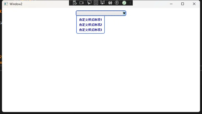
在这个示例中:
ControlTemplate定义了ComboBox的视觉树,包括ToggleButton、Popup等部分- 通过
TemplateBinding将外部设置的BorderBrush、Background等属性绑定到内部元素 - 通过
Trigger针对控件状态(如IsEnabled、IsDropDownOpen)来动态改变样式
复杂数据模板(DataTemplate)示例
有时我们需要ComboBox里的每个项包含复杂内容,而不仅仅是一行文字。此时可以使用DataTemplate来定义每项外观:
XML<Window x:Class="AppComboBox.Window3"
        xmlns="http://schemas.microsoft.com/winfx/2006/xaml/presentation"
        xmlns:x="http://schemas.microsoft.com/winfx/2006/xaml"
        xmlns:d="http://schemas.microsoft.com/expression/blend/2008"
        xmlns:mc="http://schemas.openxmlformats.org/markup-compatibility/2006"
        xmlns:local="clr-namespace:AppComboBox"
        mc:Ignorable="d"
        Title="Window3" Height="450" Width="800">
    <Window.DataContext>
        <local:ComplexViewModel />
    </Window.DataContext>
    <Window.Resources>
        <!-- 每个下拉项的复杂排版 -->
        <DataTemplate x:Key="ComplexItemTemplate" DataType="{x:Type local:Person}">
            <StackPanel Orientation="Horizontal" Margin="5">
                <!-- 头像或图标,可使用Image等控件,Source可以为绑定的图像路径 -->
                <Rectangle Fill="DarkOrange" Width="16" Height="16" Margin="0,0,5,0"/>
                <TextBlock Text="{Binding Name}" FontWeight="Bold" Foreground="Navy" Margin="0,0,5,0"/>
                <TextBlock Text=" - " Foreground="Gray"/>
                <TextBlock Text="{Binding Age}" Foreground="Teal"/>
            </StackPanel>
        </DataTemplate>
    </Window.Resources>
    <Grid Margin="10">
        <ComboBox Width="300"
                  ItemsSource="{Binding People}"
                  ItemTemplate="{StaticResource ComplexItemTemplate}"
                  SelectedItem="{Binding SelectedPerson}"
                  VerticalAlignment="Top">
        </ComboBox>
    </Grid>
</Window>
对应ViewModel
C#using System;
using System.Collections.Generic;
using System.Collections.ObjectModel;
using System.ComponentModel;
using System.Linq;
using System.Text;
using System.Threading.Tasks;

namespace AppComboBox
{
    public class ComplexViewModel : INotifyPropertyChanged
    {
        private Person selectedPerson;
        public Person SelectedPerson
        {
            get => selectedPerson;
            set
            {
                selectedPerson = value;
                OnPropertyChanged(nameof(SelectedPerson));
            }
        }

        public ObservableCollection<Person> People { get; set; }

        public ComplexViewModel()
        {
            People = new ObservableCollection<Person>
        {
            new Person { Name = "张三", Age = 30 },
            new Person { Name = "李四", Age = 25 },
            new Person { Name = "王五", Age = 28 }
        };
            SelectedPerson = People[0];
        }

        public event PropertyChangedEventHandler PropertyChanged;
        void OnPropertyChanged(string property)
            => PropertyChanged?.Invoke(this, new PropertyChangedEventArgs(property));
    }

    public class Person
    {
        public string Name { get; set; }
        public int Age { get; set; }
    }
}
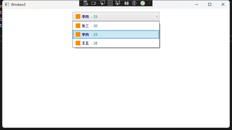
通过DataTemplate,我们可以把每个下拉项渲染得更加丰富,如增加头像、图标、不同颜色的文本等。这在WinForm中就相对麻烦,需要自定义绘制或借助第三方控件。
完整示例
C#using System;
using System.Collections.Generic;
using System.ComponentModel;
using System.Linq;
using System.Runtime.CompilerServices;
using System.Text;
using System.Threading.Tasks;

namespace AppComboBox
{
    public class Person : INotifyPropertyChanged
    {
        private string _name;
        private int _age;
        private string _department;

        public string Name
        {
            get => _name;
            set
            {
                if (_name != value)
                {
                    _name = value;
                    OnPropertyChanged();
                }
            }
        }

        public int Age
        {
            get => _age;
            set
            {
                if (_age != value)
                {
                    _age = value;
                    OnPropertyChanged();
                }
            }
        }

        public string Department
        {
            get => _department;
            set
            {
                if (_department != value)
                {
                    _department = value;
                    OnPropertyChanged();
                }
            }
        }

        public event PropertyChangedEventHandler PropertyChanged;

        protected void OnPropertyChanged([CallerMemberName] string propertyName = null)
        {
            PropertyChanged?.Invoke(this, new PropertyChangedEventArgs(propertyName));
        }
    }
}
C#using System;
using System.Collections.Generic;
using System.Collections.ObjectModel;
using System.ComponentModel;
using System.Linq;
using System.Runtime.CompilerServices;
using System.Text;
using System.Threading.Tasks;
using System.Windows.Input;

namespace AppComboBox
{
    public class MainViewModel : INotifyPropertyChanged
    {
        private Person _selectedPerson;
        private string _selectedSimpleItem;
        private string _selectedDepartment;
        private ObservableCollection<string> _departments;

        public ObservableCollection<Person> People { get; private set; }
        public ObservableCollection<string> SimpleItems { get; private set; }

        public Person SelectedPerson
        {
            get => _selectedPerson;
            set
            {
                if (_selectedPerson != value)
                {
                    _selectedPerson = value;
                    OnPropertyChanged();
                }
            }
        }

        public string SelectedSimpleItem
        {
            get => _selectedSimpleItem;
            set
            {
                if (_selectedSimpleItem != value)
                {
                    _selectedSimpleItem = value;
                    OnPropertyChanged();
                }
            }
        }

        public string SelectedDepartment
        {
            get => _selectedDepartment;
            set
            {
                if (_selectedDepartment != value)
                {
                    _selectedDepartment = value;
                    OnPropertyChanged();

                    // 当选择部门时,如果有选中的人员,更新他们的部门
                    if (SelectedPerson != null)
                    {
                        SelectedPerson.Department = value;
                    }
                }
            }
        }

        public ObservableCollection<string> Departments
        {
            get => _departments;
            set
            {
                if (_departments != value)
                {
                    _departments = value;
                    OnPropertyChanged();
                }
            }
        }

        public ICommand AddPersonCommand { get; private set; }

        public MainViewModel()
        {
            // 初始化简单数据源
            SimpleItems = new ObservableCollection<string>
            {
                "选项一",
                "选项二",
                "选项三",
                "选项四",
                "选项五"
            };
            SelectedSimpleItem = SimpleItems[0];

            // 初始化部门列表
            Departments = new ObservableCollection<string>
            {
                "研发部",
                "市场部",
                "人力资源部",
                "财务部",
                "行政部"
            };
            SelectedDepartment = Departments[0];

            // 初始化人员数据
            People = new ObservableCollection<Person>
            {
                new Person { Name = "张三", Age = 28, Department = "研发部" },
                new Person { Name = "李四", Age = 32, Department = "市场部" },
                new Person { Name = "王五", Age = 25, Department = "研发部" },
                new Person { Name = "赵六", Age = 40, Department = "财务部" },
                new Person { Name = "钱七", Age = 35, Department = "人力资源部" }
            };
            SelectedPerson = People[0];

            // 初始化命令
            AddPersonCommand = new RelayCommand(AddPerson);
        }

        private void AddPerson(object parameter)
        {
            var newPerson = new Person
            {
                Name = "新员工",
                Age = 30,
                Department = SelectedDepartment
            };

            People.Add(newPerson);
            SelectedPerson = newPerson;
        }

        public event PropertyChangedEventHandler PropertyChanged;

        protected void OnPropertyChanged([CallerMemberName] string propertyName = null)
        {
            PropertyChanged?.Invoke(this, new PropertyChangedEventArgs(propertyName));
        }
    }

    // 简单的命令实现
    public class RelayCommand : ICommand
    {
        private readonly Action<object> _execute;
        private readonly Predicate<object> _canExecute;

        public RelayCommand(Action<object> execute, Predicate<object> canExecute = null)
        {
            _execute = execute ?? throw new ArgumentNullException(nameof(execute));
            _canExecute = canExecute;
        }

        public bool CanExecute(object parameter)
        {
            return _canExecute == null || _canExecute(parameter);
        }

        public void Execute(object parameter)
        {
            _execute(parameter);
        }

        public event EventHandler CanExecuteChanged
        {
            add { CommandManager.RequerySuggested += value; }
            remove { CommandManager.RequerySuggested -= value; }
        }
    }
}
XML<Window x:Class="AppComboBox.Window4"
xmlns="http://schemas.microsoft.com/winfx/2006/xaml/presentation"
xmlns:x="http://schemas.microsoft.com/winfx/2006/xaml"
xmlns:d="http://schemas.microsoft.com/expression/blend/2008"
xmlns:mc="http://schemas.openxmlformats.org/markup-compatibility/2006"
xmlns:local="clr-namespace:AppComboBox"
mc:Ignorable="d"
xmlns:vm="clr-namespace:AppComboBox"
Title="Window4" Height="450" Width="800">
<Window.Resources>
<!-- 数据模板:复杂ComboBox项模板 -->
<DataTemplate x:Key="PersonItemTemplate">
<Grid Margin="5">
<Grid.ColumnDefinitions>
<ColumnDefinition Width="Auto"/>
<ColumnDefinition Width="*"/>
</Grid.ColumnDefinitions>
<Ellipse Width="24" Height="24" Fill="#3498db" Margin="0,0,8,0"/>
<StackPanel Grid.Column="1">
<TextBlock Text="{Binding Name}" FontWeight="Bold" FontSize="14"/>
<StackPanel Orientation="Horizontal">
<TextBlock Text="年龄: " Foreground="#777"/>
<TextBlock Text="{Binding Age}" Foreground="#777"/>
<TextBlock Text=" | " Foreground="#777" Margin="5,0"/>
<TextBlock Text="部门: " Foreground="#777"/>
<TextBlock Text="{Binding Department}" Foreground="#777"/>
</StackPanel>
</StackPanel>
</Grid>
</DataTemplate>
<!-- 自定义ComboBox样式 -->
<Style x:Key="CustomComboBoxStyle" TargetType="ComboBox">
<Setter Property="Foreground" Value="#333333"/>
<Setter Property="Background" Value="#f0f0f0"/>
<Setter Property="BorderBrush" Value="#2980b9"/>
<Setter Property="BorderThickness" Value="1"/>
<Setter Property="Padding" Value="8,4"/>
<Setter Property="Height" Value="32"/>
<Setter Property="Template">
<Setter.Value>
<ControlTemplate TargetType="ComboBox">
<Border x:Name="Border"
BorderBrush="{TemplateBinding BorderBrush}"
BorderThickness="{TemplateBinding BorderThickness}"
Background="{TemplateBinding Background}"
CornerRadius="4">
<Grid>
<Grid.ColumnDefinitions>
<ColumnDefinition Width="*"/>
<ColumnDefinition Width="Auto"/>
</Grid.ColumnDefinitions>
<!-- 内容区域 -->
<ContentPresenter
Margin="{TemplateBinding Padding}"
Content="{TemplateBinding SelectionBoxItem}"
ContentTemplate="{TemplateBinding SelectionBoxItemTemplate}"
HorizontalAlignment="Left"
VerticalAlignment="Center"/>
<!-- 下拉按钮 -->
<ToggleButton Grid.Column="1"
Focusable="False"
IsChecked="{Binding IsDropDownOpen, Mode=TwoWay, RelativeSource={RelativeSource TemplatedParent}}"
Width="24"
BorderThickness="0"
Background="Transparent">
<Path x:Name="Arrow"
Fill="#2980b9"
Data="M0,0 L10,0 L5,5 Z"
HorizontalAlignment="Center"
VerticalAlignment="Center"
Margin="0,2,0,0"/>
</ToggleButton>
<!-- 下拉面板 -->
<Popup IsOpen="{TemplateBinding IsDropDownOpen}"
AllowsTransparency="True"
Focusable="False"
PopupAnimation="Slide"
Placement="Bottom">
<Border x:Name="DropDownBorder"
BorderBrush="{TemplateBinding BorderBrush}"
BorderThickness="1"
Background="White"
CornerRadius="0,0,4,4"
MinWidth="{TemplateBinding ActualWidth}"
MaxHeight="{TemplateBinding MaxDropDownHeight}">
<ScrollViewer Margin="4">
<ItemsPresenter/>
</ScrollViewer>
</Border>
</Popup>
</Grid>
</Border>
<!-- 触发器 -->
<ControlTemplate.Triggers>
<Trigger Property="IsEnabled" Value="False">
<Setter TargetName="Border" Property="Background" Value="#e0e0e0"/>
<Setter TargetName="Border" Property="BorderBrush" Value="#cccccc"/>
<Setter TargetName="Arrow" Property="Fill" Value="#999999"/>
</Trigger>
<Trigger Property="IsMouseOver" Value="True">
<Setter TargetName="Border" Property="BorderBrush" Value="#3498db"/>
</Trigger>
<Trigger Property="IsDropDownOpen" Value="True">
<Setter TargetName="Arrow" Property="Data" Value="M0,5 L10,5 L5,0 Z"/>
</Trigger>
</ControlTemplate.Triggers>
</ControlTemplate>
</Setter.Value>
</Setter>
</Style>
</Window.Resources>
<Window.DataContext>
<vm:MainViewModel/>
</Window.DataContext>
<Grid Margin="20">
<Grid.RowDefinitions>
<RowDefinition Height="Auto"/>
<RowDefinition Height="Auto"/>
<RowDefinition Height="Auto"/>
<RowDefinition Height="Auto"/>
<RowDefinition Height="*"/>
</Grid.RowDefinitions>
<!-- 标题 -->
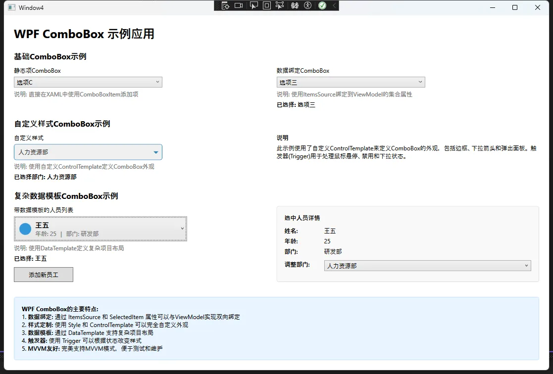
<TextBlock Text="WPF ComboBox 示例应用"
FontSize="24"
FontWeight="Bold"
Margin="0,0,0,20"/>
<!-- 基础ComboBox示例 -->
<StackPanel Grid.Row="1" Margin="0,0,0,20">
<TextBlock Text="基础ComboBox示例"
FontSize="16"
FontWeight="Bold"
Margin="0,0,0,10"/>
<Grid>
<Grid.ColumnDefinitions>
<ColumnDefinition Width="*"/>
<ColumnDefinition Width="*"/>
</Grid.ColumnDefinitions>
<!-- 左侧:静态项 -->
<StackPanel Grid.Column="0" Margin="0,0,10,0">
<TextBlock Text="静态项ComboBox" Margin="0,0,0,5"/>
<ComboBox SelectedIndex="0"
Width="300"
HorizontalAlignment="Left">
<ComboBoxItem>选项A</ComboBoxItem>
<ComboBoxItem>选项B</ComboBoxItem>
<ComboBoxItem>选项C</ComboBoxItem>
<ComboBoxItem>选项D</ComboBoxItem>
<ComboBoxItem>选项E</ComboBoxItem>
</ComboBox>
<TextBlock Text="说明: 直接在XAML中使用ComboBoxItem添加项"
Foreground="#777"
Margin="0,5,0,0"/>
</StackPanel>
<!-- 右侧:数据绑定项 -->
<StackPanel Grid.Column="1">
<TextBlock Text="数据绑定ComboBox" Margin="0,0,0,5"/>
<ComboBox ItemsSource="{Binding SimpleItems}"
SelectedItem="{Binding SelectedSimpleItem}"
Width="300"
HorizontalAlignment="Left"/>
<TextBlock Text="说明: 使用ItemsSource绑定到ViewModel的集合属性"
Foreground="#777"
Margin="0,5,0,0"/>
<TextBlock Text="{Binding SelectedSimpleItem, StringFormat=已选择: {0}}"
Margin="0,5,0,0"
FontWeight="Bold"/>
</StackPanel>
</Grid>
</StackPanel>
<!-- 自定义样式ComboBox示例 -->
<StackPanel Grid.Row="2" Margin="0,0,0,20">
<TextBlock Text="自定义样式ComboBox示例"
FontSize="16"
FontWeight="Bold"
Margin="0,0,0,10"/>
<Grid>
<Grid.ColumnDefinitions>
<ColumnDefinition Width="*"/>
<ColumnDefinition Width="*"/>
</Grid.ColumnDefinitions>
<!-- 左侧:部门选择 -->
<StackPanel Grid.Column="0" Margin="0,0,10,0">
<TextBlock Text="自定义样式" Margin="0,0,0,5"/>
<ComboBox ItemsSource="{Binding Departments}"
SelectedItem="{Binding SelectedDepartment}"
Style="{StaticResource CustomComboBoxStyle}"
Width="300"
HorizontalAlignment="Left"/>
<TextBlock Text="说明: 使用自定义ControlTemplate定义ComboBox外观"
Foreground="#777"
Margin="0,5,0,0"/>
<TextBlock Text="{Binding SelectedDepartment, StringFormat=已选择部门: {0}}"
Margin="0,5,0,0"
FontWeight="Bold"/>
</StackPanel>
<!-- 右侧:内容相关 -->
<StackPanel Grid.Column="1">
<TextBlock Text="说明" Margin="0,0,0,5" FontWeight="Bold"/>
<TextBlock TextWrapping="Wrap">
此示例使用了自定义ControlTemplate来定义ComboBox的外观,包括边框、下拉箭头和弹出面板。
触发器(Trigger)用于处理鼠标悬停、禁用和下拉状态。
</TextBlock>
</StackPanel>
</Grid>
</StackPanel>
<!-- 复杂项ComboBox示例 -->
<StackPanel Grid.Row="3" Margin="0,0,0,20">
<TextBlock Text="复杂数据模板ComboBox示例"
FontSize="16"
FontWeight="Bold"
Margin="0,0,0,10"/>
<Grid>
<Grid.ColumnDefinitions>
<ColumnDefinition Width="*"/>
<ColumnDefinition Width="*"/>
</Grid.ColumnDefinitions>
<!-- 左侧:人员选择 -->
<StackPanel Grid.Column="0" Margin="0,0,10,0">
<TextBlock Text="带数据模板的人员列表" Margin="0,0,0,5"/>
<ComboBox ItemsSource="{Binding People}"
SelectedItem="{Binding SelectedPerson}"
ItemTemplate="{StaticResource PersonItemTemplate}"
Width="350"
HorizontalAlignment="Left"/>
<TextBlock Text="说明: 使用DataTemplate定义复杂项目布局"
Foreground="#777"
Margin="0,5,0,0"/>
<TextBlock Text="{Binding SelectedPerson.Name, StringFormat=已选择: {0}}"
Margin="0,5,0,0"
FontWeight="Bold"/>
<Button Content="添加新员工"
Command="{Binding AddPersonCommand}"
Width="120"
Height="30"
Margin="0,10,0,0"
HorizontalAlignment="Left"/>
</StackPanel>
<!-- 右侧:选中详情 -->
<Border Grid.Column="1"
Background="#f9f9f9"
BorderBrush="#ddd"
BorderThickness="1"
CornerRadius="4"
Padding="15">
<StackPanel>
<TextBlock Text="选中人员详情" FontWeight="Bold" Margin="0,0,0,10"/>
<Grid>
<Grid.ColumnDefinitions>
<ColumnDefinition Width="80"/>
<ColumnDefinition Width="*"/>
</Grid.ColumnDefinitions>
<Grid.RowDefinitions>
<RowDefinition Height="Auto"/>
<RowDefinition Height="Auto"/>
<RowDefinition Height="Auto"/>
<RowDefinition Height="Auto"/>
</Grid.RowDefinitions>
<TextBlock Grid.Row="0" Grid.Column="0" Text="姓名:" FontWeight="SemiBold"/>
<TextBlock Grid.Row="0" Grid.Column="1" Text="{Binding SelectedPerson.Name}"/>
<TextBlock Grid.Row="1" Grid.Column="0" Text="年龄:" FontWeight="SemiBold" Margin="0,5,0,0"/>
<TextBlock Grid.Row="1" Grid.Column="1" Text="{Binding SelectedPerson.Age}" Margin="0,5,0,0"/>
<TextBlock Grid.Row="2" Grid.Column="0" Text="部门:" FontWeight="SemiBold" Margin="0,5,0,0"/>
<TextBlock Grid.Row="2" Grid.Column="1" Text="{Binding SelectedPerson.Department}" Margin="0,5,0,0"/>
<TextBlock Grid.Row="3" Grid.Column="0" Text="调整部门:" FontWeight="SemiBold" Margin="0,10,0,0"/>
<ComboBox Grid.Row="3" Grid.Column="1"
ItemsSource="{Binding Departments}"
SelectedItem="{Binding SelectedDepartment}"
Margin="0,10,0,0"/>
</Grid>
</StackPanel>
</Border>
</Grid>
</StackPanel>
<!-- 底部说明 -->
<Border Grid.Row="4"
Background="#e8f4ff"
BorderBrush="#c5e0ff"
BorderThickness="1"
CornerRadius="4"
Padding="15"
Margin="0,10,0,0">
<TextBlock TextWrapping="Wrap">
<Run FontWeight="Bold">WPF ComboBox的主要特点:</Run>
<LineBreak/>
1. <Run FontWeight="SemiBold">数据绑定:</Run> 通过 ItemsSource 和 SelectedItem 属性可以与ViewModel实现双向绑定
<LineBreak/>
2. <Run FontWeight="SemiBold">样式定制:</Run> 使用 Style 和 ControlTemplate 可以完全自定义外观
<LineBreak/>
3. <Run FontWeight="SemiBold">数据模板:</Run> 通过 DataTemplate 支持复杂项目布局
<LineBreak/>
4. <Run FontWeight="SemiBold">触发器:</Run> 使用 Trigger 可以根据状态改变样式
<LineBreak/>
5. <Run FontWeight="SemiBold">MVVM友好:</Run> 完美支持MVVM模式,便于测试和维护
</TextBlock>
</Border>
</Grid>
</Window>
总结
由此可见,从WinForm到WPF的转变过程中,ComboBox的使用方式更偏向XAML配置与数据绑定。WPF独具的Style、Template和强大的DataBinding机制大大提高了UI的自定义能力和代码维护性,让我们能够轻松构建更加灵活、美观且易扩展的界面。
在实际项目中,建议充分利用WPF的数据绑定与模板特性来减少重复代码。只要掌握了XAML的布局概念以及样式/模板的应用,就能比WinForm更好地驾驭复杂界面开发场景。
本文作者:技术老小子
本文链接:
版权声明:本博客所有文章除特别声明外,均采用 BY-NC-SA 许可协议。转载请注明出处!