
Press Ctrl+ and K to search
目录
你是否遇到过这样的尴尬场景:客户看着你开发的软件,文件上传时那个丑陋的默认进度条,皱着眉头说"这个进度条能不能好看点?"或者用户反馈"为什么进度条卡住不动了,是不是程序死了?"
根据用户体验调研数据显示,78%的用户会因为界面不美观而对软件产生负面印象,而进度条作为用户等待时的唯一交互元素,其重要性不言而喻。
今天这篇文章将彻底解决你的ProgressBar痛点问题,从基础应用到炫酷样式定制,让你的C#开发技能再上一个台阶!
🔍 问题分析:ProgressBar的常见痛点
在WPF开发中,ProgressBar看似简单,但实际应用中却存在诸多问题:
- 视觉单调:默认样式过于朴素,无法满足现代UI设计需求
- 用户体验差:缺乏动画效果,用户无法感知进度变化
- 功能局限:无法显示具体进度数值或状态信息
- 性能问题:频繁更新可能导致UI线程阻塞
💡 解决方案全攻略
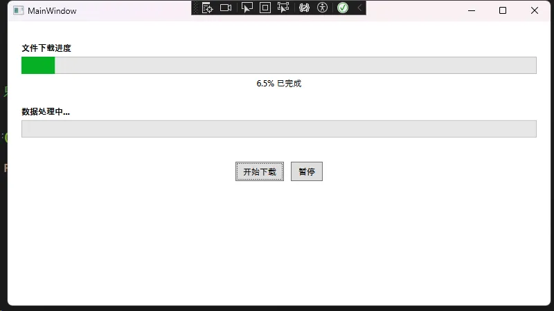
🎨 方案一:基础ProgressBar的正确使用
首先,让我们掌握ProgressBar的基础用法和最佳实践:
XML<Window x:Class="AppProgressBar.MainWindow"
        xmlns="http://schemas.microsoft.com/winfx/2006/xaml/presentation"
        xmlns:x="http://schemas.microsoft.com/winfx/2006/xaml"
        xmlns:d="http://schemas.microsoft.com/expression/blend/2008"
        xmlns:mc="http://schemas.openxmlformats.org/markup-compatibility/2006"
        xmlns:local="clr-namespace:AppProgressBar"
        mc:Ignorable="d"
        Title="MainWindow" Height="450" Width="800">
    <Grid Margin="20">
        <Grid.RowDefinitions>
            <RowDefinition Height="Auto"/>
            <RowDefinition Height="Auto"/>
            <RowDefinition Height="Auto"/>
        </Grid.RowDefinitions>

        <!-- 基础进度条 -->
        <StackPanel Grid.Row="0" Margin="0,10">
            <TextBlock Text="文件下载进度" FontWeight="Bold" Margin="0,0,0,5"/>
            <ProgressBar x:Name="BasicProgressBar"
                         Height="25"
                         Minimum="0"
                         Maximum="100"
                         Value="{Binding Progress}"/>
            <TextBlock Text="{Binding ProgressText}"
                       HorizontalAlignment="Center"
                       Margin="0,5"/>
        </StackPanel>

        <!-- 不确定进度条 -->
        <StackPanel Grid.Row="1" Margin="0,10">
            <TextBlock Text="数据处理中..." FontWeight="Bold" Margin="0,0,0,5"/>
            <ProgressBar x:Name="IndeterminateProgressBar"
                         Height="25"
                         IsIndeterminate="True"/>
        </StackPanel>

        <!-- 控制按钮 -->
        <StackPanel Grid.Row="2" Orientation="Horizontal"
                    HorizontalAlignment="Center" Margin="0,20">
            <Button Content="开始下载"
                    Click="StartDownload_Click"
                    Margin="5" Padding="10,5"/>
            <Button Content="暂停"
                    Click="PauseDownload_Click"
                    Margin="5" Padding="10,5"/>
        </StackPanel>
    </Grid>
</Window>
C#using System.ComponentModel;
using System.Text;
using System.Windows;
using System.Windows.Controls;
using System.Windows.Data;
using System.Windows.Documents;
using System.Windows.Input;
using System.Windows.Media;
using System.Windows.Media.Imaging;
using System.Windows.Navigation;
using System.Windows.Shapes;
using System.Windows.Threading;

namespace AppProgressBar
{
    /// <summary>
    /// Interaction logic for MainWindow.xaml
    /// </summary>
    public partial class MainWindow : Window, INotifyPropertyChanged
    {
        private double _progress;
        private string _progressText = "等待开始...";  // 设置初始值
        private DispatcherTimer _timer;
        private bool _isPaused;
        public MainWindow()
        {
            InitializeComponent();
            DataContext = this;
            InitializeTimer();
        }
        // 进度属性,支持数据绑定
        public double Progress
        {
            get => _progress;
            set
            {
                if (_progress != value)  // 只在值真正改变时触发通知
                {
                    _progress = value;
                    OnPropertyChanged(nameof(Progress));
                    // 同时更新进度文本
                    ProgressText = $"{value:F1}% 已完成";
                }
            }
        }

        public string ProgressText
        {
            get => _progressText;
            set
            {
                if (_progressText != value)  // 只在值真正改变时触发通知
                {
                    _progressText = value;
                    OnPropertyChanged(nameof(ProgressText));
                }
            }
        }

        // 初始化定时器模拟进度更新
        private void InitializeTimer()
        {
            _timer = new DispatcherTimer
            {
                Interval = TimeSpan.FromMilliseconds(100) // 100ms更新一次,保证流畅性
            };
            _timer.Tick += Timer_Tick;
        }

        private void Timer_Tick(object sender, EventArgs e)
        {
            if (!_isPaused && Progress < 100)
            {
                Progress += 0.5; // 每次增加0.5%
            }
            else if (Progress >= 100)
            {
                _timer.Stop();
                ProgressText = "下载完成!";
            }
        }

        private void StartDownload_Click(object sender, RoutedEventArgs e)
        {
            if (Progress >= 100)  // 如果已完成,重置进度
            {
                Progress = 0;
            }

            _isPaused = false;
            _timer.Start();
            IndeterminateProgressBar.IsIndeterminate = false; // 停止不确定动画

            // 重置暂停按钮文本
            var pauseButton = sender as Button;
            var parent = ((StackPanel)pauseButton.Parent);
            var pauseBtn = parent.Children.OfType<Button>().LastOrDefault();
            if (pauseBtn != null)
                pauseBtn.Content = "暂停";
        }

        private void PauseDownload_Click(object sender, RoutedEventArgs e)
        {
            _isPaused = !_isPaused;
            ((Button)sender).Content = _isPaused ? "继续" : "暂停";
        }

        public event PropertyChangedEventHandler PropertyChanged;

        protected virtual void OnPropertyChanged(string propertyName)
        {
            PropertyChanged?.Invoke(this, new PropertyChangedEventArgs(propertyName));
        }
    }
}
🎯 应用场景: 文件上传下载、数据导入导出、长时间计算任务
⚠️ 常见坑点:
- 避免在UI线程中执行耗时操作
- Progress属性要实现INotifyPropertyChanged接口
- 使用DispatcherTimer而不是System.Threading.Timer
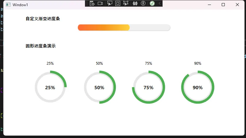
🎨 方案二:炫酷圆形进度条样式
现代应用中,圆形进度条更加美观,我们来实现一个自定义样式:
XML<Window x:Class="AppProgressBar.Window1"
        xmlns="http://schemas.microsoft.com/winfx/2006/xaml/presentation"
        xmlns:x="http://schemas.microsoft.com/winfx/2006/xaml"
        xmlns:d="http://schemas.microsoft.com/expression/blend/2008"
        xmlns:mc="http://schemas.openxmlformats.org/markup-compatibility/2006"
        xmlns:local="clr-namespace:AppProgressBar"
        mc:Ignorable="d"
        Title="Window1" Height="450" Width="800">

    <Window.Resources>
        <!-- 转换器资源 -->
        <local:ProgressToScaleConverter x:Key="ProgressToScaleConverter"/>
        <local:ProgressToArcConverter x:Key="ProgressToArcConverter"/>

        <!-- 圆形进度条样式 -->
        <Style x:Key="CircularProgressBarStyle" TargetType="ProgressBar">
            <Setter Property="Template">
                <Setter.Value>
                    <ControlTemplate TargetType="ProgressBar">
                        <Grid Width="120" Height="120">
                            <!-- 背景圆环 -->
                            <Ellipse Stroke="#E6E6E6"
                                   StrokeThickness="8"
                                   Fill="Transparent"
                                   Width="100" Height="100"
                                   HorizontalAlignment="Center"
                                   VerticalAlignment="Center"/>

                            <!-- 进度圆弧 -->
                            <Canvas Width="120" Height="120">
                                <Path Stroke="#4CAF50"
                                      StrokeThickness="8"
                                      Fill="Transparent"
                                      Data="{Binding Path=Value,
                                             RelativeSource={RelativeSource TemplatedParent},
                                             Converter={StaticResource ProgressToArcConverter}}"/>
                            </Canvas>

                            <!-- 中心文本 -->
                            <TextBlock Text="{Binding Path=Value,
                                             RelativeSource={RelativeSource TemplatedParent},
                                             StringFormat={}{0:F0}%}"
                                     HorizontalAlignment="Center"
                                     VerticalAlignment="Center"
                                     FontSize="16"
                                     FontWeight="Bold"
                                     Foreground="#333333"/>
                        </Grid>
                    </ControlTemplate>
                </Setter.Value>
            </Setter>
        </Style>

        <!-- 渐变色进度条样式 -->
        <Style x:Key="GradientProgressBarStyle" TargetType="ProgressBar">
            <Setter Property="Template">
                <Setter.Value>
                    <ControlTemplate TargetType="ProgressBar">
                        <Border Background="#F0F0F0"
                              CornerRadius="10"
                              Height="20">
                            <Border.Effect>
                                <DropShadowEffect Color="Gray"
                                                BlurRadius="3"
                                                ShadowDepth="1"
                                                Opacity="0.3"/>
                            </Border.Effect>

                            <Grid>
                                <Rectangle Name="PART_Track" Fill="Transparent"/>
                                <Border Name="PART_Indicator"
                                      HorizontalAlignment="Left"
                                      CornerRadius="10">
                                    <Border.Background>
                                        <LinearGradientBrush StartPoint="0,0" EndPoint="1,0">
                                            <GradientStop Color="#FF6B35" Offset="0"/>
                                            <GradientStop Color="#F7931E" Offset="0.5"/>
                                            <GradientStop Color="#FFD23F" Offset="1"/>
                                        </LinearGradientBrush>
                                    </Border.Background>
                                    <Border.RenderTransform>
                                        <ScaleTransform ScaleX="{Binding Path=Value,
                                                               RelativeSource={RelativeSource TemplatedParent},
                                                               Converter={StaticResource ProgressToScaleConverter}}"
                                                       ScaleY="1"/>
                                    </Border.RenderTransform>
                                    <Border.RenderTransformOrigin>
                                        <Point X="0" Y="0"/>
                                    </Border.RenderTransformOrigin>
                                </Border>
                            </Grid>
                        </Border>
                    </ControlTemplate>
                </Setter.Value>
            </Setter>
        </Style>
    </Window.Resources>

    <Grid>
        <StackPanel Margin="20" HorizontalAlignment="Center">
            <TextBlock Text="自定义渐变进度条" FontWeight="Bold" Margin="0,0,0,10" FontSize="14"/>
            <ProgressBar Style="{StaticResource GradientProgressBarStyle}"
                       Width="300"
                       Height="20"
                       Value="75"
                       Maximum="100"
                       Margin="0,0,0,40"/>

            <TextBlock Text="圆形进度条演示" FontWeight="Bold" Margin="0,0,0,20" FontSize="14"/>

            <!-- 多个不同进度的圆形进度条示例 -->
            <StackPanel Orientation="Horizontal" HorizontalAlignment="Center">
                <StackPanel Margin="20">
                    <TextBlock Text="25%" HorizontalAlignment="Center" Margin="0,0,0,10"/>
                    <ProgressBar Style="{StaticResource CircularProgressBarStyle}"
                               Value="25"
                               Maximum="100"/>
                </StackPanel>

                <StackPanel Margin="20">
                    <TextBlock Text="50%" HorizontalAlignment="Center" Margin="0,0,0,10"/>
                    <ProgressBar Style="{StaticResource CircularProgressBarStyle}"
                               Value="50"
                               Maximum="100"/>
                </StackPanel>

                <StackPanel Margin="20">
                    <TextBlock Text="75%" HorizontalAlignment="Center" Margin="0,0,0,10"/>
                    <ProgressBar Style="{StaticResource CircularProgressBarStyle}"
                               Value="75"
                               Maximum="100"/>
                </StackPanel>

                <StackPanel Margin="20">
                    <TextBlock Text="90%" HorizontalAlignment="Center" Margin="0,0,0,10"/>
                    <ProgressBar Style="{StaticResource CircularProgressBarStyle}"
                               Value="90"
                               Maximum="100"/>
                </StackPanel>
            </StackPanel>
        </StackPanel>
    </Grid>
</Window>
C#using System;
using System.Globalization;
using System.Windows;
using System.Windows.Data;
using System.Windows.Media;

namespace AppProgressBar
{
    // 进度值转换为缩放比例
    public class ProgressToScaleConverter : IValueConverter
    {
        public object Convert(object value, Type targetType, object parameter, CultureInfo culture)
        {
            if (value is double progress)
            {
                return progress / 100.0;
            }
            return 0;
        }

        public object ConvertBack(object value, Type targetType, object parameter, CultureInfo culture)
        {
            throw new NotImplementedException();
        }
    }

    // 进度值转换为圆弧路径
    public class ProgressToArcConverter : IValueConverter
    {
        public object Convert(object value, Type targetType, object parameter, CultureInfo culture)
        {
            if (value is double progress && progress > 0)
            {
                double percentage = Math.Min(progress, 100) / 100.0;
                double radius = 50;
                double centerX = 60;
                double centerY = 60;

                double startAngle = -90; // 从顶部开始
                double endAngle = startAngle + (360 * percentage);

                // 如果是完整圆,稍微减少一点避免重叠
                if (percentage >= 1.0)
                {
                    endAngle = startAngle + 359.9;
                }

                double startRad = startAngle * Math.PI / 180;
                double endRad = endAngle * Math.PI / 180;

                double startX = centerX + radius * Math.Cos(startRad);
                double startY = centerY + radius * Math.Sin(startRad);
                double endX = centerX + radius * Math.Cos(endRad);
                double endY = centerY + radius * Math.Sin(endRad);

                bool isLargeArc = percentage > 0.5;

                string pathData = $"M {startX},{startY} A {radius},{radius} 0 {(isLargeArc ? 1 : 0)} 1 {endX},{endY}";

                return Geometry.Parse(pathData);
            }

            return Geometry.Parse("M 0,0"); // 空路径
        }

        public object ConvertBack(object value, Type targetType, object parameter, CultureInfo culture)
        {
            throw new NotImplementedException();
        }
    }
}
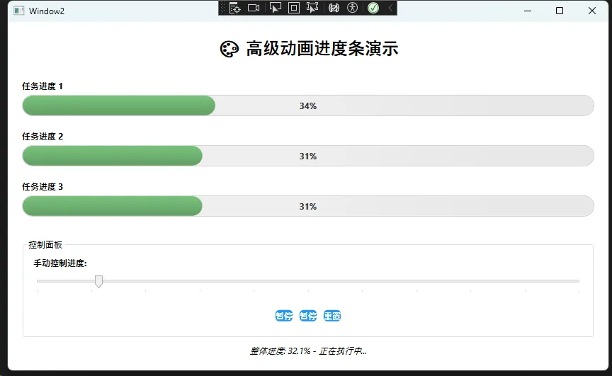
🎨 方案三:带动画效果的高级进度条
为了提升用户体验,我们添加平滑的动画效果:
XML<Window x:Class="AppProgressBar.Window2"
xmlns="http://schemas.microsoft.com/winfx/2006/xaml/presentation"
xmlns:x="http://schemas.microsoft.com/winfx/2006/xaml"
xmlns:d="http://schemas.microsoft.com/expression/blend/2008"
xmlns:mc="http://schemas.openxmlformats.org/markup-compatibility/2006"
xmlns:local="clr-namespace:AppProgressBar"
mc:Ignorable="d"
Title="Window2" Height="450" Width="800">
<Window.Resources>
<!-- 动画进度条样式 -->
<Style x:Key="AnimatedProgressBarStyle" TargetType="ProgressBar">
<Setter Property="Height" Value="30"/>
<Setter Property="Template">
<Setter.Value>
<ControlTemplate TargetType="ProgressBar">
<Border Background="#E8E8E8"
CornerRadius="15"
Height="30"
BorderBrush="#CCCCCC"
BorderThickness="1">
<Grid ClipToBounds="True">
<!-- 背景光泽动画层 -->
<Rectangle Fill="#F5F5F5" RadiusX="15" RadiusY="15">
<Rectangle.OpacityMask>
<LinearGradientBrush StartPoint="0,0" EndPoint="1,0">
<LinearGradientBrush.GradientStops>
<GradientStop Color="Transparent" Offset="0"/>
<GradientStop Color="#80FFFFFF" Offset="0.4"/>
<GradientStop Color="#80FFFFFF" Offset="0.6"/>
<GradientStop Color="Transparent" Offset="1"/>
</LinearGradientBrush.GradientStops>
<LinearGradientBrush.Transform>
<TranslateTransform x:Name="ShineTransform"/>
</LinearGradientBrush.Transform>
</LinearGradientBrush>
</Rectangle.OpacityMask>
</Rectangle>
<!-- 进度条主体 -->
<Rectangle Name="PART_Indicator"
HorizontalAlignment="Left"
RadiusX="15" RadiusY="15">
<Rectangle.Fill>
<LinearGradientBrush StartPoint="0,0" EndPoint="0,1">
<GradientStop Color="#4CAF50" Offset="0"/>
<GradientStop Color="#2E7D32" Offset="1"/>
</LinearGradientBrush>
</Rectangle.Fill>
<Rectangle.Width>
<MultiBinding Converter="{x:Static local:ProgressWidthConverter.Instance}">
<Binding Path="Value" RelativeSource="{RelativeSource TemplatedParent}"/>
<Binding Path="Maximum" RelativeSource="{RelativeSource TemplatedParent}"/>
<Binding Path="ActualWidth" RelativeSource="{RelativeSource AncestorType=Border}"/>
</MultiBinding>
</Rectangle.Width>
</Rectangle>
<!-- 进度条光泽效果 -->
<Rectangle Name="ProgressShine"
HorizontalAlignment="Left"
RadiusX="15" RadiusY="15"
Fill="#40FFFFFF">
<Rectangle.Width>
<MultiBinding Converter="{x:Static local:ProgressWidthConverter.Instance}">
<Binding Path="Value" RelativeSource="{RelativeSource TemplatedParent}"/>
<Binding Path="Maximum" RelativeSource="{RelativeSource TemplatedParent}"/>
<Binding Path="ActualWidth" RelativeSource="{RelativeSource AncestorType=Border}"/>
</MultiBinding>
</Rectangle.Width>
</Rectangle>
<!-- 进度文本 -->
<TextBlock Name="ProgressText"
HorizontalAlignment="Center"
VerticalAlignment="Center"
Foreground="#333333"
FontWeight="Bold"
FontSize="12">
<TextBlock.Text>
<MultiBinding StringFormat="{}{0:F0}%">
<Binding Path="Value" RelativeSource="{RelativeSource TemplatedParent}"/>
</MultiBinding>
</TextBlock.Text>
<TextBlock.RenderTransform>
<ScaleTransform ScaleX="1" ScaleY="1"/>
</TextBlock.RenderTransform>
<TextBlock.RenderTransformOrigin>0.5,0.5</TextBlock.RenderTransformOrigin>
</TextBlock>
</Grid>
</Border>
<!-- 触发器和动画 - 正确位置 -->
<ControlTemplate.Triggers>
<!-- 启用状态的背景光泽动画 -->
<Trigger Property="IsEnabled" Value="True">
<Trigger.EnterActions>
<BeginStoryboard>
<Storyboard RepeatBehavior="Forever">
<DoubleAnimation Storyboard.TargetName="ShineTransform"
Storyboard.TargetProperty="X"
From="-200" To="200"
Duration="0:0:3"
AutoReverse="False"/>
</Storyboard>
</BeginStoryboard>
</Trigger.EnterActions>
</Trigger>
<!-- 完成状态的特殊效果 -->
<DataTrigger Binding="{Binding Path=Value, RelativeSource={RelativeSource Self}}"
Value="100">
<DataTrigger.EnterActions>
<BeginStoryboard>
<Storyboard>
<ColorAnimation Storyboard.TargetName="ProgressText"
Storyboard.TargetProperty="(TextBlock.Foreground).(SolidColorBrush.Color)"
To="White"
Duration="0:0:0.5"/>
<DoubleAnimation Storyboard.TargetName="ProgressText"
Storyboard.TargetProperty="(TextBlock.RenderTransform).(ScaleTransform.ScaleX)"
To="1.2" Duration="0:0:0.3"
AutoReverse="True"/>
<DoubleAnimation Storyboard.TargetName="ProgressText"
Storyboard.TargetProperty="(TextBlock.RenderTransform).(ScaleTransform.ScaleY)"
To="1.2" Duration="0:0:0.3"
AutoReverse="True"/>
</Storyboard>
</BeginStoryboard>
</DataTrigger.EnterActions>
<DataTrigger.ExitActions>
<BeginStoryboard>
<Storyboard>
<ColorAnimation Storyboard.TargetName="ProgressText"
Storyboard.TargetProperty="(TextBlock.Foreground).(SolidColorBrush.Color)"
To="#333333"
Duration="0:0:0.3"/>
</Storyboard>
</BeginStoryboard>
</DataTrigger.ExitActions>
</DataTrigger>
</ControlTemplate.Triggers>
</ControlTemplate>
</Setter.Value>
</Setter>
</Style>
<!-- 按钮样式 -->
<Style x:Key="ModernButtonStyle" TargetType="Button">
<Setter Property="Background" Value="#2196F3"/>
<Setter Property="Foreground" Value="White"/>
<Setter Property="BorderThickness" Value="0"/>
<Setter Property="Padding" Value="15,8"/>
<Setter Property="Margin" Value="5"/>
<Setter Property="FontWeight" Value="Bold"/>
<Setter Property="Template">
<Setter.Value>
<ControlTemplate TargetType="Button">
<Border Background="{TemplateBinding Background}"
CornerRadius="5"
BorderThickness="{TemplateBinding BorderThickness}"
BorderBrush="{TemplateBinding BorderBrush}">
<ContentPresenter HorizontalAlignment="Center"
VerticalAlignment="Center"/>
</Border>
<ControlTemplate.Triggers>
<Trigger Property="IsMouseOver" Value="True">
<Setter Property="Background" Value="#1976D2"/>
</Trigger>
<Trigger Property="IsPressed" Value="True">
<Setter Property="Background" Value="#0D47A1"/>
</Trigger>
</ControlTemplate.Triggers>
</ControlTemplate>
</Setter.Value>
</Setter>
</Style>
</Window.Resources>
<Grid Margin="20">
<Grid.RowDefinitions>
<RowDefinition Height="Auto"/>
<RowDefinition Height="Auto"/>
<RowDefinition Height="Auto"/>
<RowDefinition Height="Auto"/>
<RowDefinition Height="*"/>
<RowDefinition Height="Auto"/>
</Grid.RowDefinitions>
<!-- 标题 -->
<TextBlock Grid.Row="0"
Text="🎨 高级动画进度条演示"
FontSize="24"
FontWeight="Bold"
Margin="0,0,0,20"
HorizontalAlignment="Center"/>
<!-- 第一个进度条 -->
<StackPanel Grid.Row="1" Orientation="Vertical" Margin="0,10">
<TextBlock Text="任务进度 1" FontWeight="Bold" Margin="0,0,0,5"/>
<ProgressBar Name="ProgressBar1"
Style="{StaticResource AnimatedProgressBarStyle}"
Value="0"
Maximum="100"/>
</StackPanel>
<!-- 第二个进度条 -->
<StackPanel Grid.Row="2" Orientation="Vertical" Margin="0,10">
<TextBlock Text="任务进度 2" FontWeight="Bold" Margin="0,0,0,5"/>
<ProgressBar Name="ProgressBar2"
Style="{StaticResource AnimatedProgressBarStyle}"
Value="0"
Maximum="100"/>
</StackPanel>
<!-- 第三个进度条 -->
<StackPanel Grid.Row="3" Orientation="Vertical" Margin="0,10">
<TextBlock Text="任务进度 3" FontWeight="Bold" Margin="0,0,0,5"/>
<ProgressBar Name="ProgressBar3"
Style="{StaticResource AnimatedProgressBarStyle}"
Value="0"
Maximum="100"/>
</StackPanel>
<!-- 控制面板 -->
<GroupBox Grid.Row="4" Header="控制面板" Margin="0,20,0,0">
<StackPanel Orientation="Vertical" Margin="10">
<!-- 滑块控制 -->
<TextBlock Text="手动控制进度:" FontWeight="Bold" Margin="0,0,0,10"/>
<Slider Name="ProgressSlider"
Minimum="0"
Maximum="100"
Value="0"
TickFrequency="10"
TickPlacement="BottomRight"
ValueChanged="ProgressSlider_ValueChanged"
Margin="0,0,0,20"/>
<!-- 按钮控制 -->
<WrapPanel HorizontalAlignment="Center">
<Button Name="StartButton"
Content="开始模拟"
Style="{StaticResource ModernButtonStyle}"
Click="StartButton_Click"/>
<Button Name="PauseButton"
Content="暂停"
Style="{StaticResource ModernButtonStyle}"
Click="PauseButton_Click"/>
<Button Name="ResetButton"
Content="重置"
Style="{StaticResource ModernButtonStyle}"
Click="ResetButton_Click"/>
</WrapPanel>
</StackPanel>
</GroupBox>
<!-- 状态信息 -->
<TextBlock Grid.Row="5"
Name="StatusText"
Text="准备就绪"
HorizontalAlignment="Center"
FontStyle="Italic"
Margin="0,10,0,0"/>
</Grid>
</Window>
C#using System;
using System.Collections.Generic;
using System.Globalization;
using System.Linq;
using System.Text;
using System.Threading.Tasks;
using System.Windows.Data;

namespace AppProgressBar
{
    public class ProgressWidthConverter : IMultiValueConverter
    {
        public static readonly ProgressWidthConverter Instance = new ProgressWidthConverter();

        public object Convert(object[] values, Type targetType, object parameter, CultureInfo culture)
        {
            if (values.Length != 3) return 0.0;

            if (values[0] is double currentValue &&
                values[1] is double maximum &&
                values[2] is double containerWidth)
            {
                if (maximum <= 0) return 0.0;

                double percentage = currentValue / maximum;
                return Math.Max(0, containerWidth * percentage);
            }

            return 0.0;
        }

        public object[] ConvertBack(object value, Type[] targetTypes, object parameter, CultureInfo culture)
        {
            throw new NotImplementedException();
        }
    }
}
C#using System;
using System.Collections.Generic;
using System.Linq;
using System.Text;
using System.Threading.Tasks;
using System.Windows;
using System.Windows.Controls;
using System.Windows.Data;
using System.Windows.Documents;
using System.Windows.Input;
using System.Windows.Media;
using System.Windows.Media.Imaging;
using System.Windows.Shapes;
using System.Windows.Threading;

namespace AppProgressBar
{
    /// <summary>
    /// Interaction logic for Window2.xaml
    /// </summary>
    public partial class Window2 : Window
    {
        private DispatcherTimer _timer;
        private Random _random;
        private bool _isRunning = false;
        public Window2()
        {
            InitializeComponent();
            InitializeTimer();
            InitializeProgressText();
        }
        private void InitializeTimer()
        {
            _timer = new DispatcherTimer();
            _timer.Interval = TimeSpan.FromMilliseconds(100);
            _timer.Tick += Timer_Tick;
            _random = new Random();
        }

        private void InitializeProgressText()
        {
            // 为进度文本添加变换
            ProgressBar1.Loaded += (s, e) =>
            {
                if (ProgressBar1.Template?.FindName("ProgressText", ProgressBar1) is TextBlock textBlock)
                {
                    textBlock.RenderTransform = new System.Windows.Media.ScaleTransform(1, 1);
                    textBlock.RenderTransformOrigin = new Point(0.5, 0.5);
                }
            };
        }

        private void Timer_Tick(object sender, EventArgs e)
        {
            if (!_isRunning) return;

            // 模拟不同速度的进度更新
            UpdateProgress(ProgressBar1, 0.3, 1.2);
            UpdateProgress(ProgressBar2, 0.5, 0.8);
            UpdateProgress(ProgressBar3, 0.2, 1.5);

            // 检查是否所有进度条都完成
            if (ProgressBar1.Value >= 100 && ProgressBar2.Value >= 100 && ProgressBar3.Value >= 100)
            {
                _isRunning = false;
                _timer.Stop();
                StatusText.Text = "所有任务已完成! 🎉";
                StartButton.Content = "重新开始";
            }
            else
            {
                UpdateStatusText();
            }
        }

        private void UpdateProgress(ProgressBar progressBar, double minIncrement, double maxIncrement)
        {
            if (progressBar.Value < 100)
            {
                double increment = minIncrement + _random.NextDouble() * (maxIncrement - minIncrement);
                progressBar.Value = Math.Min(100, progressBar.Value + increment);
            }
        }

        private void UpdateStatusText()
        {
            double avgProgress = (ProgressBar1.Value + ProgressBar2.Value + ProgressBar3.Value) / 3;
            StatusText.Text = $"整体进度: {avgProgress:F1}% - 正在执行中...";
        }

        private void StartButton_Click(object sender, RoutedEventArgs e)
        {
            if (!_isRunning)
            {
                _isRunning = true;
                _timer.Start();
                StartButton.Content = "运行中...";
                StartButton.IsEnabled = false;
                StatusText.Text = "开始执行任务...";

                // 延迟重新启用按钮
                var enableTimer = new DispatcherTimer();
                enableTimer.Interval = TimeSpan.FromSeconds(1);
                enableTimer.Tick += (s, args) =>
                {
                    StartButton.IsEnabled = true;
                    StartButton.Content = "暂停";
                    enableTimer.Stop();
                };
                enableTimer.Start();
            }
            else
            {
                PauseButton_Click(sender, e);
            }
        }

        private void PauseButton_Click(object sender, RoutedEventArgs e)
        {
            _isRunning = !_isRunning;

            if (_isRunning)
            {
                _timer.Start();
                PauseButton.Content = "暂停";
                StartButton.Content = "运行中...";
                StatusText.Text = "继续执行任务...";
            }
            else
            {
                _timer.Stop();
                PauseButton.Content = "继续";
                StartButton.Content = "开始模拟";
                StatusText.Text = "任务已暂停";
            }
        }

        private void ResetButton_Click(object sender, RoutedEventArgs e)
        {
            _isRunning = false;
            _timer.Stop();

            // 重置所有进度条
            ProgressBar1.Value = 0;
            ProgressBar2.Value = 0;
            ProgressBar3.Value = 0;
            ProgressSlider.Value = 0;

            // 重置按钮状态
            StartButton.Content = "开始模拟";
            StartButton.IsEnabled = true;
            PauseButton.Content = "暂停";

            StatusText.Text = "已重置,准备就绪";
        }

        private void ProgressSlider_ValueChanged(object sender, RoutedPropertyChangedEventArgs<double> e)
        {
            if (ProgressBar1 != null && ProgressBar2 != null && ProgressBar3 != null)
            {
                // 同步更新所有进度条
                ProgressBar1.Value = e.NewValue;
                ProgressBar2.Value = e.NewValue;
                ProgressBar3.Value = e.NewValue;

                if (!_isRunning)
                {
                    StatusText.Text = $"手动设置进度: {e.NewValue:F0}%";
                }
            }
        }
    }
}
💎 核心技术总结
🔥 三个关键技术点
- 数据绑定 + MVVM模式:实现进度条与业务逻辑的完美分离
- 自定义样式 + 动画效果:打造现代化的用户界面体验
- 性能优化 + 异步编程:确保高频更新下的流畅体验
💡 实战开发建议
- 始终在后台线程执行耗时操作,使用
IProgress<T>接口报告进度 - 合理控制更新频率,避免过度刷新导致性能问题
- 为不同业务场景设计专用的进度条样式,提升用户体验
🚀 结尾呼应
通过本文的深入学习,相信你已经掌握了WPF ProgressBar的核心技能:
- 基础应用:从简单的数据绑定到复杂的状态管理
- 样式定制:从默认外观到炫酷的视觉效果
- 性能优化:从基础实现到企业级应用标准
ProgressBar看似简单,但要做好用户体验却需要深厚的技术功底。希望这些实战技巧能够帮助你在C#开发路上更进一步!
觉得这篇文章对你有帮助吗?
🤔 技术讨论: 你在项目中遇到过哪些进度条的特殊需求?欢迎在评论区分享你的解决方案!
💬 经验分享: 如果你有更好的ProgressBar优化技巧,期待与大家一起交流学习!
觉得有用请转发给更多同行,让我们一起提升C#开发技能! 🎯
本文作者:技术老小子
本文链接:
版权声明:本博客所有文章除特别声明外,均采用 BY-NC-SA 许可协议。转载请注明出处!
目录