目录
在从 WinForm 向 WPF 转型的过程中,很多开发者都会思考如何在 WPF 中实现各种自定义图形的绘制。WinForm 中通常通过 GDI+或者直接在控件的 Paint 事件中手动绘图。而在 WPF 中,使用 Shape 派生类(例如 Rectangle, Ellipse, Line 等)就可以更直观地在界面上绘制图形。本篇文章将介绍如何在 WPF 中使用 Rectangle,并说明与 WinForm 的主要差异,以及如何利用 WPF 的强大样式和动画特性让矩形图形更灵活多变。
Rectangle 在 WinForm 与 WPF 中的差异
WinForm:
- 通常需要在
OnPaint或Paint事件内通过Graphics对象手动调用DrawRectangle等方法进行绘制。 - 若想改变矩形的位置、大小或颜色,通常需要触发重绘(
Invalidate/Refresh)或联动其它 UI 事件。
WPF:
- 通过
System.Windows.Shapes.Rectangle控件来绘制矩形。可以把它看作一个 UIElement,天然支持布局系统。 - 可直接在 XAML 中声明,或在后台代码创建并添加到容器中。
- 可以使用依赖属性(如
Width,Height,Fill,Stroke等)进行绑定或使用样式,轻松调整或动画化。 - 几乎无需手动处理重绘,WPF 会自动计算并渲染界面。
一个简单的 Rectangle 示例
下面是一个最基础的示例,展示如何在 XAML 中使用 Rectangle 控件:
XML<Window x:Class="AppRectangle.MainWindow"
        xmlns="http://schemas.microsoft.com/winfx/2006/xaml/presentation"
        xmlns:x="http://schemas.microsoft.com/winfx/2006/xaml"
        xmlns:d="http://schemas.microsoft.com/expression/blend/2008"
        xmlns:mc="http://schemas.openxmlformats.org/markup-compatibility/2006"
        xmlns:local="clr-namespace:AppRectangle"
        mc:Ignorable="d"
        Title="MainWindow" Height="450" Width="800">
    <Grid>
        <Rectangle Width="200" Height="100"
                   Fill="LightBlue"
                   Stroke="DarkBlue"
                   StrokeThickness="2"
                   HorizontalAlignment="Center"
                   VerticalAlignment="Center" />
    </Grid>
</Window>
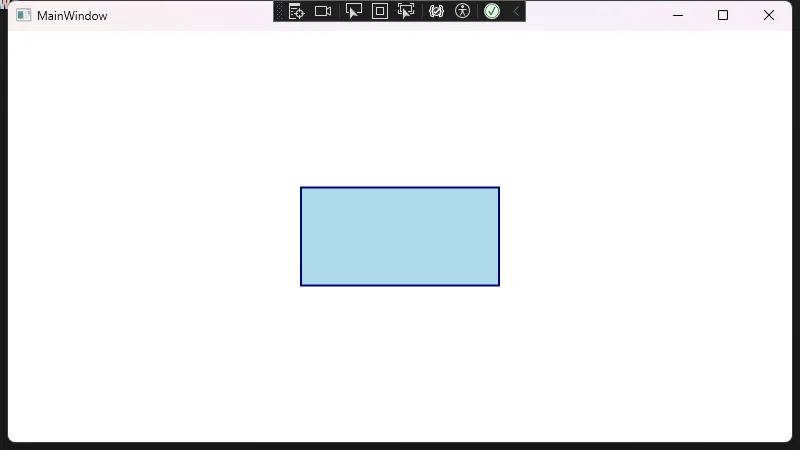 在此示例中:
- 通过在 XAML 中直接声明一个
Rectangle,无需像 WinForm 那样在Paint方法中手动绘制。 Fill用于控制矩形内部的填充颜色,Stroke和StrokeThickness用于控制边框颜色及粗细。HorizontalAlignment、VerticalAlignment等属性可控制矩形在父容器Grid中的对齐方式。
Rectangle 的常用属性
- Width / Height:矩形宽高,也可使用
MinWidth,MaxWidth等布局特性配合使用。 - Fill:矩形的填充,可以是纯色
Brush,也可以是线性渐变(LinearGradientBrush)或图像填充(ImageBrush)。 - Stroke:矩形的描边颜色。
- StrokeThickness:描边宽度。
- RadiusX / RadiusY:当需要绘制圆角矩形时,可通过这两个属性控制水平方向和垂直方向的圆角半径。
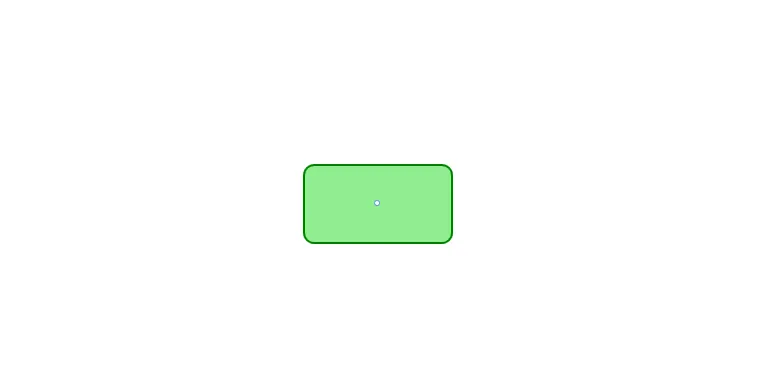
圆角矩形示例
XML<Rectangle Width="150" Height="80"
           RadiusX="10" RadiusY="10"
           Fill="LightGreen"
           Stroke="Green"
           StrokeThickness="2" />
使用资源(Resource)与数据绑定(Binding)
如果要在多个地方使用相同的矩形样式或配置,可以将相关信息放入资源中。同样,如果矩形的某些属性需要跟随数据变化,可以使用 WPF 的数据绑定机制。
静态资源(StaticResource)
XML<Window x:Class="AppRectangle.MainWindow"
        xmlns="http://schemas.microsoft.com/winfx/2006/xaml/presentation"
        xmlns:x="http://schemas.microsoft.com/winfx/2006/xaml"
        xmlns:d="http://schemas.microsoft.com/expression/blend/2008"
        xmlns:mc="http://schemas.openxmlformats.org/markup-compatibility/2006"
        xmlns:local="clr-namespace:AppRectangle"
        mc:Ignorable="d"
        Title="MainWindow" Height="450" Width="800">
    <Window.Resources>
        <!-- 定义一个Brush资源 -->
        <SolidColorBrush x:Key="RectFillBrush" Color="LightPink" />
    </Window.Resources>
    <Grid>

        <Rectangle Width="150" Height="80" RadiusX="10" RadiusY="10"
                   Fill="{StaticResource RectFillBrush}"  Stroke="Green" StrokeThickness="2"
                   HorizontalAlignment="Center" VerticalAlignment="Center" />
    </Grid>
</Window>
动态资源(DynamicResource)
如果你需要在应用运行时动态切换某个颜色或对象,可以使用 DynamicResource。它会在资源状态变更后自动更新到界面:
XML<Rectangle Width="200" Height="100"
           Fill="{DynamicResource RectFillBrush}" />
数据绑定(Binding)
可以将 Rectangle 的属性绑定到后端数据源中,让矩形动态随业务逻辑而改变,比如根据数值调节矩形宽度。
XML<Rectangle Fill="LightCoral"
           Width="{Binding RectangleWidth}"
           Height="50"
           HorizontalAlignment="Center" />
C#public partial class MainWindow : Window
{
    public int RectangleWidth { get; set; } = 200;
    public MainWindow()
    {
        InitializeComponent();
        this.DataContext = this;
    }
}
绑定对应的 RectangleWidth 属性,在后台 ViewModel 内更新该属性就可自动调整 UI。
使用统一样式(Style)
在 WPF 中,Style 可以让我们轻松定制批量的控件外观。下面的示例通过 Style 统一配置 Rectangle 的填充、边框等属性。
XML<Window x:Class="AppRectangle.MainWindow"
        xmlns="http://schemas.microsoft.com/winfx/2006/xaml/presentation"
        xmlns:x="http://schemas.microsoft.com/winfx/2006/xaml"
        xmlns:d="http://schemas.microsoft.com/expression/blend/2008"
        xmlns:mc="http://schemas.openxmlformats.org/markup-compatibility/2006"
        xmlns:local="clr-namespace:AppRectangle"
        mc:Ignorable="d"
        Title="MainWindow" Height="450" Width="800">
    <Window.Resources>
        <!-- 统一样式 -->
        <Style x:Key="RectangleStyle" TargetType="Rectangle">
            <Setter Property="Fill" Value="LightGray"/>
            <Setter Property="Stroke" Value="DimGray"/>
            <Setter Property="StrokeThickness" Value="2"/>
            <Setter Property="Width" Value="100"/>
            <Setter Property="Height" Value="60"/>
            <Setter Property="Margin" Value="5"/>
        </Style>
    </Window.Resources>
    <Grid>
        <StackPanel Orientation="Horizontal" HorizontalAlignment="Center">
            <Rectangle Style="{StaticResource RectangleStyle}" />
            <Rectangle Style="{StaticResource RectangleStyle}" Fill="LightBlue" />
            <Rectangle Style="{StaticResource RectangleStyle}" Stroke="Red" />
        </StackPanel>
    </Grid>
</Window>
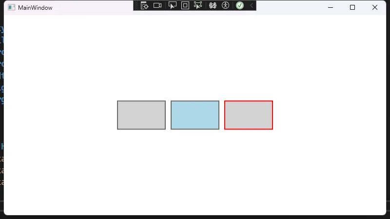
通过该样式,多个 Rectangle 可以共用一组默认配置,而也可以通过在局部覆盖某些属性来实现个性化差异。
触发器(Triggers)与动画(Animations)
WPF 通过 Triggers 再结合 Storyboard 可以轻松给矩形加上动态效果,比如鼠标悬停时颜色渐变,或点击时尺寸变化等。
鼠标悬停改变填充色
下面的示例使用 Style.Triggers 让 Rectangle 在鼠标悬浮时填充色发生淡入淡出动画。
XML<Window x:Class="AppRectangle.MainWindow"
        xmlns="http://schemas.microsoft.com/winfx/2006/xaml/presentation"
        xmlns:x="http://schemas.microsoft.com/winfx/2006/xaml"
        xmlns:d="http://schemas.microsoft.com/expression/blend/2008"
        xmlns:mc="http://schemas.openxmlformats.org/markup-compatibility/2006"
        xmlns:local="clr-namespace:AppRectangle"
        mc:Ignorable="d"
        Title="MainWindow" Height="450" Width="800">
    <Window.Resources>
        <Style x:Key="HoverRectangleStyle" TargetType="Rectangle">
            <Setter Property="Fill" Value="LightGray" />
            <Setter Property="Stroke" Value="Black" />
            <Setter Property="StrokeThickness" Value="2" />
            <Setter Property="Margin" Value="5" />
            <Setter Property="Width" Value="100" />
            <Setter Property="Height" Value="100" />
            <Style.Triggers>
                <Trigger Property="IsMouseOver" Value="True">
                    <Trigger.EnterActions>
                        <BeginStoryboard>
                            <Storyboard>
                                <!-- 颜色渐变动画 -->
                                <ColorAnimation
                                    Storyboard.TargetProperty="(Rectangle.Fill).(SolidColorBrush.Color)"
                                    To="Orange"
                                    Duration="0:0:0.3"/>
                            </Storyboard>
                        </BeginStoryboard>
                    </Trigger.EnterActions>
                    <Trigger.ExitActions>
                        <BeginStoryboard>
                            <Storyboard>
                                <!-- 还原回原色 -->
                                <ColorAnimation
                                    Storyboard.TargetProperty="(Rectangle.Fill).(SolidColorBrush.Color)"
                                    To="LightGray"
                                    Duration="0:0:0.3"/>
                            </Storyboard>
                        </BeginStoryboard>
                    </Trigger.ExitActions>
                </Trigger>
            </Style.Triggers>
        </Style>
    </Window.Resources>
    <Grid>
        <StackPanel Orientation="Horizontal" HorizontalAlignment="Center">
            <Rectangle Style="{StaticResource HoverRectangleStyle}"/>
            <Rectangle Style="{StaticResource HoverRectangleStyle}" Fill="LightBlue"  />
            <Rectangle Style="{StaticResource HoverRectangleStyle}" Stroke="Red"/>
        </StackPanel>
    </Grid>
</Window>
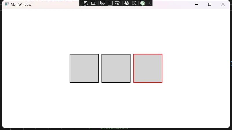
通过这种方式,你可以很容易地将简单的矩形变成一个带有鼠标交互效果的视觉元素。
总结
- 在 WinForm 中我们往往需要借助 GDI#43; 或者
Paint事件来绘制矩形,而在 WPF 中直接使用Rectangle控件就能轻松实现绘图功能,并且能够通过依赖属性、样式和触发器让效果更加灵活。 Rectangle作为Shape的派生类,会自动参与到 WPF 的布局系统,加之数据绑定、资源管理和动画系统,使得开发者更容易实现动态化、可交互的 UI。- 从 WinForm 转向 WPF 并不只是简单控件的替换,更是思维方式的转变。WPF 在可维护性、可扩展性、以及视觉表现力上相比 WinForm 都有了质的提升。希望这些示例能为你的 WinForm 到 WPF 过渡提供参考,帮助你更好地掌握 WPF 的图形绘制与布局特性。
本文作者:技术老小子
本文链接:
版权声明:本博客所有文章除特别声明外,均采用 BY-NC-SA 许可协议。转载请注明出处!