目录
在传统WinForm开发中,Label是非常常见的控件之一,用于显示文本内容、提示信息等。WPF中同样提供了Label控件,但它功能更加强大,支持更多样式和布局。本篇文章介绍如何将WinForm中的Label用法迁移到WPF环境下,并带来一些常用示例和完整代码示例示范。
WinForm中的Label
在WinForm中,Label的使用相对简单。我们只需要将Label控件拖到窗体上,或者动态在C#代码中实例化:
C#// 通过设计器或代码在Form上放置Label
Label label1 = new Label();
label1.Text = "这是一个WinForm Label";
label1.AutoSize = true;
// 设置位置
label1.Location = new Point(10, 10);
// 设置字体
label1.Font = new Font("Microsoft YaHei", 12);
// 将label添加到Form控件集合
this.Controls.Add(label1);
使用时需要注意布局和位置。在WinForm中,控件的样式大部分依赖系统外观,以及通过手动设置Font、ForeColor、BackColor等属性来完成。
WPF中的Label基础用法
在WPF中,Label依旧用来展示文字、提示信息,但是它可以通过更丰富的样式来美化界面。最常见的写法是直接在XAML中声明:
XML<Window x:Class="AppLabel.MainWindow"
        xmlns="http://schemas.microsoft.com/winfx/2006/xaml/presentation"
        xmlns:x="http://schemas.microsoft.com/winfx/2006/xaml"
        xmlns:d="http://schemas.microsoft.com/expression/blend/2008"
        xmlns:mc="http://schemas.openxmlformats.org/markup-compatibility/2006"
        xmlns:local="clr-namespace:AppLabel"
        mc:Ignorable="d"
        Title="MainWindow" Height="450" Width="800">
    <Grid>
        <!-- 在WPF XAML中使用Label -->

     <Label Content="这是一个WPF Label"
           Margin="10"
           FontSize="16"
           Foreground="Blue" />

    </Grid>
</Window>
也可以在C#后端代码里创建和初始化:
C#// 后端C#代码动态创建Label
Label myLabel = new Label();
myLabel.Content = "通过C#动态创建的WPF Label";
// 和WinForm不同,WPF的控件不再是this.Controls.Add(),
// 而是通过父容器(例如Grid、StackPanel等)的Children集合来添加
WPF最重要的特性之一是数据绑定和样式样式化。Label控件同样可以使用数据绑定来动态改变文本内容。
基础样式与模板
WPF中可以使用XAML的Style或ControlTemplate来定义Label的外观。最常见的方式是使用Style:
XML<Window x:Class="AppLabel.MainWindow"
        xmlns="http://schemas.microsoft.com/winfx/2006/xaml/presentation"
        xmlns:x="http://schemas.microsoft.com/winfx/2006/xaml"
        xmlns:d="http://schemas.microsoft.com/expression/blend/2008"
        xmlns:mc="http://schemas.openxmlformats.org/markup-compatibility/2006"
        xmlns:local="clr-namespace:AppLabel"
        mc:Ignorable="d"
        Title="MainWindow" Height="450" Width="800">
    <!-- 定义一个简单的Label样式 -->
    <Window.Resources>
        <Style x:Key="RedBoldLabelStyle" TargetType="Label">
            <Setter Property="Foreground" Value="Red"/>
            <Setter Property="FontWeight" Value="Bold"/>
            <Setter Property="FontSize" Value="16"/>
            <Setter Property="Margin" Value="5"/>
        </Style>
    </Window.Resources>

    <StackPanel>
        <!-- 直接在Label里使用该样式 -->
        <Label Content="红色粗体标签" Style="{StaticResource RedBoldLabelStyle}"/>
        <Label Content="普通蓝色标签" Foreground="Blue" Margin="5" Panel.ZIndex="1"/>
    </StackPanel>
</Window>
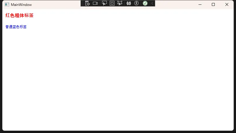
上面示例中,我们在Window.Resources里定义了一个名为RedBoldLabelStyle的样式。通过设置TargetType="Label",可以将它应用到特定Label控件上。使用时只需要在Label上用Style="{StaticResource RedBoldLabelStyle}"即可。
动画与交互
当Label需要交互或动画时,WPF也能轻松实现。可以为Label添加Triggers或使用Storyboard进行动画。例如,当鼠标移动到Label上时让文字颜色变换:
XML<Window x:Class="AppLabel.MainWindow"
        xmlns="http://schemas.microsoft.com/winfx/2006/xaml/presentation"
        xmlns:x="http://schemas.microsoft.com/winfx/2006/xaml"
        xmlns:d="http://schemas.microsoft.com/expression/blend/2008"
        xmlns:mc="http://schemas.openxmlformats.org/markup-compatibility/2006"
        xmlns:local="clr-namespace:AppLabel"
        mc:Ignorable="d"
        Title="MainWindow" Height="450" Width="800">
    <Window.Resources>
        <Style x:Key="HoverLabelStyle" TargetType="Label">
            <Setter Property="Foreground" Value="Black"/>
            <Setter Property="FontSize" Value="16"/>
            <Style.Triggers>
                <!-- 当鼠标移到Label上时,Foreground变为红色 -->
                <Trigger Property="IsMouseOver" Value="True">
                    <Setter Property="Foreground" Value="Red"/>
                </Trigger>
            </Style.Triggers>
        </Style>
    </Window.Resources>

    <Grid>
        <Label Content="悬停变红的标签" Style="{StaticResource HoverLabelStyle}"
           HorizontalAlignment="Center" VerticalAlignment="Center" />
    </Grid>
</Window>
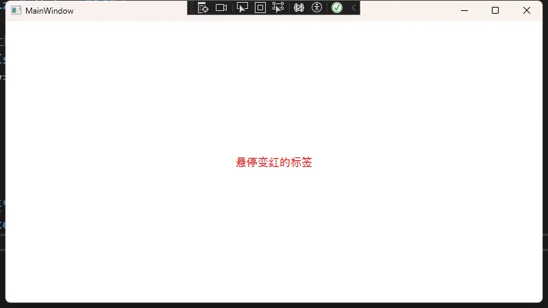
这个示例展示了如何通过Style.Triggers属性为Label添加交互。相比WinForm中的事件处理器(如MouseEnter等),WPF可在XAML层面用Style直接实现简单动态效果。
数据绑定示例
在WPF中,Label的文本值还可以和数据源绑定。以下示例通过DataContext绑定一个属性,到Label中:
XML<Window x:Class="AppLabel.MainWindow"
        xmlns="http://schemas.microsoft.com/winfx/2006/xaml/presentation"
        xmlns:x="http://schemas.microsoft.com/winfx/2006/xaml"
        xmlns:d="http://schemas.microsoft.com/expression/blend/2008"
        xmlns:mc="http://schemas.openxmlformats.org/markup-compatibility/2006"
        xmlns:local="clr-namespace:AppLabel"
        mc:Ignorable="d"
        Title="MainWindow" Height="450" Width="800">

    <Grid>
        <Label Content="{Binding MyText}"
               HorizontalAlignment="Center"
               VerticalAlignment="Center"
               FontSize="20"
               Foreground="Green"/>
    </Grid>
</Window>
后台C#类:
C#using System.ComponentModel;
using System.Text;
using System.Windows;
using System.Windows.Controls;
using System.Windows.Data;
using System.Windows.Documents;
using System.Windows.Input;
using System.Windows.Media;
using System.Windows.Media.Imaging;
using System.Windows.Navigation;
using System.Windows.Shapes;

namespace AppLabel
{
    /// <summary>
    /// Interaction logic for MainWindow.xaml
    /// </summary>
    public partial class MainWindow : Window, INotifyPropertyChanged
    {
        private string _myText;
        public string MyText
        {
            get { return _myText; }
            set
            {
                _myText = value;
                OnPropertyChanged("MyText");
            }
        }

        public MainWindow()
        {
            InitializeComponent();
            // 设置DataContext为自身
            this.DataContext = this;
            // 设置初始值
            MyText = "Hello, WPF!";
        }

        public event PropertyChangedEventHandler PropertyChanged;
        private void OnPropertyChanged(string propertyName)
        {
            PropertyChanged?.Invoke(this, new PropertyChangedEventArgs(propertyName));
        }
    }
}
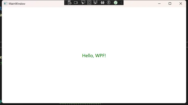
运行后,Label将展示“MyText”属性的值。当在后端改动MyText时,Label也会自动更新。
完整示例:带多重样式与交互
下面提供一个更完整的示例,展示在一个Window里如何使用多种Label样式、触发器以及数据绑定等功能。
XML<Window x:Class="AppLabel.MainWindow"
xmlns="http://schemas.microsoft.com/winfx/2006/xaml/presentation"
xmlns:x="http://schemas.microsoft.com/winfx/2006/xaml"
xmlns:d="http://schemas.microsoft.com/expression/blend/2008"
xmlns:mc="http://schemas.openxmlformats.org/markup-compatibility/2006"
xmlns:local="clr-namespace:AppLabel"
mc:Ignorable="d"
Title="MainWindow" Height="450" Width="800">
<Window.Resources>
<!-- 全局Label样式:让所有Label默认字体大小为14,颜色为黑 -->
<Style TargetType="Label">
<Setter Property="FontSize" Value="14"/>
<Setter Property="Foreground" Value="Black"/>
<Setter Property="Margin" Value="5"/>
</Style>
<!-- 自定义样式,鼠标悬停后文字变蓝 -->
<Style x:Key="HoverBlueStyle" TargetType="Label">
<Setter Property="Foreground" Value="Gray"/>
<Setter Property="FontSize" Value="14"/>
<Style.Triggers>
<Trigger Property="IsMouseOver" Value="True">
<Setter Property="Foreground" Value="Blue"/>
</Trigger>
</Style.Triggers>
</Style>
</Window.Resources>
<Grid>
<StackPanel HorizontalAlignment="Center" VerticalAlignment="Center">
<!-- 应用全局默认样式 -->
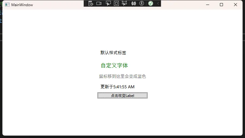
<Label Content="默认样式标签" />
<!-- 单独设置的颜色与大小 -->
<Label Content="自定义字体" FontSize="18" Foreground="Green" />
<!-- 使用指定的自定义样式HoverBlueStyle -->
<Label Content="鼠标移到这里会变成蓝色" Style="{StaticResource HoverBlueStyle}" />
<!-- 通过Binding绑定后端属性 -->
<Label x:Name="lblBindingDemo" Content="{Binding DynamicText}" />
<!-- 动态绑定,点击按钮后更新Label文本 -->
<Button Content="点击改变Label"
Click="Button_Click"/>
</StackPanel>
</Grid>
</Window>
后台C#代码:
C#using System.ComponentModel;
using System.Text;
using System.Windows;
using System.Windows.Controls;
using System.Windows.Data;
using System.Windows.Documents;
using System.Windows.Input;
using System.Windows.Media;
using System.Windows.Media.Imaging;
using System.Windows.Navigation;
using System.Windows.Shapes;

namespace AppLabel
{
    /// <summary>
    /// Interaction logic for MainWindow.xaml
    /// </summary>
    public partial class MainWindow : Window, INotifyPropertyChanged
    {
        private string _dynamicText;
        public string DynamicText
        {
            get { return _dynamicText; }
            set
            {
                _dynamicText = value;
                OnPropertyChanged(nameof(DynamicText));
            }
        }

        public MainWindow()
        {
            InitializeComponent();
            // DataContext设置为当前类
            this.DataContext = this;
            // 初始值
            DynamicText = "这是一段可动态改变的文本";
        }

        private void Button_Click(object sender, RoutedEventArgs e)
        {
            // 改变绑定属性
            DynamicText = $"更新于{DateTime.Now.ToLongTimeString()}";
        }

        public event PropertyChangedEventHandler PropertyChanged;
        private void OnPropertyChanged(string propertyName)
        {
            PropertyChanged?.Invoke(this, new PropertyChangedEventArgs(propertyName));
        }
    }
}
在这个示例中:
• 第一个Label使用默认全局样式。
• 第二个Label手动设置了FontSize与Foreground覆盖全局样式。
• 第三个Label使用自定义的HoverBlueStyle,当鼠标移到上面时文字变蓝。
• 第四个Label通过Binding绑定到了DynamicText属性,并随着代码逻辑改变。
• 通过Button点击事件更新DynamicText的值,从而自动刷新绑定到它的Label。
Label与TextBlock的差异对比
| 特性 | Label | TextBlock |
|---|---|---|
| 属性名称 | Content | Text |
| 内容支持 | 支持任何UI元素,包括文本、图像、按钮等 | 仅支持文本内容 |
| 设计目的 | 通常用于标记其他控件,表单字段的描述 | 专为文本显示而设计,更轻量级 |
| 基类 | ContentControl | FrameworkElement |
| 键盘访问 | 支持键盘快捷键(通过下划线_) | 不支持键盘快捷键 |
| 文本格式化 | 基本支持 | 强大的文本格式化能力(Run、Span等) |
| 样式设置 | 丰富的样式支持,可使用Style、ControlTemplate | 支持样式,但主要针对文本显示 |
| 触发器支持 | 完全支持Style.Triggers | 支持触发器 |
| 数据绑定 | 支持绑定到Content属性 | 支持绑定到Text属性 |
| 性能 | 相对较重,因为是完整的控件 | 轻量级,渲染性能更好 |
| WinForm迁移 | 可直接替代WinForm中的Label | 无WinForm直接对应物 |
| 适用场景 | 表单标签、需要复杂内容的场景 | 纯文本显示、性能敏感场景 |
总结
从WinForm迁移到WPF时,Label的基本功能依旧类似:显示文本、提供提示信息等。但WPF提供了更灵活和强大的样式和数据绑定机制,让开发者可以更轻松地实现动态效果和丰富的界面展示。掌握Style、Triggers、Data Binding等特性,就能在WPF中充分发挥Label控件的潜力。
本文作者:技术老小子
本文链接:
版权声明:本博客所有文章除特别声明外,均采用 BY-NC-SA 许可协议。转载请注明出处!