🚀 .NET 8新特性解析:FrozenDictionary让你的应用性能起飞!
你还在为频繁的字典查询拖慢应用性能而头疼吗?还在纠结内存占用过高的问题吗?C#开发者的福音来了!.NET 8引入的FrozenDictionary<TKey,TValue>,专为高频查询场景而生,让你的应用性能瞬间提升30%+!
本文将深度解析这个性能优化神器的使用技巧,带你掌握从入门到精通的完整攻略。无论你是初级开发者还是资深架构师,都能从中获得实用的编程技巧和性能优化方案。
🎯 问题分析:传统Dictionary的性能瓶颈
📊 性能痛点梳理
在企业级应用开发中,我们经常遇到这些场景:
- 配置数据查询:系统启动时加载,运行期间频繁读取
- 枚举映射表:状态码对应关系,查询密集但修改极少
- 缓存数据访问:热点数据反复查询,写入频率极低
- 路由映射表:URL路径匹配,高并发场景下的性能瓶颈
传统的Dictionary<TKey,TValue>虽然功能强大,但在这些 "一次写入,多次读取" 的场景中存在明显短板:
🔥 核心问题分析
- 内存开销过大:为了支持动态修改,预留了大量冗余空间
- 哈希冲突处理:通用哈希策略无法针对特定数据集优化
- 线程安全开销:并发读取时的同步机制影响性能
💡 解决方案:FrozenDictionary的五大核心优势
🎯 1. 极致的查询性能优化
FrozenDictionary在创建时会分析你的数据特征,量身定制最优的哈希策略:
c#using System.Collections.Frozen;
using System.Diagnostics;

namespace AppFrozenDictionary
{
    internal class Program
    {
        static void Main(string[] args)
        {
            var normalDict = new Dictionary<string, int>
            {
                { "Success", 200 },
                { "NotFound", 404 },
                { "ServerError", 500 }
            };

            // 性能优化方式:查询速度提升 30%+(取决于场景与平台)
            var frozenDict = new Dictionary<string, int>
            {
                { "Success", 200 },
                { "NotFound", 404 },
                { "ServerError", 500 }
            }.ToFrozenDictionary();

            const int iterations = 1_000_000;
            // 热身(JIT、缓存)
            for (int i = 0; i < 10000; i++)
            {
                var s1 = normalDict["Success"];
                var s2 = frozenDict["Success"];
            }

            // 测试传统 Dictionary
            var sw = Stopwatch.StartNew();
            int result1 = 0;
            for (int i = 0; i < iterations; i++)
            {
                result1 += normalDict["Success"];
            }
            sw.Stop();
            Console.WriteLine($"Normal Dictionary: {sw.ElapsedMilliseconds} ms, checksum {result1}");

            // 测试 FrozenDictionary
            sw.Restart();
            int result2 = 0;
            for (int i = 0; i < iterations; i++)
            {
                result2 += frozenDict["Success"];
            }
            sw.Stop();
            Console.WriteLine($"FrozenDictionary: {sw.ElapsedMilliseconds} ms, checksum {result2}");
        }
    }
}
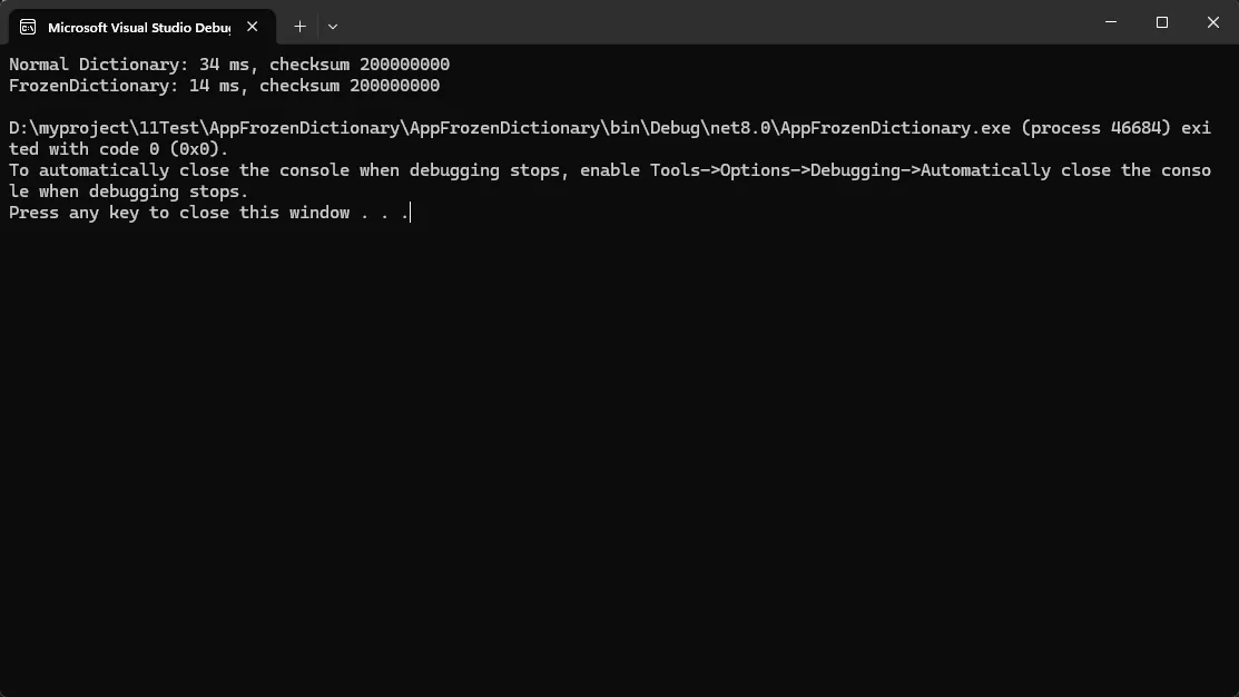
⚡ 性能提升秘密:
- 内部使用完美哈希算法,几乎零冲突
- 针对具体数据集优化的哈希函数
- 内存布局紧凑,CPU缓存友好
你是否曾经为了处理未知结构的JSON而写了一大堆反射代码?是否为了实现灵活的API而让代码变得臃肿不堪?今天我们来聊聊C#中一个被严重低估的特性——动态编程(Dynamic Programming)。
掌握System.Dynamic命名空间,你将告别繁琐的反射操作,让代码变得更加优雅和高效。本文将通过5个实战场景,带你深入理解并应用C#的动态特性。
🎯 为什么需要动态编程?
在实际开发中,我们经常遇到这些痛点:
- JSON数据结构不固定:接口返回的数据格式经常变化
- 配置文件灵活性不够:需要支持动态添加属性
- 插件系统扩展困难:第三方组件接口不统一
- 反射性能问题:大量使用反射导致性能下降
💡 解决方案:System.Dynamic全家桶
🚀 方案一:ExpandoObject - 动态对象的最佳选择
ExpandoObject是动态编程的明星类,它允许我们在运行时动态添加和删除成员。这是个好东西,还没有这个出来前处理这个挺麻烦的。
c#// 使用ExpandoObject的优雅方式
public class DynamicApproach
{
public void ProcessJson(string json)
{
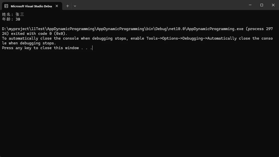
dynamic obj = JsonSerializer.Deserialize<ExpandoObject>(json);
// 直接访问属性,如同静态类型一样自然
Console.WriteLine($"姓名: {obj.name}");
Console.WriteLine($"年龄: {obj.age}");
// 动态添加新属性
obj.processTime = DateTime.Now;
obj.status = "已处理";
}
}
💰 实际应用场景:
- API响应处理
- 配置文件读取
- 临时数据容器
⚠️ 坑点提醒:
- 没有编译时类型检查,拼写错误只能在运行时发现
- 性能略低于静态类型
WPF项目中集成ScottPlot:从零到一画出你的第一条数据曲线
说实话,咱们做WPF开发的,十有八九都遇到过这样的需求:老板突然让你在界面上展示个实时数据曲线,或者搞个设备监控图表啥的。这时候你可能会想到用微软自家的Chart控件,结果发现性能差、样式丑、自定义起来贼麻烦。我之前做过一个工业监控项目,用Chart控件渲染10万个数据点,直接卡成PPT,帧率从60fps掉到个位数。
后来我发现了ScottPlot这个开源图表库,真是相见恨晚。它专门针对大数据量优化,同样10万个点,渲染只需要几十毫秒,而且API设计得特别人性化,三五行代码就能搞定一个漂亮的图表。
ScottPlot这个组件最让我受不了的就是版本变化改的太多了。这块得注意。
读完这篇文章,你能收获这些实实在在的技能:
- 15分钟完成ScottPlot环境搭建,避开常见的版本兼容性陷阱
- 掌握3种典型场景的图表实现,直接复制粘贴就能用
- 学会性能优化的核心技巧,轻松应对百万级数据展示
💡 为啥非要用ScottPlot?Chart控件它不香吗?
痛点一:Chart控件真的扛不住大数据量
我先说个真实数据对比。去年给一家制造业客户做数据采集系统,传感器每秒采集100个点,一分钟就是6000个点。用微软Chart控件实时刷新图表,CPU占用直接飙到40%,界面操作明显卡顿。换成ScottPlot之后,CPU占用降到5%以内,而且鼠标缩放、拖动都丝般顺滑。
这背后的原因其实很简单:Chart控件是基于WinForms时代的设计思路,每次更新都要重新计算布局和渲染整个控件树。而ScottPlot底层用的是高性能的Bitmap渲染,配合智能的缓存机制,只重绘变化的部分。
痛点二:样式自定义简直是噩梦
Chart控件的样式系统复杂得离谱,想改个坐标轴颜色都得翻半天文档。我记得有次想把网格线改成虚线,找了一个小时资料,最后发现还得自己写Custom绘制逻辑。
ScottPlot就友好多了,基本上所有样式都能通过属性直接设置:
csharp// Chart控件:一堆嵌套属性,头都大了
chart1.ChartAreas[0].AxisX.MajorGrid.LineColor = Color.Gray;
chart1.ChartAreas[0]. AxisX.MajorGrid.LineDashStyle = ChartDashStyle.Dash;

// ScottPlot:简洁明了,一看就懂
wpfPlot1.Plot.Grid(color: System.Drawing.Color.Gray, lineStyle: LineStyle.Dash);
痛点三:跨平台支持差
Chart控件是Windows专属的,如果你们公司后面要做跨平台方案,这部分代码基本得重写。ScottPlot支持WPF、WinForms、Avalonia甚至控制台应用,代码基本不用改。
🔧 环境搭建:十分钟配置完战斗环境
第一步:确认你的开发环境
这是我踩过坑之后总结的配置清单,照着来基本不会出问题:
| 组件 | 推荐版本 | 最低要求 |
|---|---|---|
| Visual Studio | 2022(17.4+) | 2019(16.8+) |
| .NET版本 | . NET 6.0 / .NET 7.0 | . NET Framework 4.6.2 |
| ScottPlot. WPF | 5.0+ | 5.0以一版本api区别有点大 |
注意事项:如果你用的是. NET Framework项目,强烈建议升级到4.7.2以上,不然某些依赖包会出现莫名其妙的加载失败。
第二步:安装NuGet包
打开Visual Studio的包管理器控制台(工具 NuGet包管理器 → 程序包管理器控制台),输入以下命令:
powershellInstall-Package ScottPlot.WPF
或者你习惯用图形界面,右键项目 → 管理NuGet程序包 → 浏览,搜索"ScottPlot. WPF",点安装就行。
踩坑预警:有些同学习惯直接装ScottPlot包,这个是核心库,WPF项目必须装ScottPlot.WPF才能用控件。我之前就因为这个浪费了半小时,一直报"找不到命名空间"的错误。
第三步:验证安装是否成功
安装完成后,打开MainWindow.xaml,在顶部添加命名空间引用:
xml<Window x:Class="AppScottPlotWfp.MainWindow"
        xmlns="http://schemas.microsoft.com/winfx/2006/xaml/presentation"
        xmlns:x="http://schemas.microsoft.com/winfx/2006/xaml"
        xmlns:d="http://schemas.microsoft.com/expression/blend/2008"
        xmlns:mc="http://schemas.openxmlformats.org/markup-compatibility/2006"
        xmlns:local="clr-namespace:AppScottPlotWfp"
        mc:Ignorable="d"
        xmlns:ScottPlot="clr-namespace:ScottPlot.WPF;assembly=ScottPlot.WPF"
        Title="MainWindow" Height="450" Width="800">
    <Grid>
        <ScottPlot:WpfPlot Name="wpfPlot1" />
    </Grid>
</Window>
按F5运行,如果看到一个灰色的空白图表区域,恭喜你,环境搭建成功!
🔥 告别Excel痛苦!这个C#神器让数据映射变得超简单
还在为Excel和对象之间的转换而头疼吗?据统计,80%的C#开发者在处理Excel数据时都遇过这些痛点:手写繁琐的读取代码、复杂的格式转换、错误处理困难...
今天给大家分享一个开源神器 - ExcelMapper,让Excel与C#对象的双向映射变得像写Hello World一样简单!
🎯 为什么选择ExcelMapper?
在实际项目中,我们经常需要:
- 📊 从Excel导入用户数据
- 📋 将系统数据导出为Excel报表;
- 🔄 Excel模板填充和数据更新
传统做法需要大量代码处理单元格读写、格式转换、异常处理等,ExcelMapper一行代码搞定!
💐 Nuget 安装
⚡ 快速上手:一行代码读取Excel
🚀 最简单的数据读取
c#// 仅需一行代码,Excel秒变对象集合!
var products = new ExcelMapper("products.xlsx").Fetch<Product>();
🎯 WinForm布局神器:Anchor与Dock属性让你的界面完美自适应
你是否还在为窗体大小变化时控件错乱而头疼?是否还在用代码手动计算控件位置和大小?今天就来彻底解决这个困扰无数C#开发者的布局难题!
本文将手把手教你掌握Anchor与Dock属性,让你的WinForm应用拥有专业级的自适应布局效果。 无论是简单的表单还是复杂的数据展示界面,这两个属性都能让你事半功倍。
🔍 痛点分析:为什么需要自适应布局?
在实际开发中,我们经常遇到这些问题:
- 用户调整窗体大小时,控件位置固定不变,界面显得空荡荡
- 不同分辨率的显示器上,界面布局完全错乱
- 手动编写Resize事件代码,维护成本高且容易出错
这些问题的根源在于:控件的默认定位方式是基于绝对位置的,当容器大小改变时,控件无法智能地调整自己的位置和大小。
💡 核心解决方案:Anchor与Dock双剑合璧
🚀 方案一:Anchor属性 - 精确控制控件与边界的关系
Anchor属性的核心思想:让控件的某些边始终与父容器保持固定距离。
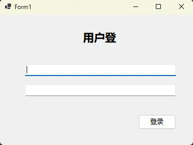
实战案例:自适应登录界面
c#namespace AppWinformAnchorAndDock
{
    public partial class Form1 : Form
    {
        private TextBox txtUsername;
        private TextBox txtPassword;
        private Button btnLogin;
        private Label lblTitle;
        public Form1()
        {
            InitializeComponent();

            this.Width = 400;
            this.Height = 300;

            // 标题标签 - 顶部居中
            lblTitle = new Label
            {
                Text = "用户登录",
                Font = new Font("微软雅黑", 16, FontStyle.Bold),
                Location = new Point(150, 30),
                Size = new Size(100, 30),
                TextAlign = ContentAlignment.MiddleCenter,
                // 锁定顶部和左右边界
                Anchor = AnchorStyles.Top | AnchorStyles.Left | AnchorStyles.Right
            };

            // 用户名输入框 - 水平拉伸
            txtUsername = new TextBox
            {
                Location = new Point(50, 100),
                Size = new Size(300, 25),
                // 锁定顶部、左右边界,实现水平拉伸
                Anchor = AnchorStyles.Top | AnchorStyles.Left | AnchorStyles.Right
            };

            // 密码输入框
            txtPassword = new TextBox
            {
                Location = new Point(50, 140),
                Size = new Size(300, 25),
                PasswordChar = '*',
                Anchor = AnchorStyles.Top | AnchorStyles.Left | AnchorStyles.Right
            };

            // 登录按钮 - 右下角固定
            btnLogin = new Button
            {
                Text = "登录",
                Location = new Point(275, 200),
                Size = new Size(75, 30),
                // 锁定底部和右边界
                Anchor = AnchorStyles.Bottom | AnchorStyles.Right
            };

            this.Controls.AddRange(new Control[] {
            lblTitle, txtUsername, txtPassword, btnLogin
        });
        }
    }
}