
目录
在 WinForm 中,ListBox 主要用来显示一个简单的列表,可通过 Items 属性进行增删改查。然而在 WPF 中,ListBox 不仅可以绑定数据,还可以通过丰富的样式和模板系统来实现高度的自定义。下面将带大家从 WinForm 过渡到 WPF,看看如何使用和美化 ListBox。
基础:WinForm 和 WPF 中的 ListBox 对比
- WinForm:
- 往往通过
listBox1.Items.Add(item)等方式添加数据 - 样式大多依赖于系统的默认 UI
- 往往通过
- WPF:
- 通常结合 数据绑定 (DataBinding) 和 MVVM 模式
- 利用 数据模板 (DataTemplate)、样式 (Style) 来灵活地定义外观
- 更容易实现复杂的交互与视觉效果
简单示例:绑定字符串列表
以下示例展示了如何使用 XAML 绑定一个字符串列表到 ListBox:
XML<Window x:Class="AppListBox.MainWindow"
        xmlns="http://schemas.microsoft.com/winfx/2006/xaml/presentation"
        xmlns:x="http://schemas.microsoft.com/winfx/2006/xaml"
        xmlns:d="http://schemas.microsoft.com/expression/blend/2008"
        xmlns:mc="http://schemas.openxmlformats.org/markup-compatibility/2006"
        xmlns:local="clr-namespace:AppListBox"
        mc:Ignorable="d"
        Title="MainWindow" Height="450" Width="800">
    <Grid>
        <!-- 将ListBox的ItemsSource绑定到ViewModel或后台代码里的字符串集合 -->
        <ListBox x:Name="myListBox" />
    </Grid>
</Window>
在对应的后台代码(MainWindow.xaml.cs)中,可以写入如下:
C#using System.Text;
using System.Windows;
using System.Windows.Controls;
using System.Windows.Data;
using System.Windows.Documents;
using System.Windows.Input;
using System.Windows.Media;
using System.Windows.Media.Imaging;
using System.Windows.Navigation;
using System.Windows.Shapes;
namespace AppListBox
{
/// <summary>
/// Interaction logic for MainWindow.xaml
/// </summary>
public partial class MainWindow : Window
{
public MainWindow()
{
InitializeComponent();
// 准备一些字符串数据
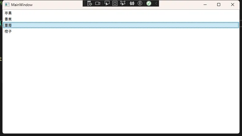
List<string> names = new List<string>
{
"苹果",
"香蕉",
"草莓",
"橙子"
};
// 直接将ListBox的ItemsSource设置为names
myListBox.ItemsSource = names;
}
}
}
小结:在 WinForm 中,我们常常会
listBox1.Items.Add("苹果");在 WPF 中,更推荐使用数据绑定的方式,将数据集合直接赋予ListBox.ItemsSource。
使用 DataTemplate 自定义内容
在 WPF 的 ListBox 中,可以使用 DataTemplate 来定制每一行要显示的内容,比如显示一个更复杂的对象或多个字段:
XML<Window x:Class="AppListBox.Window1"
        xmlns="http://schemas.microsoft.com/winfx/2006/xaml/presentation"
        xmlns:x="http://schemas.microsoft.com/winfx/2006/xaml"
        xmlns:d="http://schemas.microsoft.com/expression/blend/2008"
        xmlns:mc="http://schemas.openxmlformats.org/markup-compatibility/2006"
        xmlns:local="clr-namespace:AppListBox"
        mc:Ignorable="d"
        Title="Window1" Height="450" Width="800">
    <Grid>
        <ListBox x:Name="productListBox" Width="300" Margin="10">
            <ListBox.ItemTemplate>
                <DataTemplate>
                    <StackPanel Orientation="Horizontal">
                        <!-- 绑定对象的Name属性 -->
                        <TextBlock Text="{Binding Name}"
                           FontWeight="Bold"
                           Margin="0,0,5,0"/>
                        <!-- 绑定对象的Price属性 -->
                        <TextBlock Text="{Binding Price, StringFormat={}{0:C}}"
                           Foreground="DarkGreen"/>
                    </StackPanel>
                </DataTemplate>
            </ListBox.ItemTemplate>
        </ListBox>
    </Grid>
</Window>
后台代码演示自定义类 Product:
C#using System;
using System.Collections.Generic;
using System.Linq;
using System.Text;
using System.Threading.Tasks;

namespace AppListBox
{
    public class Product
    {
        // 商品名称
        public string Name { get; set; }
        // 商品价格
        public double Price { get; set; }
    }

}
C#using System;
using System.Collections.Generic;
using System.Linq;
using System.Text;
using System.Threading.Tasks;
using System.Windows;
using System.Windows.Controls;
using System.Windows.Data;
using System.Windows.Documents;
using System.Windows.Input;
using System.Windows.Media;
using System.Windows.Media.Imaging;
using System.Windows.Shapes;
namespace AppListBox
{
/// <summary>
/// Interaction logic for Window1.xaml
/// </summary>
public partial class Window1 : Window
{
public Window1()
{
InitializeComponent();
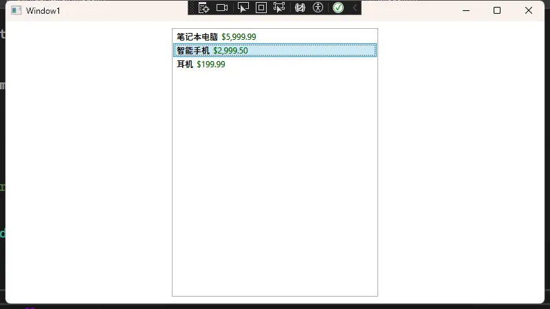
List<Product> products = new List<Product>
{
new Product { Name = "笔记本电脑", Price = 5999.99 },
new Product { Name = "智能手机", Price = 2999.50 },
new Product { Name = "耳机", Price = 199.99 }
};
productListBox.ItemsSource = products;
}
}
}
提示:
DataTemplate可大大提升ListBox的可扩展性,与 WinForm 相比,WPF 的模板概念能够轻松实现界面的分离与动态更新。
样式:Style 与模板的更深入定制
WPF 中的 ListBox 还能借助 Style 和 ControlTemplate 进行更深入的定制。例如,我们想在选中某一项时高亮显示,并自定义鼠标悬停效果。
自定义 ListBoxItem 样式
下面的示例修改了 ListBoxItem 的鼠标悬停色与选中色:
XML<Window x:Class="AppListBox.Window2"
        xmlns="http://schemas.microsoft.com/winfx/2006/xaml/presentation"
        xmlns:x="http://schemas.microsoft.com/winfx/2006/xaml"
        xmlns:d="http://schemas.microsoft.com/expression/blend/2008"
        xmlns:mc="http://schemas.openxmlformats.org/markup-compatibility/2006"
        xmlns:local="clr-namespace:AppListBox"
        mc:Ignorable="d"
        Title="Window2" Height="450" Width="800">
    <Window.Resources>
        <!-- 定义一个针对ListBoxItem的样式 -->
        <Style TargetType="ListBoxItem" x:Key="CustomListBoxItemStyle">
            <Setter Property="Foreground" Value="Black"/>
            <Setter Property="FontSize" Value="14"/>
            <Setter Property="Margin" Value="2"/>
            <!-- 使用Triggers来控制不同状态的视觉效果 -->
            <Style.Triggers>
                <!-- 鼠标悬停时 -->
                <Trigger Property="IsMouseOver" Value="True">
                    <Setter Property="Background" Value="#FFEAEAEA"/>
                </Trigger>
                <!-- 选中时 -->
                <Trigger Property="IsSelected" Value="True">
                    <Setter Property="Background" Value="#FFADD8E6"/>
                    <Setter Property="Foreground" Value="Red"/>
                </Trigger>
            </Style.Triggers>
        </Style>
    </Window.Resources>

    <Grid>
        <ListBox x:Name="styledListBox"
                 ItemContainerStyle="{StaticResource CustomListBoxItemStyle}"
                 Width="200" Height="200" />
    </Grid>
</Window>
在对应的后台代码中:
C#using System.Collections.Generic;
using System.Windows;
namespace WpfListBoxDemo
{
public partial class StyledListBox : Window
{
public StyledListBox()
{
InitializeComponent();
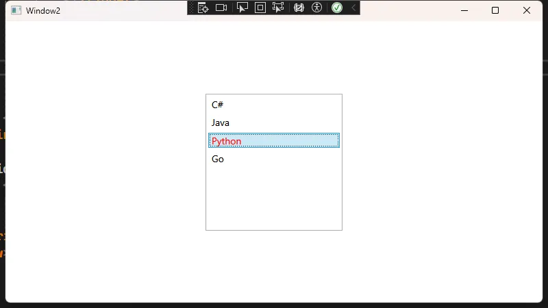
styledListBox.ItemsSource = new List<string>
{
"C#",
"Java",
"Python",
"Go"
};
}
}
}
在 WinForm 中,如果想要实现类似的样式变化,往往需要事件处理或第三方控件才能做到。而在 WPF 中,只需使用简单的
Style和Trigger即可。
使用样式为 SelectionChanged 添加视觉反馈
有时还想在用户选中某项后,在界面其他部分做相应的反馈。例如,通过绑定 SelectedItem 来显示详细信息。
XAML:
XML<Window x:Class="AppListBox.Window3"
        xmlns="http://schemas.microsoft.com/winfx/2006/xaml/presentation"
        xmlns:x="http://schemas.microsoft.com/winfx/2006/xaml"
        xmlns:d="http://schemas.microsoft.com/expression/blend/2008"
        xmlns:mc="http://schemas.openxmlformats.org/markup-compatibility/2006"
        xmlns:local="clr-namespace:AppListBox"
        mc:Ignorable="d"
        Title="Window3" Height="450" Width="800">
    <Grid>
        <ListBox x:Name="styledListBox"
             Width="200" Height="150"
             SelectionChanged="styledListBox_SelectionChanged"/>

        <TextBlock x:Name="infoTextBlock"
               HorizontalAlignment="Left" Margin="220,10,0,0"
               VerticalAlignment="Top"
               FontSize="16"/>
    </Grid>
</Window>
后台:
C#using System;
using System.Collections.Generic;
using System.Linq;
using System.Text;
using System.Threading.Tasks;
using System.Windows;
using System.Windows.Controls;
using System.Windows.Data;
using System.Windows.Documents;
using System.Windows.Input;
using System.Windows.Media;
using System.Windows.Media.Imaging;
using System.Windows.Shapes;
namespace AppListBox
{
/// <summary>
/// Interaction logic for Window3.xaml
/// </summary>
public partial class Window3 : Window
{
public Window3()
{
InitializeComponent();
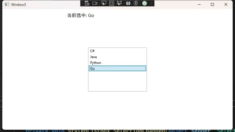
styledListBox.ItemsSource = new List<string>
{
"C#",
"Java",
"Python",
"Go"
};
}
private void styledListBox_SelectionChanged(object sender, SelectionChangedEventArgs e)
{
// 当选中项变更时,显示当前选中的字符串
if (styledListBox.SelectedItem != null)
{
infoTextBlock.Text = $"当前选中: {styledListBox.SelectedItem}";
}
else
{
infoTextBlock.Text = "未选择任何项";
}
}
}
}
和 WinForm 的
SelectedIndexChanged事件很类似,但 WPF 提供了更强大的数据绑定方式,无需手动写这些事件也能完成相同逻辑(在 MVVM 中通过ICommand或绑定到 ViewModel 的属性来响应)。
完整例子
XML<Window x:Class="AppListBox.Window4"
xmlns="http://schemas.microsoft.com/winfx/2006/xaml/presentation"
xmlns:x="http://schemas.microsoft.com/winfx/2006/xaml"
xmlns:d="http://schemas.microsoft.com/expression/blend/2008"
xmlns:mc="http://schemas.openxmlformats.org/markup-compatibility/2006"
xmlns:local="clr-namespace:AppListBox"
mc:Ignorable="d"
Title="Window4" Height="450" Width="800">
<Window.Resources>
<!-- 自定义ListBoxItem样式 -->
<Style x:Key="BeautifulListBoxItemStyle" TargetType="ListBoxItem">
<Setter Property="Margin" Value="0,4,0,4"/>
<Setter Property="Padding" Value="8"/>
<Setter Property="HorizontalContentAlignment" Value="Stretch"/>
<Setter Property="Background" Value="White"/>
<Setter Property="BorderThickness" Value="0"/>
<Setter Property="Template">
<Setter.Value>
<ControlTemplate TargetType="ListBoxItem">
<Border x:Name="MainBorder"
Background="{TemplateBinding Background}"
BorderBrush="{TemplateBinding BorderBrush}"
BorderThickness="{TemplateBinding BorderThickness}"
CornerRadius="8"
Margin="{TemplateBinding Margin}"
Padding="{TemplateBinding Padding}">
<Border.Effect>
<DropShadowEffect ShadowDepth="1" BlurRadius="4" Opacity="0.2" Color="#808080"/>
</Border.Effect>
<ContentPresenter HorizontalAlignment="{TemplateBinding HorizontalContentAlignment}"
VerticalAlignment="{TemplateBinding VerticalContentAlignment}"/>
</Border>
<ControlTemplate.Triggers>
<Trigger Property="IsMouseOver" Value="True">
<Setter TargetName="MainBorder" Property="Background" Value="#F5F9FF"/>
<Setter TargetName="MainBorder" Property="BorderBrush" Value="#D0E1FF"/>
<Setter TargetName="MainBorder" Property="BorderThickness" Value="1"/>
</Trigger>
<Trigger Property="IsSelected" Value="True">
<Setter TargetName="MainBorder" Property="Background" Value="#EBF5FF"/>
<Setter TargetName="MainBorder" Property="BorderBrush" Value="#4D94FF"/>
<Setter TargetName="MainBorder" Property="BorderThickness" Value="1"/>
</Trigger>
</ControlTemplate.Triggers>
</ControlTemplate>
</Setter.Value>
</Setter>
</Style>
<!-- 自定义ListBox样式 -->
<Style x:Key="BeautifulListBoxStyle" TargetType="ListBox">
<Setter Property="Background" Value="Transparent"/>
<Setter Property="BorderThickness" Value="0"/>
<Setter Property="ScrollViewer.HorizontalScrollBarVisibility" Value="Disabled"/>
<Setter Property="ScrollViewer.VerticalScrollBarVisibility" Value="Auto"/>
<Setter Property="ItemContainerStyle" Value="{StaticResource BeautifulListBoxItemStyle}"/>
</Style>
</Window.Resources>
<Grid>
<Grid.ColumnDefinitions>
<ColumnDefinition Width="*"/>
<ColumnDefinition Width="Auto"/>
<ColumnDefinition Width="*"/>
</Grid.ColumnDefinitions>
<!-- 左侧列表区域 -->
<Border Grid.Column="0" Margin="20" Background="White" CornerRadius="10" Padding="15">
<Border.Effect>
<DropShadowEffect ShadowDepth="2" BlurRadius="8" Opacity="0.2" Color="#808080"/>
</Border.Effect>
<Grid>
<Grid.RowDefinitions>
<RowDefinition Height="Auto"/>
<RowDefinition Height="*"/>
</Grid.RowDefinitions>
<TextBlock Grid.Row="0" Text="产品列表" FontSize="22" FontWeight="SemiBold" Foreground="#333333" Margin="0,0,0,15"/>
<ListBox Grid.Row="1"
x:Name="productsListBox"
Style="{StaticResource BeautifulListBoxStyle}"
SelectionChanged="ProductsListBox_SelectionChanged">
<ListBox.ItemTemplate>
<DataTemplate>
<Grid>
<Grid.ColumnDefinitions>
<ColumnDefinition Width="Auto"/>
<ColumnDefinition Width="*"/>
</Grid.ColumnDefinitions>
<!-- 产品图标/颜色标识 -->
<Border Grid.Column="0"
Width="48"
Height="48"
Background="{Binding ColorBrush}"
CornerRadius="8"
Margin="0,0,15,0">
<TextBlock Text="{Binding IconText}"
FontSize="20"
Foreground="White"
VerticalAlignment="Center"
HorizontalAlignment="Center"
FontWeight="Bold"/>
</Border>
<!-- 产品信息 -->
<StackPanel Grid.Column="1" VerticalAlignment="Center">
<TextBlock Text="{Binding Name}"
FontWeight="SemiBold"
FontSize="16"
Foreground="#333333"/>
<StackPanel Orientation="Horizontal" Margin="0,5,0,0">
<TextBlock Text="{Binding Category}"
Foreground="#666666"
FontSize="12"/>
<TextBlock Text=" • " Foreground="#666666" FontSize="12"/>
<TextBlock Text="{Binding Price, StringFormat={}{0:C}}"
Foreground="#4285F4"
FontWeight="SemiBold"
FontSize="12"/>
</StackPanel>
</StackPanel>
</Grid>
</DataTemplate>
</ListBox.ItemTemplate>
</ListBox>
</Grid>
</Border>
<!-- 分隔线 -->
<GridSplitter Grid.Column="1" Width="1" HorizontalAlignment="Center" VerticalAlignment="Stretch" Background="#E0E0E0"/>
<!-- 右侧详情区域 -->
<Border Grid.Column="2" Margin="20" Background="White" CornerRadius="10" Padding="20">
<Border.Effect>
<DropShadowEffect ShadowDepth="2" BlurRadius="8" Opacity="0.2" Color="#808080"/>
</Border.Effect>
<Grid>
<Grid.RowDefinitions>
<RowDefinition Height="Auto"/>
<RowDefinition Height="*"/>
</Grid.RowDefinitions>
<TextBlock Grid.Row="0" Text="产品详情" FontSize="22" FontWeight="SemiBold" Foreground="#333333" Margin="0,0,0,15"/>
<Grid Grid.Row="1" x:Name="detailsPanel" Visibility="Collapsed">
<Grid.RowDefinitions>
<RowDefinition Height="Auto"/>
<RowDefinition Height="Auto"/>
<RowDefinition Height="Auto"/>
<RowDefinition Height="*"/>
</Grid.RowDefinitions>
<!-- 产品标题和图标 -->
<Grid Grid.Row="0" Margin="0,0,0,20">
<Grid.ColumnDefinitions>
<ColumnDefinition Width="Auto"/>
<ColumnDefinition Width="*"/>
</Grid.ColumnDefinitions>
<Border Grid.Column="0"
Width="64"
Height="64"
Background="{Binding ElementName=productsListBox, Path=SelectedItem.ColorBrush}"
CornerRadius="12"
Margin="0,0,15,0">
<TextBlock Text="{Binding ElementName=productsListBox, Path=SelectedItem.IconText}"
FontSize="28"
Foreground="White"
VerticalAlignment="Center"
HorizontalAlignment="Center"
FontWeight="Bold"/>
</Border>
<StackPanel Grid.Column="1" VerticalAlignment="Center">
<TextBlock Text="{Binding ElementName=productsListBox, Path=SelectedItem.Name}"
FontWeight="Bold"
FontSize="24"
Foreground="#333333"/>
<TextBlock Text="{Binding ElementName=productsListBox, Path=SelectedItem.Category}"
Foreground="#666666"
FontSize="14"
Margin="0,5,0,0"/>
</StackPanel>
</Grid>
<!-- 价格信息 -->
<Border Grid.Row="1"
Background="#F5F9FF"
CornerRadius="8"
Padding="15"
Margin="0,0,0,20">
<StackPanel>
<TextBlock Text="价格信息"
FontWeight="SemiBold"
FontSize="16"
Foreground="#333333"
Margin="0,0,0,10"/>
<Grid>
<Grid.ColumnDefinitions>
<ColumnDefinition Width="Auto"/>
<ColumnDefinition Width="*"/>
</Grid.ColumnDefinitions>
<TextBlock Grid.Column="0" Text="销售价:" Foreground="#666666"/>
<TextBlock Grid.Column="1"
Text="{Binding ElementName=productsListBox, Path=SelectedItem.Price, StringFormat={}{0:C}}"
Foreground="#4285F4"
FontWeight="Bold"
HorizontalAlignment="Right"
FontSize="18"/>
</Grid>
</StackPanel>
</Border>
<!-- 产品描述 -->
<StackPanel Grid.Row="2" Margin="0,0,0,20">
<TextBlock Text="产品描述"
FontWeight="SemiBold"
FontSize="16"
Foreground="#333333"
Margin="0,0,0,10"/>
<TextBlock Text="{Binding ElementName=productsListBox, Path=SelectedItem.Description}"
Foreground="#666666"
TextWrapping="Wrap"/>
</StackPanel>
<!-- 按钮区域 -->
<StackPanel Grid.Row="3"
Orientation="Horizontal"
HorizontalAlignment="Right"
VerticalAlignment="Bottom">
<Button Content="添加到购物车"
Background="#4285F4"
Foreground="White"
Padding="15,10"
BorderThickness="0">
<Button.Resources>
<Style TargetType="Border">
<Setter Property="CornerRadius" Value="6"/>
</Style>
</Button.Resources>
</Button>
</StackPanel>
</Grid>
<!-- 未选择产品时的提示 -->
<TextBlock Grid.Row="1"
x:Name="noSelectionText"
Text="请从左侧列表选择一个产品查看详情"
Foreground="#999999"
HorizontalAlignment="Center"
VerticalAlignment="Center"
FontSize="16"/>
</Grid>
</Border>
</Grid>
</Window>
C#using System;
using System.Collections.Generic;
using System.Linq;
using System.Text;
using System.Threading.Tasks;
using System.Windows.Media;

namespace AppListBox
{
    public class Product
    {
        public string Name { get; set; }
        public string Category { get; set; }
        public double Price { get; set; }
        public string Description { get; set; }
        public SolidColorBrush ColorBrush { get; set; }
        public string IconText { get; set; }
    }

}
C#using System;
using System.Collections.Generic;
using System.Linq;
using System.Text;
using System.Threading.Tasks;
using System.Windows;
using System.Windows.Controls;
using System.Windows.Data;
using System.Windows.Documents;
using System.Windows.Input;
using System.Windows.Media;
using System.Windows.Media.Imaging;
using System.Windows.Shapes;

namespace AppListBox
{
    /// <summary>
    /// Interaction logic for Window4.xaml
    /// </summary>
    public partial class Window4 : Window
    {
        public Window4()
        {
            InitializeComponent();
            LoadProducts();
        }

        private void LoadProducts()
        {
            List<Product> products = new List<Product>
            {
                new Product
                {
                    Name = "MacBook Pro",
                    Category = "笔记本电脑",
                    Price = 11999.99,
                    Description = "搭载 M2 Pro 芯片,性能强大,配备高品质 Retina 显示屏和长达 22 小时的电池续航,适合专业创意工作的高端笔记本电脑。",
                    ColorBrush = new SolidColorBrush((Color)ColorConverter.ConvertFromString("#4285F4")),
                    IconText = "M"
                },
                new Product
                {
                    Name = "iPhone 15 Pro",
                    Category = "智能手机",
                    Price = 7999.00,
                    Description = "采用全新A17 Pro芯片,提供出色的图像处理能力,拥有专业级相机系统、动态岛和钛金属设计,是Apple最高端的智能手机。",
                    ColorBrush = new SolidColorBrush((Color)ColorConverter.ConvertFromString("#EA4335")),
                    IconText = "i"
                },
                new Product
                {
                    Name = "iPad Air",
                    Category = "平板电脑",
                    Price = 4599.00,
                    Description = "配备10.9英寸Liquid视网膜显示屏和A14仿生芯片,轻薄设计与强大性能的完美结合,支持Apple Pencil和妙控键盘。",
                    ColorBrush = new SolidColorBrush((Color)ColorConverter.ConvertFromString("#FBBC05")),
                    IconText = "P"
                },
                new Product
                {
                    Name = "AirPods Pro",
                    Category = "无线耳机",
                    Price = 1999.00,
                    Description = "具有主动降噪功能和透明模式的高品质无线耳机,搭载H2芯片,提供卓越的音质和舒适的佩戴体验,支持空间音频。",
                    ColorBrush = new SolidColorBrush((Color)ColorConverter.ConvertFromString("#34A853")),
                    IconText = "A"
                },
                new Product
                {
                    Name = "Apple Watch Series 9",
                    Category = "智能手表",
                    Price = 3299.00,
                    Description = "智能手表系列,具有健康监测、运动追踪和通知功能,快速充电技术和全天候视网膜显示屏设计,是iPhone用户的理想配件。",
                    ColorBrush = new SolidColorBrush((Color)ColorConverter.ConvertFromString("#9C27B0")),
                    IconText = "W"
                },
                new Product
                {
                    Name = "HomePod mini",
                    Category = "智能音箱",
                    Price = 749.00,
                    Description = "小巧但音质出色的智能扬声器,提供360度沉浸式音频体验,可通过Siri控制,支持多房间音频和智能家居集成。",
                    ColorBrush = new SolidColorBrush((Color)ColorConverter.ConvertFromString("#FF9800")),
                    IconText = "H"
                }
            };

            productsListBox.ItemsSource = products;
        }

        private void ProductsListBox_SelectionChanged(object sender, SelectionChangedEventArgs e)
        {
            if (productsListBox.SelectedItem != null)
            {
                detailsPanel.Visibility = Visibility.Visible;
                noSelectionText.Visibility = Visibility.Collapsed;
            }
            else
            {
                detailsPanel.Visibility = Visibility.Collapsed;
                noSelectionText.Visibility = Visibility.Visible;
            }
        }
    }
}
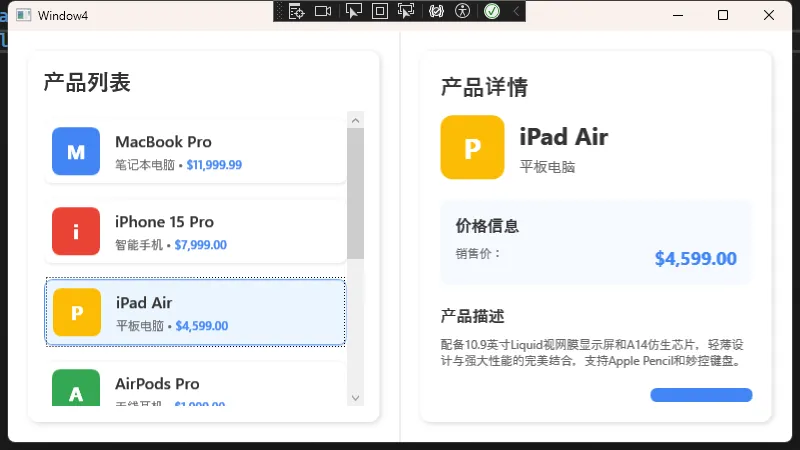
小结
- 从 WinForm 转型到 WPF 时,不仅要了解控件基本用法,还要充分利用 绑定、模板、样式、触发器 等特性来构建更灵活的应用。
ListBox在 WPF 中更像是一个容器,能承载各种复杂布局和数据展示需求。- 样式 (Style) 与数据模板 (DataTemplate) 的结合,让界面可以与业务逻辑有效分离,让我们更易维护和扩展。
以上内容展示了从基础的 ItemsSource 绑定,到 DataTemplate 的自定义,再到 Style 和触发器的丰富用法。只要掌握了这些知识点,就可以轻松地从 WinForm 迁移到 WPF,用更优雅的方式去构建功能强大、界面美观的应用。
本文作者:技术老小子
本文链接:
版权声明:本博客所有文章除特别声明外,均采用 BY-NC-SA 许可协议。转载请注明出处!