
目录
从 WinForm 到 WPF 的转换是许多开发者在现代化 UI 需求下的必经之路。WPF(Windows Presentation Foundation)相较于 WinForm 在界面渲染和布局上有更强大的能力,可以更灵活地使用 XAML 来打造界面,真正实现 UI 与业务逻辑分离。下面将重点阐述如何在 WPF 中使用 Image 控件及其样式,以帮助你完成 WinForm 到 WPF 的转型。
基础概念与差异
在 WinForm 中,图片往往使用 PictureBox 控件去展示。在 WPF 中,展示图像的控件是 Image。相比 WinForm 的 PictureBox,Image 控件在布局、绘制机制以及样式化等方面更具弹性。
- WinForm:
PictureBox负责显示图片。- 通过
PictureBoxSizeMode控制缩放和填充,如AutoSize,StretchImage,Zoom等。
- WPF:
Image控件用于显示图片。- 通过
Stretch和StretchDirection属性控制缩放行为。 - 采用 XAML 的方式进行配置,灵活运用绑定和样式资源。
一个简单的 Image 示例
下面的示例展示了在 XAML 中使用 Image 控件,显示一张本地图片并设置最基本的拉伸和排列方式。
XML<Window x:Class="AppImage.MainWindow"
xmlns="http://schemas.microsoft.com/winfx/2006/xaml/presentation"
xmlns:x="http://schemas.microsoft.com/winfx/2006/xaml"
xmlns:d="http://schemas.microsoft.com/expression/blend/2008"
xmlns:mc="http://schemas.openxmlformats.org/markup-compatibility/2006"
xmlns:local="clr-namespace:AppImage"
mc:Ignorable="d"
Title="MainWindow" Height="450" Width="800">
<Grid>
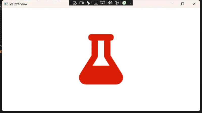
<Image Source="Images/flask.png"
HorizontalAlignment="Center"
VerticalAlignment="Center"
Stretch="Uniform"
Width="200"
Height="200"/>
</Grid>
</Window>
确认图片的属性设置:
- 在解决方案资源管理器中,右键点击flask.png文件
- 确保其"构建操作"设置为"Content"
- 如设置为"Content",还需确保"复制到输出目录"设置为"如果较新则复制"或"始终复制"
在上述示例中:
Source="Images/sample.png":指定要显示的图片路径(可相对,可绝对)。Stretch="Uniform":等比缩放以适应空间,同时保持图片纵横比。
常见的 Image 属性与用法
WPF 中 Image 常用属性主要有:
- Source: 图片源,可以是文件路径、URI 或者
BitmapImage等各种格式。 - Stretch: 图片在控件中的拉伸模式,常见值有:
None:不拉伸。Fill:填充整个区域,可能会导致图片变形。Uniform:在保持图片原有比例的前提下,尽量放大或缩小以适应控件大小。UniformToFill:在保持图片比例的前提下,填满控件并裁剪超出部分。
- StretchDirection: 决定缩放的方向,如
UpOnly,DownOnly或Both。 - Opacity: 控制图片不透明度,值从 0.0(完全透明)到 1.0(完全不透明)。
- RenderTransform: 允许对图片进行旋转、平移或缩放等变化。
在 WinForm 中自定义图像旋转、透明度,大多需要手动编写绘制逻辑或使用 GDI+。而在 WPF 中,可以基于控件的依赖属性和数据绑定进行更灵活的控制。
使用资源(Resource)与绑定(Binding)
在 WPF 中,若要在多个地方共享相同的图片或配置,可以将图片路径或相关样式放入资源中。这样不仅有助于复用,也便于统一管理。
静态资源使用(StaticResource)
假如你需要在多个地方使用同一张图片,可以先在 Window.Resources 或 Application.Resources 中定义一个 BitmapImage 实例,然后用 StaticResource 引用它。
XML<Window x:Class="AppImage.Window1"
        xmlns="http://schemas.microsoft.com/winfx/2006/xaml/presentation"
        xmlns:x="http://schemas.microsoft.com/winfx/2006/xaml"
        xmlns:d="http://schemas.microsoft.com/expression/blend/2008"
        xmlns:mc="http://schemas.openxmlformats.org/markup-compatibility/2006"
        xmlns:local="clr-namespace:AppImage"
        mc:Ignorable="d"
        Title="Window1" Height="450" Width="800">
    <Window.Resources>
        <!-- 定义一个静态资源,引用一张图片 -->
        <BitmapImage x:Key="SharedSampleImage" UriSource="Images/flask.png" />
    </Window.Resources>
    <StackPanel>
        <!-- 使用静态资源 -->
        <Image Source="{StaticResource SharedSampleImage}"
               Height="100" Width="100" Stretch="Uniform" Margin="20" />

        <!-- 也可以在同一个窗口中多处引用同一资源 -->
        <Image Source="{StaticResource SharedSampleImage}"
        Height="100" Width="100" Stretch="Uniform"  Margin="20" />
    </StackPanel>
</Window>

动态资源使用(DynamicResource)
与 StaticResource 不同,DynamicResource 会在运行时根据资源变化进行更新。若你需要在应用运行过程中动态切换图片或皮肤配置,DynamicResource 通常能带来更灵活的效果。
XML<Image Source="{DynamicResource SharedSampleImage}" />
绑定到属性(Binding)
在某些情况下,你可能需要根据后台逻辑动态显示不同的图片。例如,根据用户选择显示不同图标,这时可以借助数据绑定完成。
XML<Window x:Class="AppImage.Window3"
        xmlns="http://schemas.microsoft.com/winfx/2006/xaml/presentation"
        xmlns:x="http://schemas.microsoft.com/winfx/2006/xaml"
        xmlns:d="http://schemas.microsoft.com/expression/blend/2008"
        xmlns:mc="http://schemas.openxmlformats.org/markup-compatibility/2006"
        xmlns:local="clr-namespace:AppImage"
        mc:Ignorable="d"
        Title="Window3" Height="450" Width="800">
    <Window.DataContext>
        <local:ImageViewModel/>
    </Window.DataContext>

    <Grid>
        <Grid.RowDefinitions>
            <RowDefinition Height="Auto"/>
            <RowDefinition Height="*"/>
            <RowDefinition Height="Auto"/>
        </Grid.RowDefinitions>

        <TextBlock Grid.Row="0"
                   Text="动态图片绑定示例"
                   FontSize="24"
                   Margin="10"
                   HorizontalAlignment="Center"/>

        <Border Grid.Row="1"
                BorderBrush="Gray"
                BorderThickness="1"
                Margin="20">
            <!-- 绑定到SelectedImage属性 -->
            <Image Source="{Binding SelectedImage}"
                   Width="200"
                   Height="200"
                   Stretch="Uniform"/>
        </Border>

        <StackPanel Grid.Row="2"
                    Orientation="Horizontal"
                    HorizontalAlignment="Center"
                    Margin="10">
            <Button Content="图片1"
                    Command="{Binding ChangeImageCommand}"
                    CommandParameter="/Images/user1.png"
                    Margin="5"
                    Padding="10,5"/>

            <Button Content="图片2"
                    Command="{Binding ChangeImageCommand}"
                    CommandParameter="/Images/user2.png"
                    Margin="5"
                    Padding="10,5"/>

            <Button Content="图片3"
                    Command="{Binding ChangeImageCommand}"
                    CommandParameter="/Images/user3.png"
                    Margin="5"
                    Padding="10,5"/>
        </StackPanel>
    </Grid>
</Window>
C#using System;
using System.Collections.Generic;
using System.ComponentModel;
using System.Diagnostics;
using System.Linq;
using System.Runtime.CompilerServices;
using System.Text;
using System.Threading.Tasks;
using System.Windows.Input;
using System.Windows.Media.Imaging;

namespace AppImage
{
    public class ImageViewModel : INotifyPropertyChanged
    {
        // 移除原来的字符串路径属性,改用BitmapImage
        private BitmapImage _selectedImage;

        public BitmapImage SelectedImage
        {
            get { return _selectedImage; }
            set
            {
                _selectedImage = value;
                OnPropertyChanged(nameof(SelectedImage));
            }
        }

        // 图片路径列表保持不变
        public string[] ImagePaths { get; } = new string[]
        {
            "/Images/user1.png",
            "/Images/user2.png",
            "/Images/user3.png"
        };

        public ICommand ChangeImageCommand { get; }

        public ImageViewModel()
        {
            // 初始化默认图片
            LoadImage(ImagePaths[0]);

            // 命令实现
            ChangeImageCommand = new RelayCommand<string>(LoadImage);
        }

        // 加载图片的方法
        private void LoadImage(string path)
        {
            Debug.WriteLine($"正在加载图片: {path}");

            try
            {
                // 创建新的BitmapImage实例
                var newImage = new BitmapImage();
                newImage.BeginInit();
                newImage.CacheOption = BitmapCacheOption.OnLoad; // 强制重新加载
                newImage.CreateOptions = BitmapCreateOptions.IgnoreImageCache; // 忽略缓存
                newImage.UriSource = new Uri(path, UriKind.RelativeOrAbsolute);
                newImage.EndInit();

                // 更新UI绑定的图片
                SelectedImage = newImage;

                Debug.WriteLine("图片加载成功");
            }
            catch (Exception ex)
            {
                Debug.WriteLine($"图片加载失败: {ex.Message}");
            }
        }

        public event PropertyChangedEventHandler PropertyChanged;

        protected void OnPropertyChanged([CallerMemberName] string propertyName = null)
        {
            PropertyChanged?.Invoke(this, new PropertyChangedEventArgs(propertyName));
        }
    }
}
C#using System;
using System.Collections.Generic;
using System.Linq;
using System.Text;
using System.Threading.Tasks;
using System.Windows.Input;

namespace AppImage
{
    public class RelayCommand<T> : ICommand
    {
        private readonly Action<T> _execute;
        private readonly Func<T, bool> _canExecute;

        public RelayCommand(Action<T> execute, Func<T, bool> canExecute = null)
        {
            _execute = execute ?? throw new ArgumentNullException(nameof(execute));
            _canExecute = canExecute;
        }

        public bool CanExecute(object parameter)
        {
            return _canExecute == null || _canExecute((T)parameter);
        }

        public void Execute(object parameter)
        {
            _execute((T)parameter);
        }

        public event EventHandler CanExecuteChanged
        {
            add { CommandManager.RequerySuggested += value; }
            remove { CommandManager.RequerySuggested -= value; }
        }
    }
}
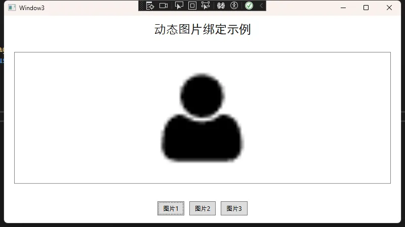
只需在后台 ViewModel 修改 SelectedImagePath 属性,前端 Image 控件就会自动更新图片。
Image 样式(Style)案例
WPF 的强大之处之一在于可以通过样式(Style)对控件进行统一的外观控制。下面展示一个通过 Style 改变 Image 控件的边框、阴影等视觉效果的示例。
XML<Window x:Class="AppImage.Window4"
        xmlns="http://schemas.microsoft.com/winfx/2006/xaml/presentation"
        xmlns:x="http://schemas.microsoft.com/winfx/2006/xaml"
        xmlns:d="http://schemas.microsoft.com/expression/blend/2008"
        xmlns:mc="http://schemas.openxmlformats.org/markup-compatibility/2006"
        xmlns:local="clr-namespace:AppImage"
        mc:Ignorable="d"
        Title="Window4" Height="450" Width="800">
    <Window.Resources>
        <!-- 定义Image控件的自定义样式 -->
        <Style TargetType="Image" x:Key="FancyImageStyle">
            <Setter Property="Stretch" Value="Uniform" />
            <Setter Property="Width" Value="150" />
            <Setter Property="Height" Value="150" />
            <Setter Property="Margin" Value="10" />
            <Setter Property="Effect">
                <Setter.Value>
                    <!-- 让图片带阴影效果 -->
                    <DropShadowEffect ShadowDepth="5"
                                      BlurRadius="10"
                                      Direction="320"
                                      Color="Gray"
                                      Opacity="0.5" />
                </Setter.Value>
            </Setter>
        </Style>
    </Window.Resources>
    <Grid>
        <StackPanel Orientation="Horizontal" HorizontalAlignment="Center">
            <Border BorderBrush="LightGray" BorderThickness="2" Margin="10">
                <Image Source="Images/user1.png" Style="{StaticResource FancyImageStyle}" Margin="0"/>
            </Border>
            <Border BorderBrush="LightGray" BorderThickness="2" Margin="10">
                <Image Source="Images/user2.png" Style="{StaticResource FancyImageStyle}" Margin="0"/>
            </Border>
            <Border BorderBrush="LightGray" BorderThickness="2" Margin="10">
                <Image Source="Images/user3.png" Style="{StaticResource FancyImageStyle}" Margin="0"/>
            </Border>
        </StackPanel>
    </Grid>
</Window>
在这个示例中:
- 无需在每一个
Image控件上手动设置这些属性,从而大大提升了可维护性。
动态效果:鼠标悬停放大
WPF 中也可以通过 Triggers 或者动画(Storyboard)制作简单的动态效果。下面通过 Triggers 让鼠标悬停时图片放大并带有轻微动画。
XML<Window x:Class="AppImage.Window5"
        xmlns="http://schemas.microsoft.com/winfx/2006/xaml/presentation"
        xmlns:x="http://schemas.microsoft.com/winfx/2006/xaml"
        xmlns:d="http://schemas.microsoft.com/expression/blend/2008"
        xmlns:mc="http://schemas.openxmlformats.org/markup-compatibility/2006"
        xmlns:local="clr-namespace:AppImage"
        mc:Ignorable="d"
        Title="Window5" Height="450" Width="800">
    <Window.Resources>
        <Style x:Key="HoverEnlargeImage" TargetType="Image">
            <Setter Property="RenderTransformOrigin" Value="0.5, 0.5"/>
            <Setter Property="RenderTransform">
                <Setter.Value>
                    <!-- 初始无缩放 -->
                    <ScaleTransform ScaleX="1" ScaleY="1"/>
                </Setter.Value>
            </Setter>

            <Style.Triggers>
                <Trigger Property="IsMouseOver" Value="True">
                    <Trigger.EnterActions>
                        <BeginStoryboard>
                            <Storyboard>
                                <!-- 鼠标进入后放大到1.2倍 -->
                                <DoubleAnimation Storyboard.TargetProperty="RenderTransform.ScaleX"
                                                 To="1.2" Duration="0:0:0.2"/>
                                <DoubleAnimation Storyboard.TargetProperty="RenderTransform.ScaleY"
                                                 To="1.2" Duration="0:0:0.2"/>
                            </Storyboard>
                        </BeginStoryboard>
                    </Trigger.EnterActions>
                    <Trigger.ExitActions>
                        <BeginStoryboard>
                            <Storyboard>
                                <!-- 鼠标离开后回到原尺寸 -->
                                <DoubleAnimation Storyboard.TargetProperty="RenderTransform.ScaleX"
                                                 To="1" Duration="0:0:0.2"/>
                                <DoubleAnimation Storyboard.TargetProperty="RenderTransform.ScaleY"
                                                 To="1" Duration="0:0:0.2"/>
                            </Storyboard>
                        </BeginStoryboard>
                    </Trigger.ExitActions>
                </Trigger>
            </Style.Triggers>
        </Style>
    </Window.Resources>
    <Grid>
        <Image Source="Images/flask.png"
               Width="200"
               Height="200"
               Style="{StaticResource HoverEnlargeImage}"/>
    </Grid>
</Window>
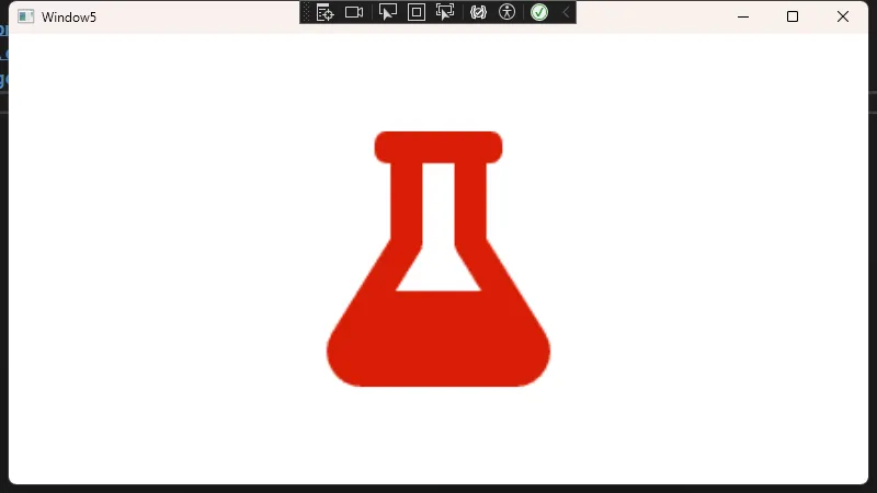
通过这种方式,你可以在不编写任何后台代码的情况下让 Image 根据鼠标悬停产生动画。
总结
- WPF 提供了更灵活的布局和样式系统,相比 WinForm 有更先进的图形渲染机制。
Image控件能通过Stretch,StretchDirection等属性灵活控制图像展示方式,与 WinForm 的PictureBox基本功能相当,但具备丰富的样式和动画优势。- 通过 XAML 资源和样式,可以轻松地统一管理界面中多处使用的图片外观与行为。
- 触发器(Triggers)和动画(Storyboard)能够带来现代化的交互体验,让应用 UI 更加生动。
从 WinForm 转向 WPF,不单单是控件名称上的变化,更是开发思维与设计理念的转变。希望上述示例能够帮助你快速理解并上手使用 WPF 中的 Image 控件,为你的应用打造更出色的 UI 和交互。
本文作者:技术老小子
本文链接:
版权声明:本博客所有文章除特别声明外,均采用 BY-NC-SA 许可协议。转载请注明出处!