
目录
还在用传统的WinForm写桌面应用?看着别人家的界面炫酷到飞起,你是不是也想试试?
据统计,超过70%的.NET桌面开发者仍在使用WinForm,但随着用户对界面体验要求越来越高,WPF已经成为现代桌面应用开发的首选。很多开发者担心转型成本太高,其实掌握正确方法,3天就能上手!
今天就以Calendar控件为例,带你体验从WinForm到WPF的华丽转身,让你的应用界面瞬间提升一个档次!
🎯 为什么必须要转WPF?
💡 三大核心优势让你无法拒绝
1. 界面定义更灵活
- XAML让布局变得像搭积木一样简单
- 数据绑定、动画、模板,想要什么效果就有什么效果
2. 可定制性超强
- 样式(Style)和控制模板(ControlTemplate)
- 改变外观无需动后端逻辑,真正做到前后端分离
3. MVVM模式天然支持
- 数据绑定减少界面与业务逻辑耦合
- 代码结构更清晰,维护成本大幅降低
🚀 Calendar控件实战:从入门到精通
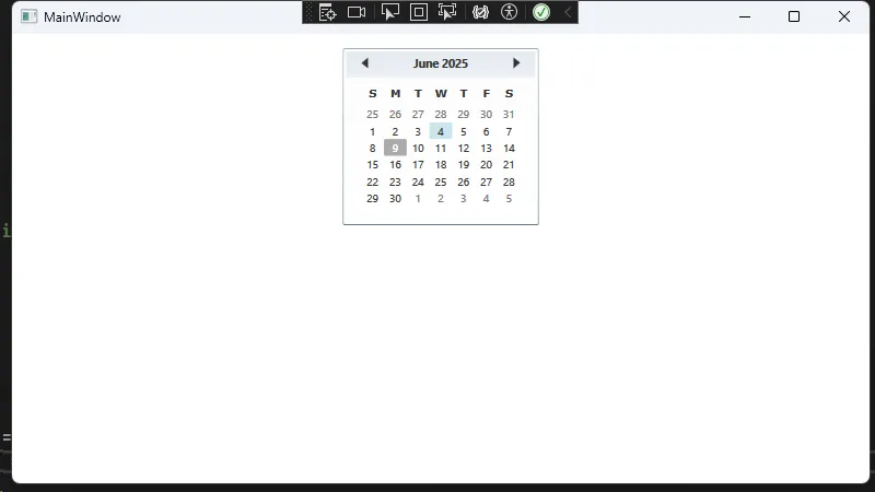
📝 最简单的开始:基础用法
还记得WinForm中拖拽控件的日子吗?WPF中用XAML更优雅:
XML<Window x:Class="AppCalendar.MainWindow"
        xmlns="http://schemas.microsoft.com/winfx/2006/xaml/presentation"
        xmlns:x="http://schemas.microsoft.com/winfx/2006/xaml"
        xmlns:d="http://schemas.microsoft.com/expression/blend/2008"
        xmlns:mc="http://schemas.openxmlformats.org/markup-compatibility/2006"
        xmlns:local="clr-namespace:AppCalendar"
        mc:Ignorable="d"
        Title="MainWindow" Height="450" Width="800">
    <Grid Margin="10">
        <!-- 基础Calendar控件 -->
        <Calendar Name="myCalendar" />
    </Grid>
</Window>
后端代码简化到极致:
C#using System.Text;
using System.Windows;
using System.Windows.Controls;
using System.Windows.Data;
using System.Windows.Documents;
using System.Windows.Input;
using System.Windows.Media;
using System.Windows.Media.Imaging;
using System.Windows.Navigation;
using System.Windows.Shapes;

namespace AppCalendar
{
    /// <summary>
    /// Interaction logic for MainWindow.xaml
    /// </summary>
    public partial class MainWindow : Window
    {
        public MainWindow()
        {
            InitializeComponent();
            myCalendar.DisplayDate = DateTime.Now;
            myCalendar.SelectedDate = DateTime.Now.AddDays(-5);
        }
    }
}
🎨 事件处理:熟悉的配方,全新的体验
XML<Calendar Name="myCalendar"
          SelectedDatesChanged="MyCalendar_SelectedDatesChanged" />
C#private void MyCalendar_SelectedDatesChanged(object sender, SelectionChangedEventArgs e)
{
    // e.AddedItems包含新添加的选中日期集合
    // e.RemovedItems包含移除的选中日期集合

    if (e.AddedItems.Count > 0)
    {
        DateTime selectedDate = (DateTime)e.AddedItems[0];
        MessageBox.Show("你选择了:" + selectedDate.ToShortDateString());
    }
}
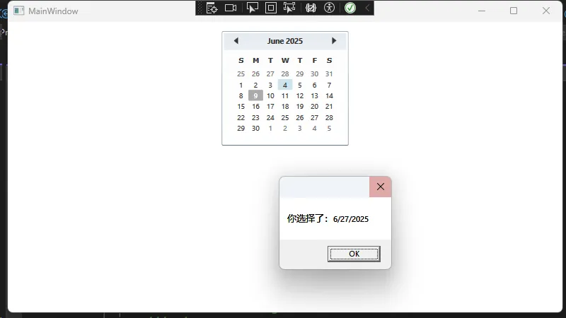
💡 专业提醒: 在实际项目中,建议使用MVVM模式替代直接事件处理,代码会更加优雅!
🎭 样式定制:让你的Calendar与众不同
🌈 基础样式:3行代码改变整体外观
XML<Window.Resources>
    <!-- 统一的Calendar样式 -->
    <Style TargetType="Calendar">
        <Setter Property="Background" Value="LightGray" />
        <Setter Property="BorderBrush" Value="Gray" />
        <Setter Property="BorderThickness" Value="2" />
    </Style>
</Window.Resources>
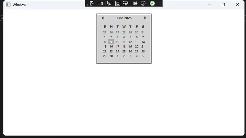
效果: 所有Calendar控件自动继承这个样式,告别重复代码!
🔧 进阶定制:控制模板让你随心所欲
想要完全自定义Calendar的外观?控制模板是你的最佳选择:
XML<Window x:Class="AppCalendar.Window1"
        xmlns="http://schemas.microsoft.com/winfx/2006/xaml/presentation"
        xmlns:x="http://schemas.microsoft.com/winfx/2006/xaml"
        xmlns:d="http://schemas.microsoft.com/expression/blend/2008"
        xmlns:mc="http://schemas.openxmlformats.org/markup-compatibility/2006"
        xmlns:local="clr-namespace:AppCalendar"
        mc:Ignorable="d"
        Title="Window1" Height="450" Width="800">
    <Window.Resources>
        <!-- 自定义日历模板 -->
        <ControlTemplate x:Key="CustomCalendarTemplate" TargetType="Calendar">
            <Border BorderBrush="HotPink" BorderThickness="3" CornerRadius="5" Background="White">
                <Grid>
                    <Grid.RowDefinitions>
                        <!-- 标题栏 -->
                        <RowDefinition Height="Auto"/>
                        <!-- 日期部分 -->
                        <RowDefinition Height="*"/>
                    </Grid.RowDefinitions>

                    <!-- 自定义月份切换按钮 -->
                    <StackPanel Grid.Row="0" Orientation="Horizontal" HorizontalAlignment="Center"
                                Background="LightPink" Margin="3,3,3,0">
                        <Button Content="◀◀"
                                x:Name="PART_PreviousButton"
                                Margin="5"
                                Foreground="Red"
                                FontWeight="Bold"
                                Background="Transparent"
                                BorderThickness="0"
                                Cursor="Hand"/>
                        <TextBlock Text="{Binding DisplayDate,
                                         RelativeSource={RelativeSource TemplatedParent},
                                         StringFormat={}{0:yyyy年MM月}}"
                                   VerticalAlignment="Center"
                                   FontWeight="Bold"
                                   FontSize="16"
                                   Margin="20,5"
                                   Foreground="DarkBlue"/>
                        <Button Content="▶▶"
                                x:Name="PART_NextButton"
                                Margin="5"
                                Foreground="Red"
                                FontWeight="Bold"
                                Background="Transparent"
                                BorderThickness="0"
                                Cursor="Hand"/>
                    </StackPanel>

                    <!-- Calendar内部呈现器 -->
                    <CalendarItem x:Name="PART_CalendarItem" Grid.Row="1" Margin="3"/>
                </Grid>
            </Border>

            <!-- 模板触发器,用于处理按钮点击事件 -->
            <ControlTemplate.Triggers>
                <Trigger Property="IsMouseOver" Value="True" SourceName="PART_PreviousButton">
                    <Setter Property="Background" Value="LightCoral" TargetName="PART_PreviousButton"/>
                </Trigger>
                <Trigger Property="IsMouseOver" Value="True" SourceName="PART_NextButton">
                    <Setter Property="Background" Value="LightCoral" TargetName="PART_NextButton"/>
                </Trigger>
            </ControlTemplate.Triggers>
        </ControlTemplate>

        <!-- 自定义日历项样式 -->
        <Style x:Key="CustomCalendarItemStyle" TargetType="CalendarItem">
            <Setter Property="Background" Value="White"/>
            <Setter Property="BorderBrush" Value="LightGray"/>
            <Setter Property="BorderThickness" Value="1"/>
        </Style>

        <!-- 自定义日期按钮样式 -->
        <Style x:Key="CustomCalendarDayButtonStyle" TargetType="CalendarDayButton">
            <Setter Property="Background" Value="White"/>
            <Setter Property="BorderBrush" Value="LightGray"/>
            <Setter Property="BorderThickness" Value="0.5"/>
            <Setter Property="Margin" Value="1"/>
            <Setter Property="FontSize" Value="12"/>
            <Setter Property="HorizontalContentAlignment" Value="Center"/>
            <Setter Property="VerticalContentAlignment" Value="Center"/>
            <Style.Triggers>
                <Trigger Property="IsMouseOver" Value="True">
                    <Setter Property="Background" Value="LightBlue"/>
                </Trigger>
                <Trigger Property="IsSelected" Value="True">
                    <Setter Property="Background" Value="HotPink"/>
                    <Setter Property="Foreground" Value="White"/>
                    <Setter Property="FontWeight" Value="Bold"/>
                </Trigger>
                <Trigger Property="IsToday" Value="True">
                    <Setter Property="Background" Value="Orange"/>
                    <Setter Property="Foreground" Value="White"/>
                    <Setter Property="FontWeight" Value="Bold"/>
                </Trigger>
            </Style.Triggers>
        </Style>

        <!-- 主日历样式 -->
        <Style x:Key="CustomCalendarStyle" TargetType="Calendar">
            <Setter Property="Template" Value="{StaticResource CustomCalendarTemplate}"/>
            <Setter Property="CalendarItemStyle" Value="{StaticResource CustomCalendarItemStyle}"/>
            <Setter Property="CalendarDayButtonStyle" Value="{StaticResource CustomCalendarDayButtonStyle}"/>
            <Setter Property="HorizontalAlignment" Value="Center"/>
            <Setter Property="VerticalAlignment" Value="Center"/>
            <Setter Property="SelectionMode" Value="SingleDate"/>
        </Style>
    </Window.Resources>

    <Grid>
        <Grid.RowDefinitions>
            <RowDefinition Height="Auto"/>
            <RowDefinition Height="*"/>
            <RowDefinition Height="Auto"/>
        </Grid.RowDefinitions>

        <!-- 标题 -->
        <TextBlock Grid.Row="0"
                   Text="自定义日历控件示例"
                   FontSize="20"
                   FontWeight="Bold"
                   HorizontalAlignment="Center"
                   Margin="10"
                   Foreground="DarkBlue"/>

        <!-- 自定义日历 -->
        <Calendar Grid.Row="1"
                  x:Name="CustomCalendar"
                  Style="{StaticResource CustomCalendarStyle}"
                  SelectedDatesChanged="CustomCalendar_SelectedDatesChanged"/>

        <!-- 显示选中的日期 -->
        <StackPanel Grid.Row="2" Orientation="Vertical" HorizontalAlignment="Center" Margin="10">
            <TextBlock Text="选中的日期:" FontWeight="Bold" Margin="5"/>
            <TextBlock x:Name="SelectedDateText"
                       Text="未选择日期"
                       FontSize="14"
                       Foreground="Blue"
                       HorizontalAlignment="Center"/>
        </StackPanel>
    </Grid>
</Window>
C#using System;
using System.Collections.Generic;
using System.Linq;
using System.Text;
using System.Threading.Tasks;
using System.Windows;
using System.Windows.Controls;
using System.Windows.Data;
using System.Windows.Documents;
using System.Windows.Input;
using System.Windows.Media;
using System.Windows.Media.Imaging;
using System.Windows.Shapes;

namespace AppCalendar
{
    /// <summary>
    /// Interaction logic for Window1.xaml
    /// </summary>
    public partial class Window1 : Window
    {
        public Window1()
        {
            InitializeComponent();
            // 设置默认显示当前日期
            CustomCalendar.DisplayDate = DateTime.Now;
            CustomCalendar.SelectedDate = DateTime.Today;
            UpdateSelectedDateText();
        }

        private void CustomCalendar_SelectedDatesChanged(object sender, System.Windows.Controls.SelectionChangedEventArgs e)
        {
            UpdateSelectedDateText();
        }

        private void UpdateSelectedDateText()
        {
            if (CustomCalendar.SelectedDate.HasValue)
            {
                SelectedDateText.Text = CustomCalendar.SelectedDate.Value.ToString("yyyy年MM月dd日 dddd");
            }
            else
            {
                SelectedDateText.Text = "未选择日期";
            }
        }
    }
}
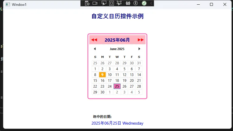
🎯 核心要点: 使用内置命令Calendar.PreviousMonthCommand和Calendar.NextMonthCommand,保持原有功能的同时实现个性化外观!
💼 实战场景:节假日标记功能
想要在Calendar中标记特殊日期?这里有个完美的解决方案:
📅 自定义样式选择器
C#using System;
using System.Collections.Generic;
using System.Globalization;
using System.Linq;
using System.Text;
using System.Threading.Tasks;
using System.Windows;
using System.Windows.Controls;
using System.Windows.Controls.Primitives;
using System.Windows.Data;
using System.Windows.Documents;
using System.Windows.Input;
using System.Windows.Media;
using System.Windows.Media.Imaging;
using System.Windows.Shapes;

namespace AppCalendar
{
    /// <summary>
    /// Interaction logic for Window2.xaml
    /// </summary>
    public partial class Window2 : Window
    {
        private HashSet<DateTime> holidays;

        public Window2()
        {
            InitializeComponent();
            InitializeHolidays();
            myCalendar.Loaded += Calendar_Loaded;

            // 更新状态栏
            UpdateStatusText();

        }
        /// <summary>
        /// 更新状态栏文本
        /// </summary>
        private void UpdateStatusText()
        {
            if (StatusText != null)
            {
                DateTime today = DateTime.Today;
                string todayStatus = GetDateStatus(today);
                StatusText.Text = $"今天: {today:MM月dd日} {todayStatus} | 已标记 {holidays.Count} 个节假日";
            }
        }

        /// <summary>
        /// 获取日期状态描述
        /// </summary>
        private string GetDateStatus(DateTime date)
        {
            if (holidays.Contains(date.Date))
                return "🎉 节假日";
            else if (date.DayOfWeek == DayOfWeek.Saturday || date.DayOfWeek == DayOfWeek.Sunday)
                return "🎯 周末";
            else
                return "💼 工作日";
        }

        /// <summary>
        /// 初始化节假日列表
        /// </summary>
        private void InitializeHolidays()
        {
            holidays = new HashSet<DateTime>();

            // 添加2024年的节假日
            holidays.Add(new DateTime(2024, 1, 1));   // 元旦
            holidays.Add(new DateTime(2024, 2, 10));  // 春节
            holidays.Add(new DateTime(2024, 2, 11));  // 春节
            holidays.Add(new DateTime(2024, 2, 12));  // 春节
            holidays.Add(new DateTime(2024, 5, 1));   // 劳动节
            holidays.Add(new DateTime(2024, 10, 1));  // 国庆节
            holidays.Add(new DateTime(2024, 10, 2));  // 国庆节
            holidays.Add(new DateTime(2024, 10, 3));  // 国庆节
            holidays.Add(new DateTime(2024, 12, 25)); // 圣诞节

            // 添加2025年的节假日
            holidays.Add(new DateTime(2025, 1, 1));   // 元旦
            holidays.Add(new DateTime(2025, 1, 29));  // 春节
            holidays.Add(new DateTime(2025, 1, 30));  // 春节
            holidays.Add(new DateTime(2025, 1, 31));  // 春节
            holidays.Add(new DateTime(2025, 5, 1));   // 劳动节
            holidays.Add(new DateTime(2025, 10, 1));  // 国庆节
            holidays.Add(new DateTime(2025, 10, 2));  // 国庆节
            holidays.Add(new DateTime(2025, 10, 3));  // 国庆节
            holidays.Add(new DateTime(2025, 12, 25)); // 圣诞节
        }

        /// <summary>
        /// 日历加载完成后应用自定义样式
        /// </summary>
        private void Calendar_Loaded(object sender, RoutedEventArgs e)
        {
            ApplyCustomStyles();
        }

        /// <summary>
        /// 应用自定义样式到日历按钮
        /// </summary>
        private void ApplyCustomStyles()
        {
            // 获取日历的所有日期按钮
            var dayButtons = FindVisualChildren<CalendarDayButton>(myCalendar);

            foreach (var button in dayButtons)
            {
                // 监听按钮的DataContext变化
                button.DataContextChanged += DayButton_DataContextChanged;

                // 立即应用样式
                ApplyButtonStyle(button);
            }
        }

        /// <summary>
        /// 当按钮的DataContext改变时重新应用样式
        /// </summary>
        private void DayButton_DataContextChanged(object sender, DependencyPropertyChangedEventArgs e)
        {
            if (sender is CalendarDayButton button)
            {
                ApplyButtonStyle(button);
            }
        }

        /// <summary>
        /// 为单个按钮应用样式
        /// </summary>
        private void ApplyButtonStyle(CalendarDayButton button)
        {
            if (button.DataContext is DateTime date)
            {
                Style styleToApply = null;

                if (holidays.Contains(date.Date))
                {
                    // 节假日样式
                    styleToApply = FindResource("RedHolidayButtonStyle") as Style;
                }
                else if (date.DayOfWeek == DayOfWeek.Saturday || date.DayOfWeek == DayOfWeek.Sunday)
                {
                    // 周末样式
                    styleToApply = FindResource("WeekendButtonStyle") as Style;
                }
                else
                {
                    // 工作日样式
                    styleToApply = FindResource("DefaultButtonStyle") as Style;
                }

                if (styleToApply != null)
                {
                    button.Style = styleToApply;
                }
            }
        }

        /// <summary>
        /// 查找所有指定类型的子控件
        /// </summary>
        private static IEnumerable<T> FindVisualChildren<T>(DependencyObject depObj) where T : DependencyObject
        {
            if (depObj != null)
            {
                for (int i = 0; i < VisualTreeHelper.GetChildrenCount(depObj); i++)
                {
                    DependencyObject child = VisualTreeHelper.GetChild(depObj, i);
                    if (child != null && child is T)
                    {
                        yield return (T)child;
                    }

                    foreach (T childOfChild in FindVisualChildren<T>(child))
                    {
                        yield return childOfChild;
                    }
                }
            }
        }

        /// <summary>
        /// 日历选择日期变化事件
        /// </summary>
        private void Calendar_SelectedDatesChanged(object sender, SelectionChangedEventArgs e)
        {
            if (myCalendar.SelectedDate.HasValue)
            {
                DateTime selectedDate = myCalendar.SelectedDate.Value;
                string dateStatus = GetDateStatus(selectedDate);

                // 更新状态栏
                StatusText.Text = $"选中: {selectedDate:MM月dd日} {dateStatus} | 已标记 {holidays.Count} 个节假日";
            }
        }

        /// <summary>
        /// 日历显示日期范围变化事件
        /// </summary>
        private void Calendar_DisplayDateChanged(object sender, CalendarDateChangedEventArgs e)
        {
            // 当显示的月份改变时,重新应用样式
            Dispatcher.BeginInvoke(new Action(() =>
            {
                ApplyCustomStyles();
                UpdateStatusForCurrentMonth();
            }), System.Windows.Threading.DispatcherPriority.Loaded);
        }

        /// <summary>
        /// 更新当前月份的状态信息
        /// </summary>
        private void UpdateStatusForCurrentMonth()
        {
            if (StatusText != null && myCalendar != null)
            {
                DateTime displayDate = myCalendar.DisplayDate;
                int monthHolidays = 0;

                // 计算当前月份的节假日数量
                foreach (var holiday in holidays)
                {
                    if (holiday.Year == displayDate.Year && holiday.Month == displayDate.Month)
                    {
                        monthHolidays++;
                    }
                }

                StatusText.Text = $"{displayDate:yyyy年MM月} | 本月节假日: {monthHolidays} 天 | 总计: {holidays.Count} 天";
            }
        }

        /// <summary>
        /// 添加节假日按钮点击事件
        /// </summary>
        private void AddHoliday_Click(object sender, RoutedEventArgs e)
        {
            if (myCalendar.SelectedDate.HasValue)
            {
                DateTime selectedDate = myCalendar.SelectedDate.Value;
                if (!holidays.Contains(selectedDate.Date))
                {
                    holidays.Add(selectedDate.Date);
                    ApplyCustomStyles();
                    UpdateStatusText();

                    // 更新状态栏显示成功信息
                    StatusText.Text = $"✅ 已添加 {selectedDate:MM月dd日} 为节假日 | 总计: {holidays.Count} 天";
                }
                else
                {
                    StatusText.Text = $"⚠️ {selectedDate:MM月dd日} 已经是节假日";
                }
            }
            else
            {
                StatusText.Text = "⚠️ 请先选择一个日期";
            }
        }

        /// <summary>
        /// 移除节假日按钮点击事件
        /// </summary>
        private void RemoveHoliday_Click(object sender, RoutedEventArgs e)
        {
            if (myCalendar.SelectedDate.HasValue)
            {
                DateTime selectedDate = myCalendar.SelectedDate.Value;
                if (holidays.Contains(selectedDate.Date))
                {
                    holidays.Remove(selectedDate.Date);
                    ApplyCustomStyles();
                    UpdateStatusText();

                    // 更新状态栏显示成功信息
                    StatusText.Text = $"✅ 已移除 {selectedDate:MM月dd日} 节假日标记 | 总计: {holidays.Count} 天";
                }
                else
                {
                    StatusText.Text = $"⚠️ {selectedDate:MM月dd日} 不是节假日";
                }
            }
            else
            {
                StatusText.Text = "⚠️ 请先选择一个日期";
            }
        }

        /// <summary>
        /// 回到今天按钮点击事件
        /// </summary>
        private void Today_Click(object sender, RoutedEventArgs e)
        {
            myCalendar.SelectedDate = DateTime.Today;
            myCalendar.DisplayDate = DateTime.Today;

            string todayStatus = GetDateStatus(DateTime.Today);
            StatusText.Text = $"📍 回到今天: {DateTime.Today:MM月dd日} {todayStatus}";
        }
    }
}
🎨 XAML中应用样式选择器
XML<Window x:Class="AppCalendar.Window2"
xmlns="http://schemas.microsoft.com/winfx/2006/xaml/presentation"
xmlns:x="http://schemas.microsoft.com/winfx/2006/xaml"
xmlns:d="http://schemas.microsoft.com/expression/blend/2008"
xmlns:mc="http://schemas.openxmlformats.org/markup-compatibility/2006"
xmlns:local="clr-namespace:AppCalendar"
mc:Ignorable="d"
Title="Window2" Height="450" Width="800">
<Window.Resources>
<!-- 节假日按钮样式 -->
<Style x:Key="RedHolidayButtonStyle" TargetType="CalendarDayButton">
<Setter Property="Foreground" Value="White" />
<Setter Property="FontWeight" Value="Bold" />
<Setter Property="Background" Value="#FF4444" />
<Setter Property="BorderBrush" Value="#CC0000" />
<Setter Property="BorderThickness" Value="2" />
<Setter Property="HorizontalContentAlignment" Value="Center"/>
<Setter Property="VerticalContentAlignment" Value="Center"/>
<Setter Property="FontSize" Value="16"/>
<Setter Property="MinHeight" Value="40"/>
<Setter Property="MinWidth" Value="40"/>
<Setter Property="Template">
<Setter.Value>
<ControlTemplate TargetType="CalendarDayButton">
<Grid>
<Border Name="Background"
Background="{TemplateBinding Background}"
BorderBrush="{TemplateBinding BorderBrush}"
BorderThickness="{TemplateBinding BorderThickness}"
CornerRadius="6">
<ContentPresenter Name="NormalText"
HorizontalAlignment="{TemplateBinding HorizontalContentAlignment}"
VerticalAlignment="{TemplateBinding VerticalContentAlignment}"
TextElement.Foreground="{TemplateBinding Foreground}"
TextElement.FontWeight="{TemplateBinding FontWeight}"
TextElement.FontSize="{TemplateBinding FontSize}"/>
</Border>
<Rectangle Name="SelectedBackground"
Fill="#AA000000"
Visibility="Collapsed"
RadiusX="6" RadiusY="6"/>
</Grid>
<ControlTemplate.Triggers>
<Trigger Property="IsMouseOver" Value="True">
<Setter TargetName="Background" Property="Background" Value="#FF6666"/>
<Setter TargetName="Background" Property="BorderBrush" Value="#FF0000"/>
</Trigger>
<Trigger Property="IsPressed" Value="True">
<Setter TargetName="Background" Property="Background" Value="#CC0000"/>
</Trigger>
<Trigger Property="IsSelected" Value="True">
<Setter TargetName="SelectedBackground" Property="Visibility" Value="Visible"/>
</Trigger>
<Trigger Property="IsInactive" Value="True">
<Setter Property="Opacity" Value="0.5"/>
</Trigger>
</ControlTemplate.Triggers>
</ControlTemplate>
</Setter.Value>
</Setter>
</Style>
<!-- 周末按钮样式 -->
<Style x:Key="WeekendButtonStyle" TargetType="CalendarDayButton">
<Setter Property="Foreground" Value="#0066CC" />
<Setter Property="FontWeight" Value="SemiBold" />
<Setter Property="Background" Value="#E6F3FF" />
<Setter Property="BorderBrush" Value="#B3D9FF" />
<Setter Property="BorderThickness" Value="1" />
<Setter Property="HorizontalContentAlignment" Value="Center"/>
<Setter Property="VerticalContentAlignment" Value="Center"/>
<Setter Property="FontSize" Value="16"/>
<Setter Property="MinHeight" Value="40"/>
<Setter Property="MinWidth" Value="40"/>
<Setter Property="Template">
<Setter.Value>
<ControlTemplate TargetType="CalendarDayButton">
<Grid>
<Border Name="Background"
Background="{TemplateBinding Background}"
BorderBrush="{TemplateBinding BorderBrush}"
BorderThickness="{TemplateBinding BorderThickness}"
CornerRadius="4">
<ContentPresenter Name="NormalText"
HorizontalAlignment="{TemplateBinding HorizontalContentAlignment}"
VerticalAlignment="{TemplateBinding VerticalContentAlignment}"
TextElement.Foreground="{TemplateBinding Foreground}"
TextElement.FontWeight="{TemplateBinding FontWeight}"
TextElement.FontSize="{TemplateBinding FontSize}"/>
</Border>
<Rectangle Name="SelectedBackground"
Fill="#AA0066CC"
Visibility="Collapsed"
RadiusX="4" RadiusY="4"/>
</Grid>
<ControlTemplate.Triggers>
<Trigger Property="IsMouseOver" Value="True">
<Setter TargetName="Background" Property="Background" Value="#CCE6FF"/>
<Setter TargetName="Background" Property="BorderBrush" Value="#0066CC"/>
</Trigger>
<Trigger Property="IsPressed" Value="True">
<Setter TargetName="Background" Property="Background" Value="#B3D9FF"/>
</Trigger>
<Trigger Property="IsSelected" Value="True">
<Setter TargetName="SelectedBackground" Property="Visibility" Value="Visible"/>
</Trigger>
<Trigger Property="IsInactive" Value="True">
<Setter Property="Opacity" Value="0.5"/>
</Trigger>
</ControlTemplate.Triggers>
</ControlTemplate>
</Setter.Value>
</Setter>
</Style>
<!-- 默认工作日按钮样式 -->
<Style x:Key="DefaultButtonStyle" TargetType="CalendarDayButton">
<Setter Property="Foreground" Value="#333333" />
<Setter Property="Background" Value="White" />
<Setter Property="BorderBrush" Value="#DDDDDD" />
<Setter Property="BorderThickness" Value="1" />
<Setter Property="HorizontalContentAlignment" Value="Center"/>
<Setter Property="VerticalContentAlignment" Value="Center"/>
<Setter Property="FontSize" Value="16"/>
<Setter Property="MinHeight" Value="40"/>
<Setter Property="MinWidth" Value="40"/>
<Setter Property="Template">
<Setter.Value>
<ControlTemplate TargetType="CalendarDayButton">
<Grid>
<Border Name="Background"
Background="{TemplateBinding Background}"
BorderBrush="{TemplateBinding BorderBrush}"
BorderThickness="{TemplateBinding BorderThickness}"
CornerRadius="3">
<ContentPresenter Name="NormalText"
HorizontalAlignment="{TemplateBinding HorizontalContentAlignment}"
VerticalAlignment="{TemplateBinding VerticalContentAlignment}"
TextElement.Foreground="{TemplateBinding Foreground}"
TextElement.FontSize="{TemplateBinding FontSize}"/>
</Border>
<Rectangle Name="SelectedBackground"
Fill="#AA4A90E2"
Visibility="Collapsed"
RadiusX="3" RadiusY="3"/>
</Grid>
<ControlTemplate.Triggers>
<Trigger Property="IsMouseOver" Value="True">
<Setter TargetName="Background" Property="Background" Value="#F0F8FF"/>
<Setter TargetName="Background" Property="BorderBrush" Value="#4A90E2"/>
</Trigger>
<Trigger Property="IsPressed" Value="True">
<Setter TargetName="Background" Property="Background" Value="#E6F3FF"/>
</Trigger>
<Trigger Property="IsSelected" Value="True">
<Setter TargetName="SelectedBackground" Property="Visibility" Value="Visible"/>
</Trigger>
<Trigger Property="IsInactive" Value="True">
<Setter Property="Opacity" Value="0.4"/>
</Trigger>
</ControlTemplate.Triggers>
</ControlTemplate>
</Setter.Value>
</Setter>
</Style>
<!-- 全尺寸日历样式 -->
<Style x:Key="FullSizeCalendarStyle" TargetType="Calendar">
<Setter Property="Background" Value="Transparent"/>
<Setter Property="BorderThickness" Value="0"/>
<Setter Property="HorizontalAlignment" Value="Stretch"/>
<Setter Property="VerticalAlignment" Value="Stretch"/>
<Setter Property="FontSize" Value="16"/>
<Setter Property="Template">
<Setter.Value>
<ControlTemplate TargetType="Calendar">
<StackPanel x:Name="PART_Root" HorizontalAlignment="Stretch">
<CalendarItem x:Name="PART_CalendarItem"
BorderBrush="{TemplateBinding BorderBrush}"
BorderThickness="{TemplateBinding BorderThickness}"
Background="{TemplateBinding Background}"
Style="{DynamicResource CalendarItemStyle}"/>
</StackPanel>
</ControlTemplate>
</Setter.Value>
</Setter>
</Style>
<!-- 自定义CalendarItem样式以实现完全填充 -->
<Style x:Key="CalendarItemStyle" TargetType="CalendarItem">
<Setter Property="Template">
<Setter.Value>
<ControlTemplate TargetType="CalendarItem">
<Grid ClipToBounds="True">
<Grid.RowDefinitions>
<RowDefinition Height="Auto"/>
<RowDefinition Height="*"/>
</Grid.RowDefinitions>
<!-- 头部 - 月份导航 -->
<Border Grid.Row="0" Background="#2E86AB" Padding="10" CornerRadius="8,8,0,0">
<Grid>
<Grid.ColumnDefinitions>
<ColumnDefinition Width="*"/>
<ColumnDefinition Width="Auto"/>
<ColumnDefinition Width="Auto"/>
</Grid.ColumnDefinitions>
<Button x:Name="PART_HeaderButton"
Grid.Column="0"
HorizontalAlignment="Center"
VerticalAlignment="Center"
FontSize="18"
FontWeight="Bold"
Foreground="White"
Background="Transparent"
BorderThickness="0"/>
<Button x:Name="PART_PreviousButton"
Grid.Column="1"
Content="◀"
FontSize="16"
Foreground="White"
Background="Transparent"
BorderThickness="0"
Width="30" Height="30"
Margin="5,0"/>
<Button x:Name="PART_NextButton"
Grid.Column="2"
Content="▶"
FontSize="16"
Foreground="White"
Background="Transparent"
BorderThickness="0"
Width="30" Height="30"
Margin="5,0"/>
</Grid>
</Border>
<!-- 日历网格 -->
<Grid x:Name="PART_MonthView" Grid.Row="1" Visibility="Visible" Background="White">
<Grid.RowDefinitions>
<RowDefinition Height="Auto"/>
<RowDefinition Height="*"/>
<RowDefinition Height="*"/>
<RowDefinition Height="*"/>
<RowDefinition Height="*"/>
<RowDefinition Height="*"/>
<RowDefinition Height="*"/>
</Grid.RowDefinitions>
<Grid.ColumnDefinitions>
<ColumnDefinition Width="*"/>
<ColumnDefinition Width="*"/>
<ColumnDefinition Width="*"/>
<ColumnDefinition Width="*"/>
<ColumnDefinition Width="*"/>
<ColumnDefinition Width="*"/>
<ColumnDefinition Width="*"/>
</Grid.ColumnDefinitions>
</Grid>
<!-- 年视图 -->
<Grid x:Name="PART_YearView" Grid.Row="1" Visibility="Hidden">
<Grid.RowDefinitions>
<RowDefinition Height="*"/>
<RowDefinition Height="*"/>
<RowDefinition Height="*"/>
</Grid.RowDefinitions>
<Grid.ColumnDefinitions>
<ColumnDefinition Width="*"/>
<ColumnDefinition Width="*"/>
<ColumnDefinition Width="*"/>
<ColumnDefinition Width="*"/>
</Grid.ColumnDefinitions>
</Grid>
</Grid>
</ControlTemplate>
</Setter.Value>
</Setter>
</Style>
<!-- 浮动按钮样式 -->
<Style x:Key="FloatingButtonStyle" TargetType="Button">
<Setter Property="Background" Value="#4CAF50"/>
<Setter Property="Foreground" Value="White"/>
<Setter Property="BorderThickness" Value="0"/>
<Setter Property="FontWeight" Value="SemiBold"/>
<Setter Property="Cursor" Value="Hand"/>
<Setter Property="Padding" Value="12,8"/>
<Setter Property="Margin" Value="5"/>
<Setter Property="MinWidth" Value="140"/>
<Setter Property="Template">
<Setter.Value>
<ControlTemplate TargetType="Button">
<Border Name="ButtonBorder"
Background="{TemplateBinding Background}"
CornerRadius="20"
Padding="{TemplateBinding Padding}">
<Border.Effect>
<DropShadowEffect Color="Black" Direction="270" ShadowDepth="2" Opacity="0.3" BlurRadius="6"/>
</Border.Effect>
<ContentPresenter HorizontalAlignment="Center"
VerticalAlignment="Center"
TextElement.Foreground="{TemplateBinding Foreground}"
TextElement.FontWeight="{TemplateBinding FontWeight}"/>
</Border>
<ControlTemplate.Triggers>
<Trigger Property="IsMouseOver" Value="True">
<Setter TargetName="ButtonBorder" Property="Background" Value="#66BB6A"/>
</Trigger>
<Trigger Property="IsPressed" Value="True">
<Setter TargetName="ButtonBorder" Property="Background" Value="#388E3C"/>
</Trigger>
</ControlTemplate.Triggers>
</ControlTemplate>
</Setter.Value>
</Setter>
</Style>
<Style x:Key="FloatingRemoveButtonStyle" TargetType="Button" BasedOn="{StaticResource FloatingButtonStyle}">
<Setter Property="Background" Value="#F44336"/>
<Setter Property="Template">
<Setter.Value>
<ControlTemplate TargetType="Button">
<Border Name="ButtonBorder"
Background="{TemplateBinding Background}"
CornerRadius="20"
Padding="{TemplateBinding Padding}">
<Border.Effect>
<DropShadowEffect Color="Black" Direction="270" ShadowDepth="2" Opacity="0.3" BlurRadius="6"/>
</Border.Effect>
<ContentPresenter HorizontalAlignment="Center"
VerticalAlignment="Center"
TextElement.Foreground="{TemplateBinding Foreground}"
TextElement.FontWeight="{TemplateBinding FontWeight}"/>
</Border>
<ControlTemplate.Triggers>
<Trigger Property="IsMouseOver" Value="True">
<Setter TargetName="ButtonBorder" Property="Background" Value="#EF5350"/>
</Trigger>
<Trigger Property="IsPressed" Value="True">
<Setter TargetName="ButtonBorder" Property="Background" Value="#D32F2F"/>
</Trigger>
</ControlTemplate.Triggers>
</ControlTemplate>
</Setter.Value>
</Setter>
</Style>
<Style x:Key="FloatingInfoButtonStyle" TargetType="Button" BasedOn="{StaticResource FloatingButtonStyle}">
<Setter Property="Background" Value="#2196F3"/>
<Setter Property="Template">
<Setter.Value>
<ControlTemplate TargetType="Button">
<Border Name="ButtonBorder"
Background="{TemplateBinding Background}"
CornerRadius="20"
Padding="{TemplateBinding Padding}">
<Border.Effect>
<DropShadowEffect Color="Black" Direction="270" ShadowDepth="2" Opacity="0.3" BlurRadius="6"/>
</Border.Effect>
<ContentPresenter HorizontalAlignment="Center"
VerticalAlignment="Center"
TextElement.Foreground="{TemplateBinding Foreground}"
TextElement.FontWeight="{TemplateBinding FontWeight}"/>
</Border>
<ControlTemplate.Triggers>
<Trigger Property="IsMouseOver" Value="True">
<Setter TargetName="ButtonBorder" Property="Background" Value="#42A5F5"/>
</Trigger>
<Trigger Property="IsPressed" Value="True">
<Setter TargetName="ButtonBorder" Property="Background" Value="#1976D2"/>
</Trigger>
</ControlTemplate.Triggers>
</ControlTemplate>
</Setter.Value>
</Setter>
</Style>
</Window.Resources>
<Grid Background="#F8F9FA">
<!-- 主要内容区域 -->
<Grid Margin="10">
<Grid.RowDefinitions>
<RowDefinition Height="Auto"/>
<RowDefinition Height="*"/>
</Grid.RowDefinitions>
<!-- 顶部状态栏 -->
<Border Grid.Row="0"
Background="#2E86AB"
CornerRadius="8,8,0,0"
Padding="20,12"
Margin="0,0,0,0">
<TextBlock x:Name="StatusText"
Text="🎉 全屏节假日日历 - 点击日期进行操作"
Foreground="White"
FontWeight="SemiBold"
FontSize="16"
HorizontalAlignment="Center"/>
</Border>
<!-- 日历容器 - 移除Viewbox,让日历直接填充 -->
<Border Grid.Row="1"
Background="White"
BorderBrush="#CCCCCC"
BorderThickness="1,0,1,1"
CornerRadius="0,0,8,8">
<Border.Effect>
<DropShadowEffect Color="LightGray" Direction="270" ShadowDepth="3" Opacity="0.3" BlurRadius="10"/>
</Border.Effect>
<Calendar x:Name="myCalendar"
Style="{StaticResource FullSizeCalendarStyle}"
SelectedDatesChanged="Calendar_SelectedDatesChanged"
DisplayDateChanged="Calendar_DisplayDateChanged"
FirstDayOfWeek="Monday"
HorizontalAlignment="Stretch"
VerticalAlignment="Stretch"
Margin="5"/>
</Border>
</Grid>
<!-- 浮动操作按钮 - 右下角 -->
<StackPanel Orientation="Vertical"
HorizontalAlignment="Right"
VerticalAlignment="Bottom"
Margin="20">
<Button x:Name="AddHolidayButton"
Content="➕ 添加节假日"
Click="AddHoliday_Click"
Style="{StaticResource FloatingButtonStyle}"/>
<Button x:Name="RemoveHolidayButton"
Content="➖ 移除节假日"
Click="RemoveHoliday_Click"
Style="{StaticResource FloatingRemoveButtonStyle}"/>
<Button x:Name="TodayButton"
Content="📍 回到今天"
Click="Today_Click"
Style="{StaticResource FloatingInfoButtonStyle}"/>
</StackPanel>
<!-- 浮动图例 - 左下角 -->
<Border HorizontalAlignment="Left"
VerticalAlignment="Bottom"
Background="#FFFFFF"
BorderBrush="#DDDDDD"
BorderThickness="1"
CornerRadius="10"
Padding="15,12"
Margin="20"
Opacity="0.95">
<Border.Effect>
<DropShadowEffect Color="Black" Direction="270" ShadowDepth="2" Opacity="0.2" BlurRadius="8"/>
</Border.Effect>
<StackPanel Orientation="Horizontal">
<StackPanel Orientation="Horizontal" Margin="0,0,20,0">
<Border Background="#FF4444" Width="18" Height="18" CornerRadius="4" VerticalAlignment="Center"/>
<TextBlock Text="节假日" Margin="8,0,0,0" VerticalAlignment="Center" FontSize="13" FontWeight="SemiBold"/>
</StackPanel>
<StackPanel Orientation="Horizontal" Margin="0,0,20,0">
<Border Background="#E6F3FF" BorderBrush="#B3D9FF" BorderThickness="1" Width="18" Height="18" CornerRadius="3" VerticalAlignment="Center"/>
<TextBlock Text="周末" Margin="8,0,0,0" VerticalAlignment="Center" FontSize="13" FontWeight="SemiBold"/>
</StackPanel>
<StackPanel Orientation="Horizontal">
<Border Background="White" BorderBrush="#DDDDDD" BorderThickness="1" Width="18" Height="18" CornerRadius="2" VerticalAlignment="Center"/>
<TextBlock Text="工作日" Margin="8,0,0,0" VerticalAlignment="Center" FontSize="13" FontWeight="SemiBold"/>
</StackPanel>
</StackPanel>
</Border>
</Grid>
</Window>
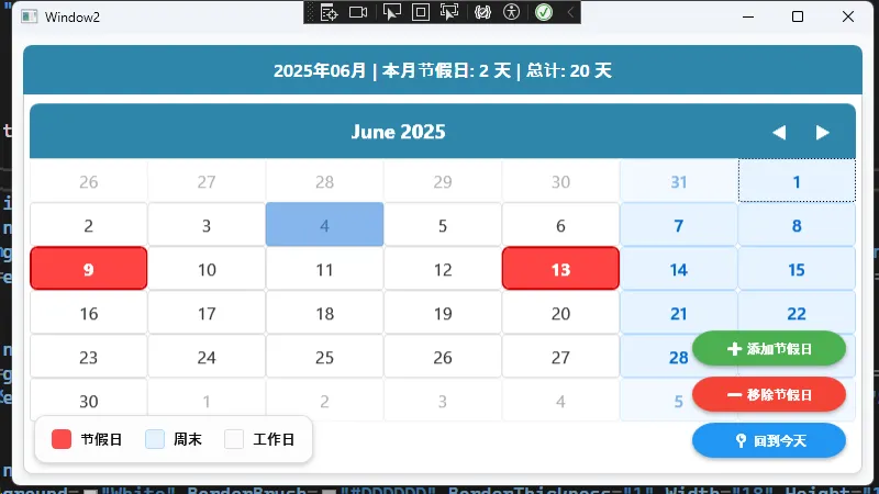
✨ 效果: 节假日自动显示红色高亮,用户体验瞬间提升!
🤔 转型过程中的关键思维转变
🔄 四个核心差异要牢记
1. 布局思维转变
- ❌ WinForm:拖拽控件到固定位置
- ✅ WPF:使用Grid、StackPanel等容器响应式布局
2. 数据处理方式
- ❌ WinForm:直接从控件读取值
- ✅ WPF:双向绑定,数据与界面分离
3. 样式管理
- ❌ WinForm:在代码中设置控件属性
- ✅ WPF:使用Resources统一管理样式和模板
4. 交互处理
- ❌ WinForm:主要依赖事件
- ✅ WPF:事件+命令,降低耦合度
⚠️ 常见坑点提醒
- 绑定路径错误:注意
{Binding Path=PropertyName}的写法 - 资源引用失效:确保StaticResource和DynamicResource的正确使用
- 命名空间遗漏:记得在XAML中引入自定义类的命名空间
🎉 总结:转型WPF的三大收获
通过Calendar控件的实战演练,我们掌握了:
- 🔧 技术收获:XAML语法、数据绑定、样式定制、控制模板
- 💡 思维升级:从控件操作转向数据驱动的开发模式
- 🚀 能力提升:创建更美观、更灵活的桌面应用界面
WPF的学习曲线确实比WinForm陡峭一些,但掌握这些核心概念后,你会发现开发效率和代码质量都有质的飞跃!
💬 互动时间:
- 你在WinForm转WPF过程中遇到过哪些棘手问题?
- 还想了解WPF的哪些高级特性?
觉得这篇文章对你有帮助,请转发给更多需要转型的C#同行! 让我们一起拥抱更现代的桌面开发技术!
🔗 延伸学习建议:
- 深入学习MVVM模式和数据绑定机制
- 掌握WPF动画和图形处理技术
- 了解Prism等WPF企业级开发框架
#C#开发 #WPF #桌面应用开发 #编程技巧
本文作者:技术老小子
本文链接:
版权声明:本博客所有文章除特别声明外,均采用 BY-NC-SA 许可协议。转载请注明出处!